With Circle vs on Circle comparison chart
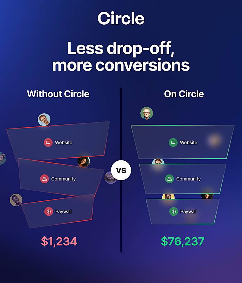
This comparison chart from Circle nails a key marketing move: show, don’t tell. With a single side-by-side visual, they turn an invisible benefit (fewer drop-offs) into a crystal-clear money gain.
Marketing Analysis
On the left: chaos, lost users, $1,234.
On the right: everything works together, $76,237.
Circle’s design makes you feel the frustration of a broken system and the relief of integration.
Why It Works
- Visual contrast instantly communicates value
- Numbers anchor the benefit in tangible results
- One clear message: “Use Circle, make more money”
- Simplicity makes it skimmable and shareable
Examples
- Apple’s “Mac vs PC” ads simplified complex differences into clear contrasts
- Slack’s early demos showed messy emails vs clean Slack threads
- ClickUp’s “One app to replace them all” nails the same all-in-one pitch
Analyzed by Swipebot
Loading analysis...
.png?width=3840&quality=80)