Automation Sketch: Manual → Software → Outsourcing → AI
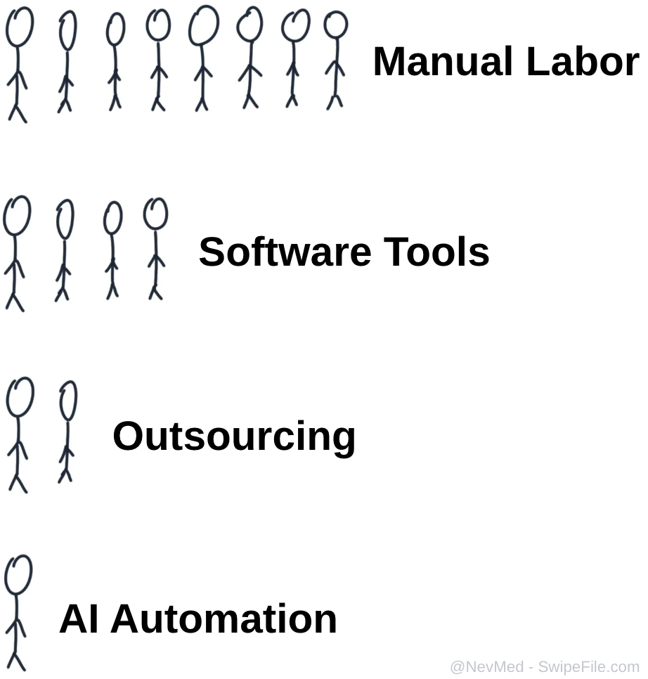
This sketch is your org chart on automation. At the top, a crowd of stick figures grinding away with manual labor. Each row down, the headcount shrinks: software tools, then outsourcing, then finally one lonely stick figure doing the same job using AI automation. The point: the work stays the same, but the number of humans needed falls off a cliff. If your company chart still looks like the top row, this post is your permission slip to redraw it.
How to Use This Visual in Your Business
Show this image in planning meetings whenever a manager says, “We just need to hire more people.” Ask, “How do we move this task one row down?” Could a workflow tool cut the team in half? Could a simple AI agent reduce busywork to a single operator? Use the drawing as a gut-check: if your solution adds stick figures instead of removing them, you are scaling payroll, not output.
The Psychology Behind the Doodles
- Crowded top row makes manual labor feel bloated, expensive, and hard to manage.
- Middle rows show software and outsourcing as stepping-stones, not final destinations.
- Single AI worker at the bottom creates a powerful contrast: less payroll, fewer meetings, same output.
- Your brain instantly gets the upgrade path: do not add people, add leverage.
Real Teams, Smaller Headcount
Zapier runs lean marketing campaigns by letting a tiny team chain together automations that used to need a full department.

Shopify merchants replace whole support shifts by using AI chatbots to answer routine questions 24/7.
Notion keeps product teams small by combining docs, project management, and AI assistants in one place.
