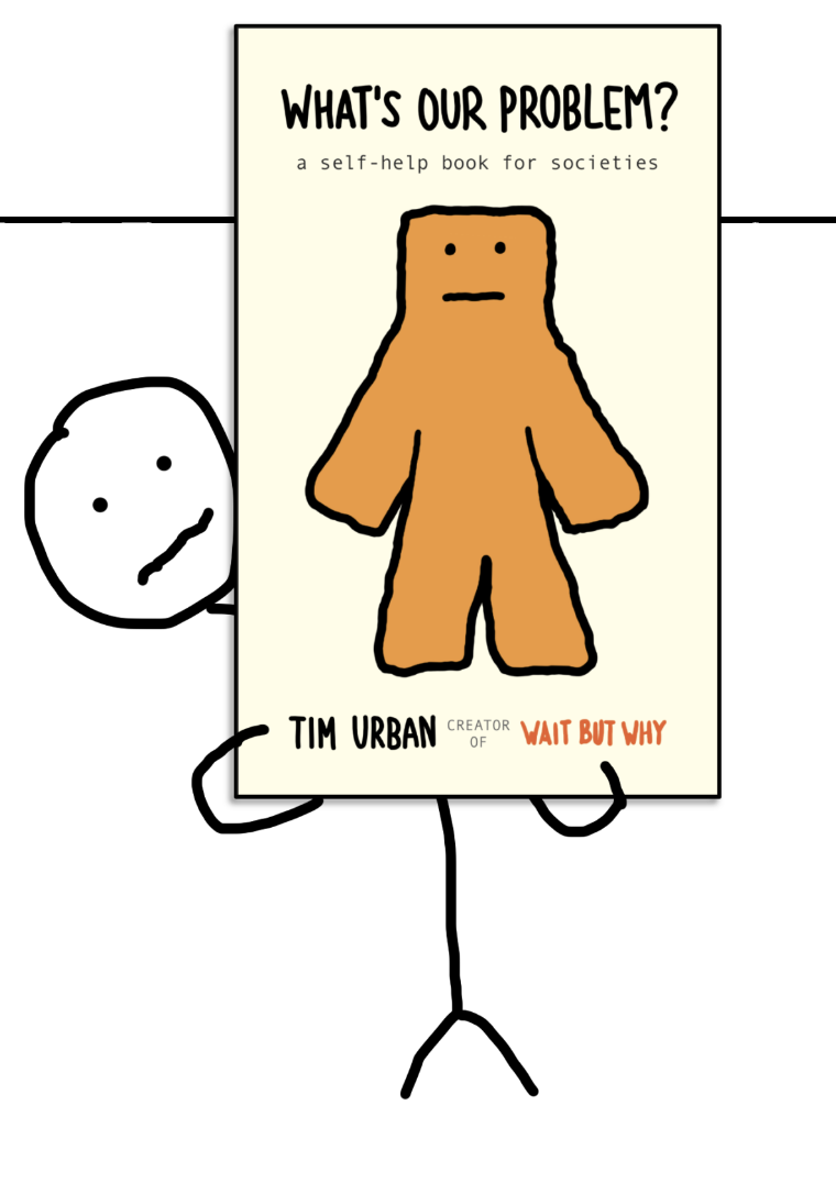
This promo for Tim Urban’s What’s Our Problem? is a masterclass in visual focus. It’s minimal, funny, and instantly recognizable as Wait But Why. The heatmap shows exactly how the design sucks you in: first to the orange blob guy, then to the title, and finally to the author credit.
Why It Works
- Simple design = no distractions
- Strong contrast (orange on cream) grabs attention
- Centered character pulls the viewer’s gaze
- Familiar stick-figure style builds instant brand recognition
- Eye path naturally leads to the important info
Real-World Examples
- Apple ads: simple product-on-white draws instant eye focus
- Nike’s “Just Do It” posters use one bold image + minimal text
- Oatly packaging: hand-drawn typography and offbeat humor for quick recall
- Basecamp homepage: open layout guides eyes straight to the CTA
Analyzed by Swipebot
Loading analysis...
