Bryan Johnson collaboration hair restoration ad
Updated on
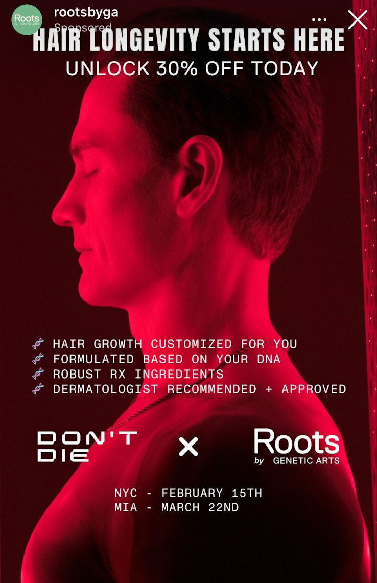
This Roots ad is a great example of how visual contrast grabs attention fast. The deep red glow on Bryan Johnson instantly halts scrolling and makes you curious why this scene feels so futuristic and clinical. Then they back it up with crisp bullet points that sell the science.
Why it works
- Red lighting commands attention and sparks emotion
- Short bullets explain benefits, not features
- “Based on your DNA” feels tech-forward and personalized
- Visual minimalism makes copy the hero
- Contrast between human skin tone and red tech lighting feels memorable
Examples
- Apple’s red iPhone campaigns use bold color to stand out in minimalist feeds
- Oura Ring ads highlight data-driven personalization just like this one
- Hims uses clean, clinical visuals to turn “medical” into modern and cool
Analyzed by Swipebot
Loading analysis...
