1,913 Images and Illustration Examples That Teach Things
Drawings and illustrations and photography can transmit more information from human-to-human than text can. This board is perfect for designers and marketers seeking visual inspiration.

Turn Awful Wire Transfers Into Two Steps
Wire transfers are already stressful, but this visual nails why they feel downright awful. On the left you’ve got the...

Turn Your Email List Into Revenue Engine
Most people treat their email list like a dusty address book: nice to have, rarely opened. The Kit screenshots flip...

Targeted Bed Cooling: Save Energy, Sleep Better
Most people crank the AC to freeze their whole house just to cool off under the covers. The image above...

Stop Sleep Divorce With Two Temperature Zones
This ad takes a boring mattress feature and turns it into a relationship saver. Instead of talking specs, it attacks...

Local business host influencer events
This isn’t a boring conference room meetup. It’s a packed waterpark, bright colors, kids splashing, and a giant headline yelling...
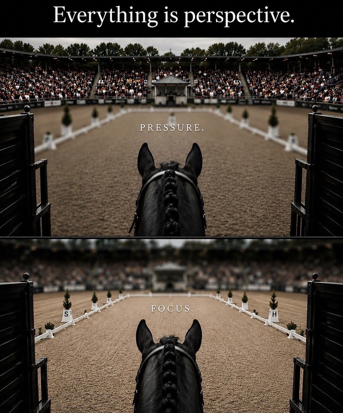
Reframe Pressure Into Single-Minded Focus
Look at the image: same arena, same horse, same roaring crowd. In the first frame the background is razor sharp...
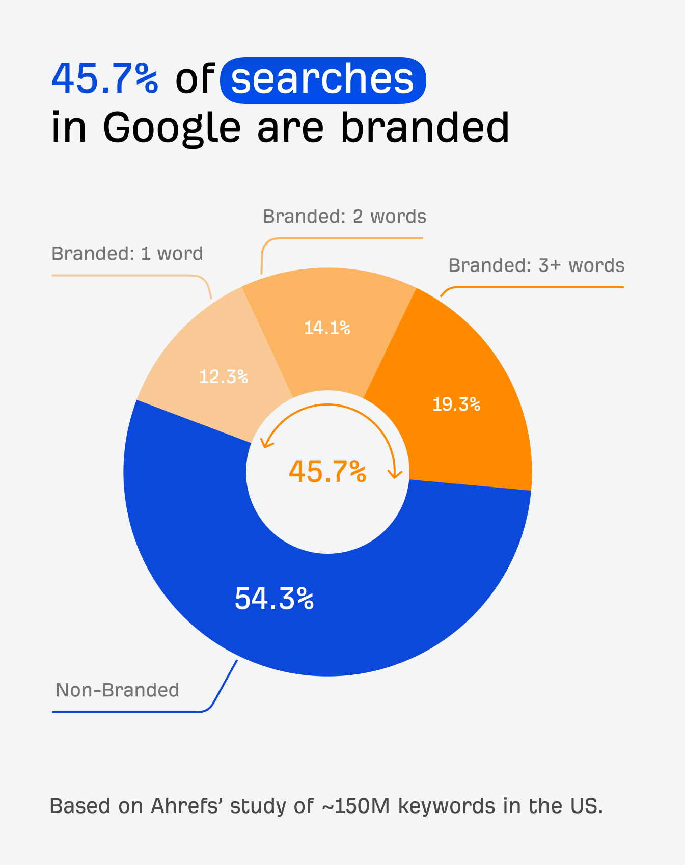
Make Branded Searches Your Biggest SEO Win
Everyone obsesses over ranking for generic keywords like “best CRM” or “email marketing tools.” But the chart from Ahrefs’ latest...
From $22 t-shirt to $5,000 of clients
Everyone chases clients with funnels, fancy logos, and ad dashboards… then walks past the easiest lead magnet on earth: their...
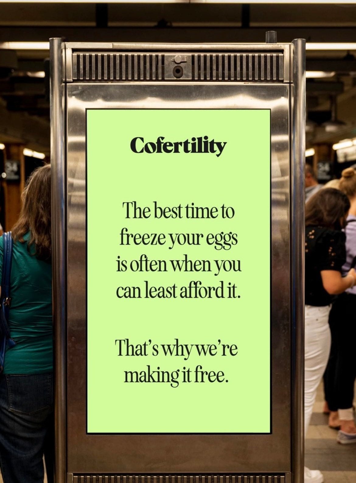
Free Egg Freezing If You Donate Half
This subway ad looks harmless at first glance: soft green background, elegant serif font, empathetic line about not being able...
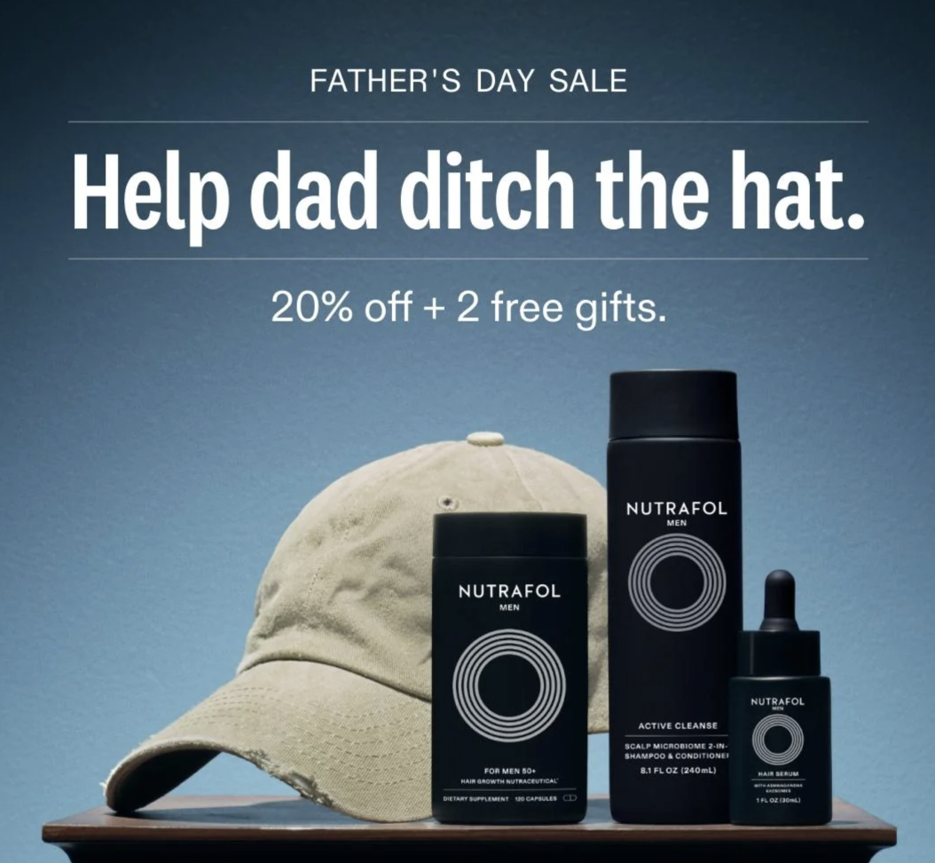
Ditch The Hat: Father's Day Hair Campaign
This Father’s Day ad doesn’t talk about follicles, serums, or science. It zooms in on one simple, relatable villain: dad’s...
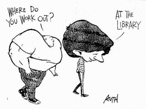
Niche Your Copy For Readers, Not Gym Bros
This cartoon nails a problem most marketers ignore. One guy’s jacked like a gym bro and asks, “Where do you...
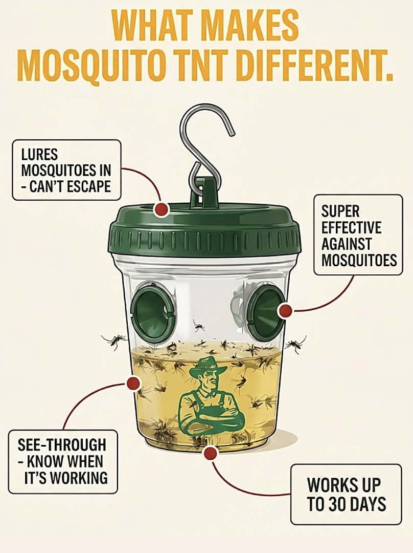
Sell With Proof: See-Through Mosquito Trap
If your product actually works, show it working. This mosquito trap ad doesn’t brag with fluffy claims, it rubs your...
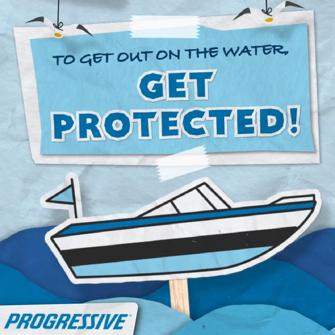
Get Boaters Insured Before They Sail
This ad nails how to nudge boaters into buying insurance before they even untie the dock lines. With one simple...
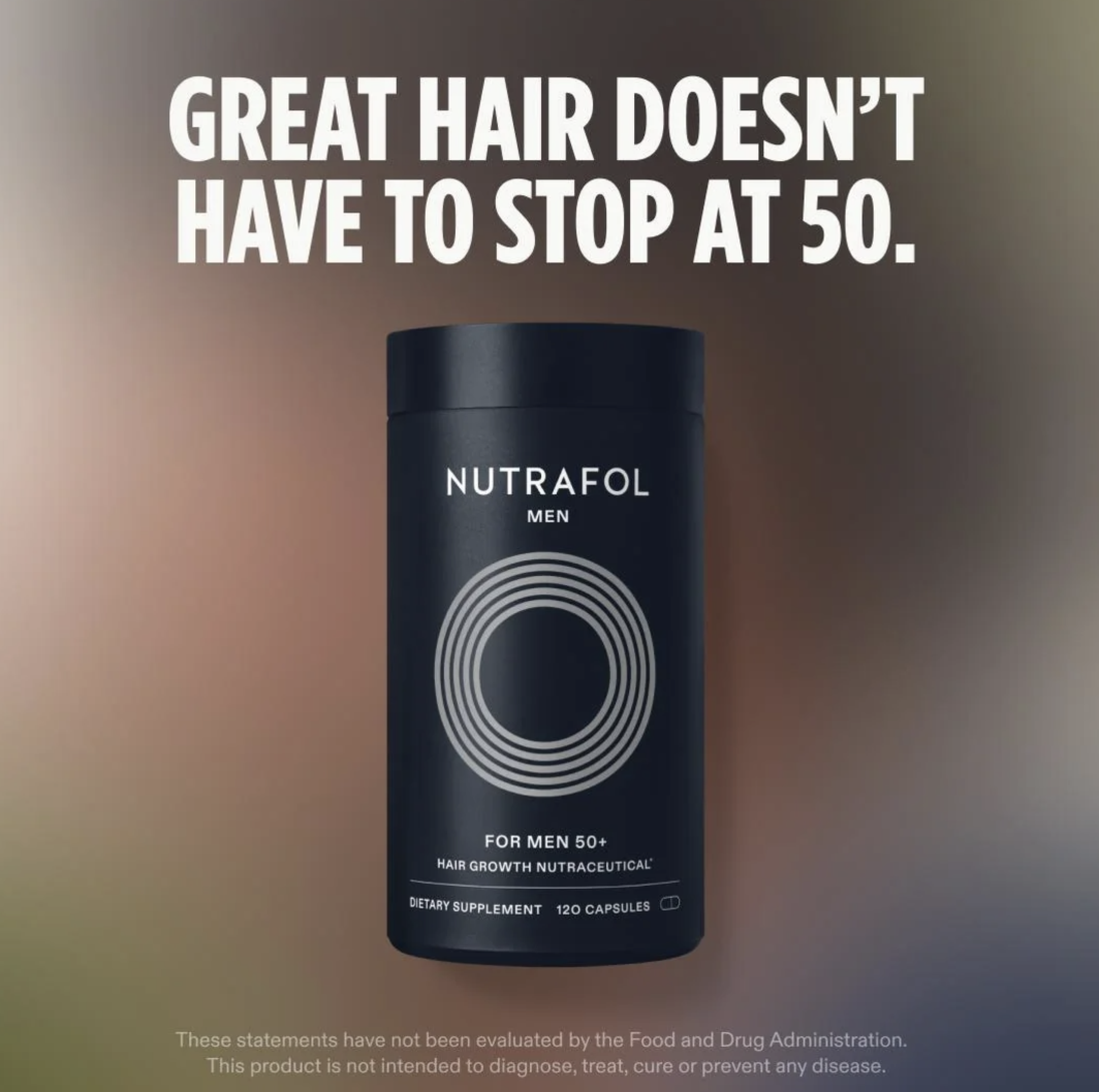
Keep Great Hair After 50
The ad image hits you with one bold line: “Great hair doesn’t have to stop at 50.” No jargon, no...
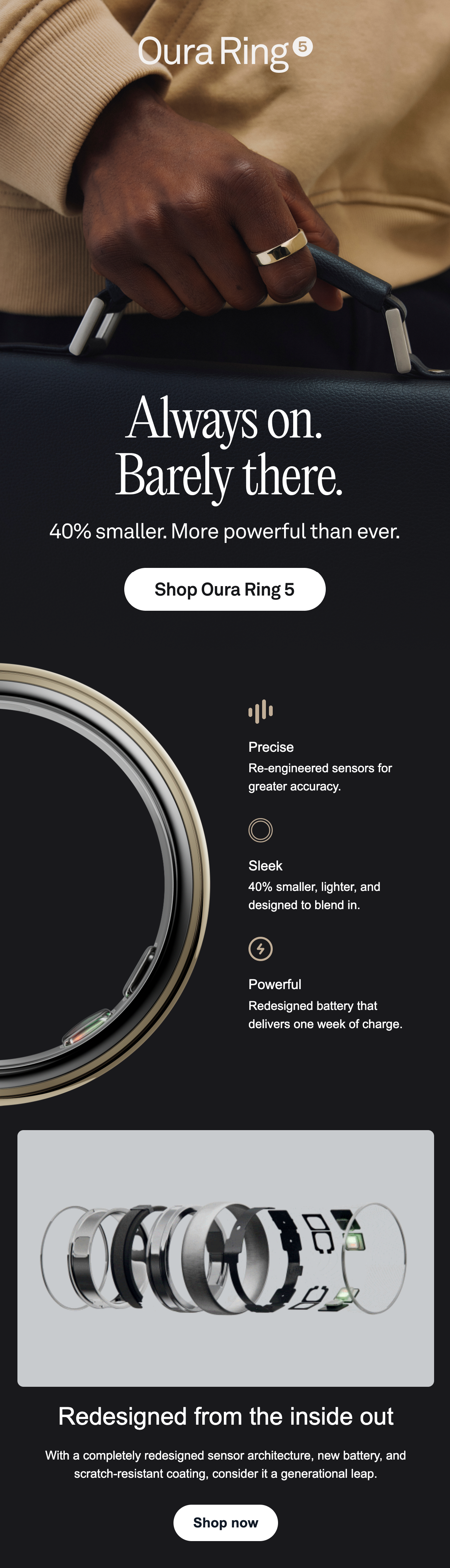
Always-On Tracking, 40% Smaller Ring
This ad for the new Oura Ring 5 is a masterclass in selling high-tech without looking high-tech. In one long...
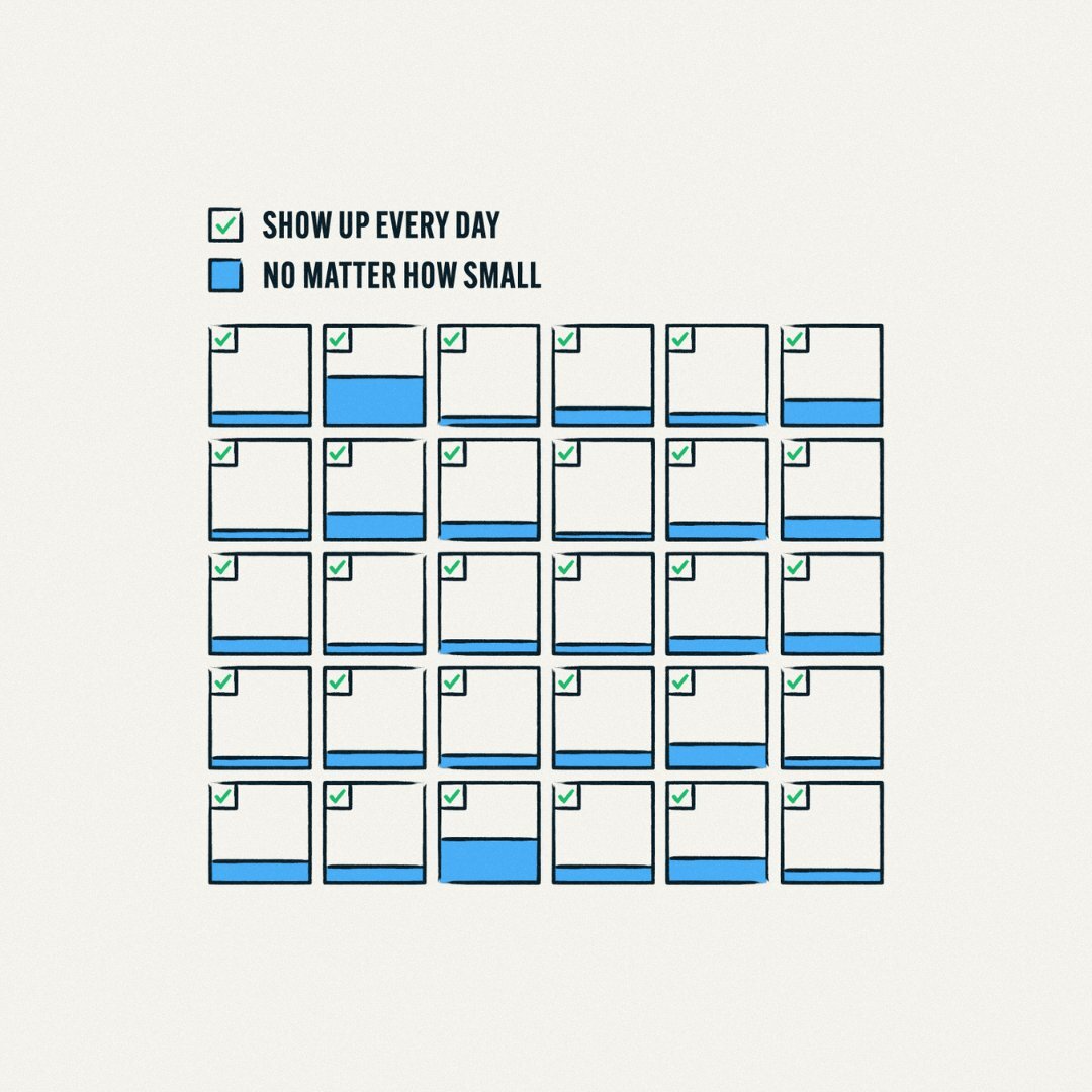
Ship Micro Wins Every Single Day
The image is stupidly simple: a month of little squares, each with a tiny green check and a blue bar...

Turn Ads Into Stories People Join
Most ads scream at people from the sidelines. These billboards dragged people onto the field. A tiny horror film called...

One Bold Line, Then Conversational Long Copy
Oatly’s billboard is a masterclass in modern copy: one huge, shouty line that stops traffic, followed by a wall of...

Stay Awake For Moments Worth Losing Sleep Over
This bus-stop ad doesn’t scream about beans, blends, or bargain prices. Instead, it hits you with a giant handwritten checklist...
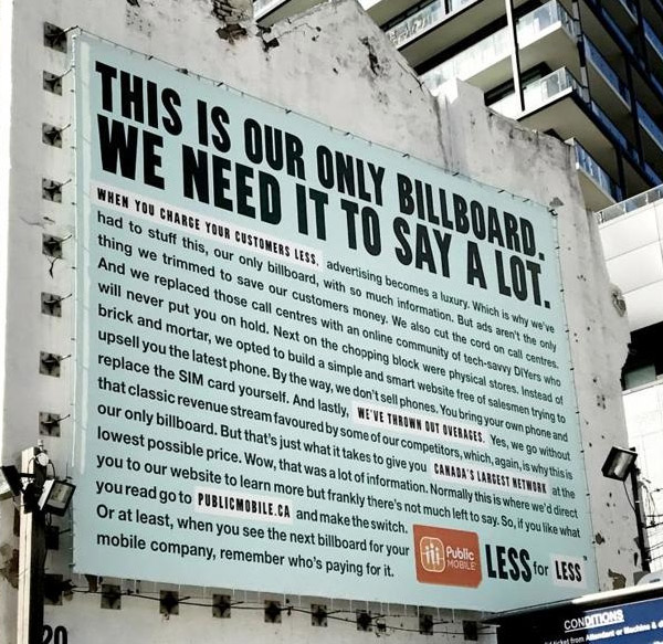
One Honest Billboard That Cuts Costs
Most billboards yell five words and hope you remember a logo. This one from Public Mobile does the opposite: it’s...

Lacoste Ditches Crocodile For Endangered Species
Lacoste did the one thing brands swear they’ll never do: mess with the logo. The iconic crocodile vanished from their...
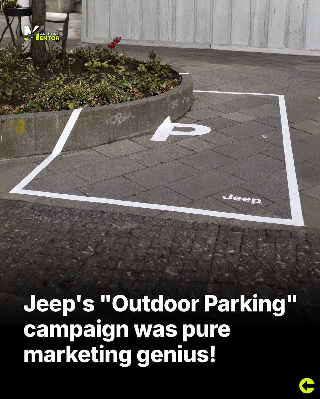
Guerrilla Parking: Jeep's Brilliant Street Stunt
Jeep didn’t buy more billboards. It simply grabbed a roll of white tape and hijacked the city. By turning stairs,...
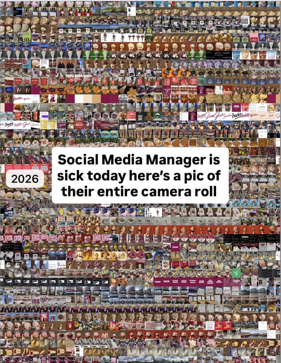
Turn Any Camera Roll Into Daily Content
Open your camera roll and it probably looks like this image: thousands of tiny thumbnails, random food pics, receipts, screenshots,...

Show Price Upfront: Sell More Pools
This ad does something most pool builders are too scared to do: it shows the pool and the price in...