1,836 Images and Illustration Examples That Teach Things
Drawings and illustrations and photography can transmit more information from human-to-human than text can. This board is perfect for designers and marketers seeking visual inspiration.

Gary Vee: Create Content, Build Access, Repeat
Create content, build access, repeat. That’s the entire game. The image from this reel says it all: intense eye contact,...
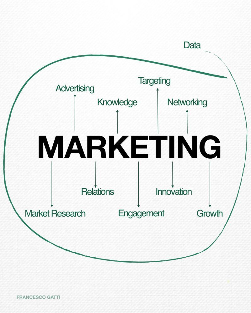
Marketing Mapped: Turn Data Into Growth
This simple diagram nails what most dashboards miss: marketing is not a pile of metrics, it’s a system. Data sits...
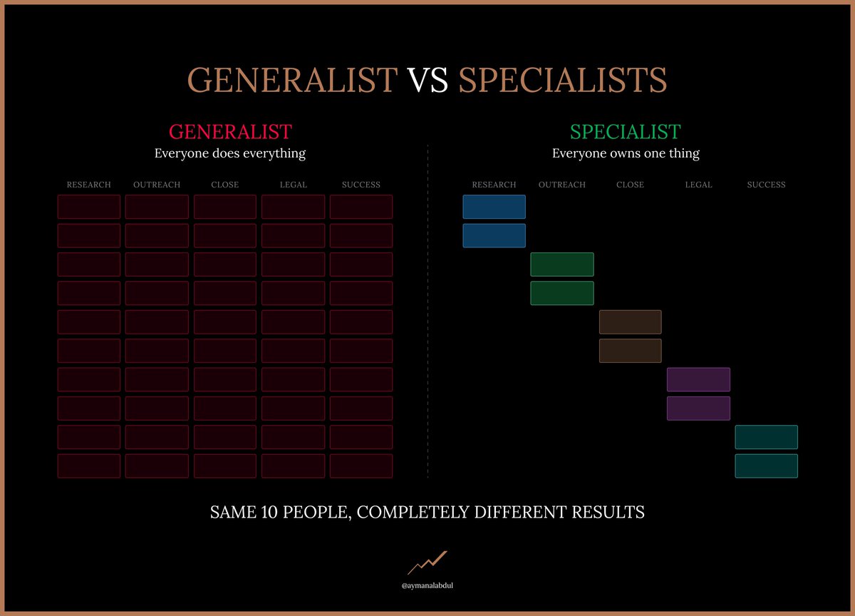
Ditch Mini-Me Hires and Build a Specialist Sales Machine
Most founders accidentally build a fan club, not a sales team. They keep hiring smart, hungry “mini-me” generalists and wonder...
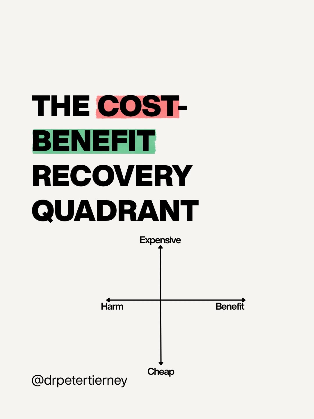
Choose Cheap Recovery Wins Over Fancy Gear
Most people chase recovery like it’s a tech hobby: more gadgets, more subscriptions, more science-y words. But when you look...
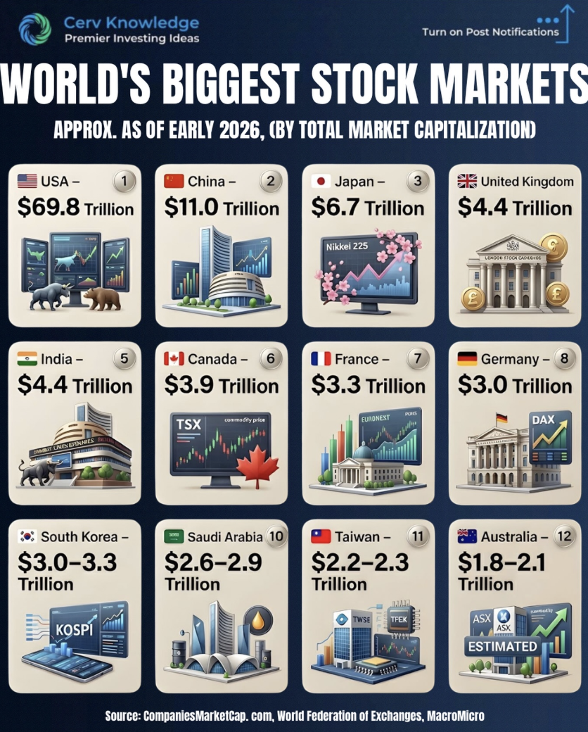
Top 12 Exchanges That Move Global Capital
This visual of the world’s biggest stock markets is basically a map of where global money sleeps at night. In...

Don't Sweat It: Service Your AC Now
If you are eyeing your fridge like it is a personal cooling station, your AC has officially waited too long...

Highest performing before/after ad for a large piano learning company
Play Any Song By Ear In 40 Minutes is the anti-traditional piano method. The image says it all: on the...

Call It Bad, Make People Crave It
Krispy Kreme took the health-police script and flipped it. Their “Doughnuts are bad for you” ad spends a full page...

Real life car advertising for taxes company with QR code Source
This Lamborghini is a rolling sales letter. The message on the door taps into the exact fear every taxpayer has...

Don't Just Consuming. Do Things. Document Everything.
This graphic smacks you with a simple truth: scrolling is not the game. The three bars walk you from passive...

Turn 'It's Leaked' Into Service Leads
The Blanton’s billboard turns a homeowner’s worst text, “It’s leaked,” into a giant, money-making headline. One glance and you instantly...

Learn Less, Execute More, Win Consistently
This sketch nails the whole game of progress in three frames. First, a mess of overlapping squares shows what it...
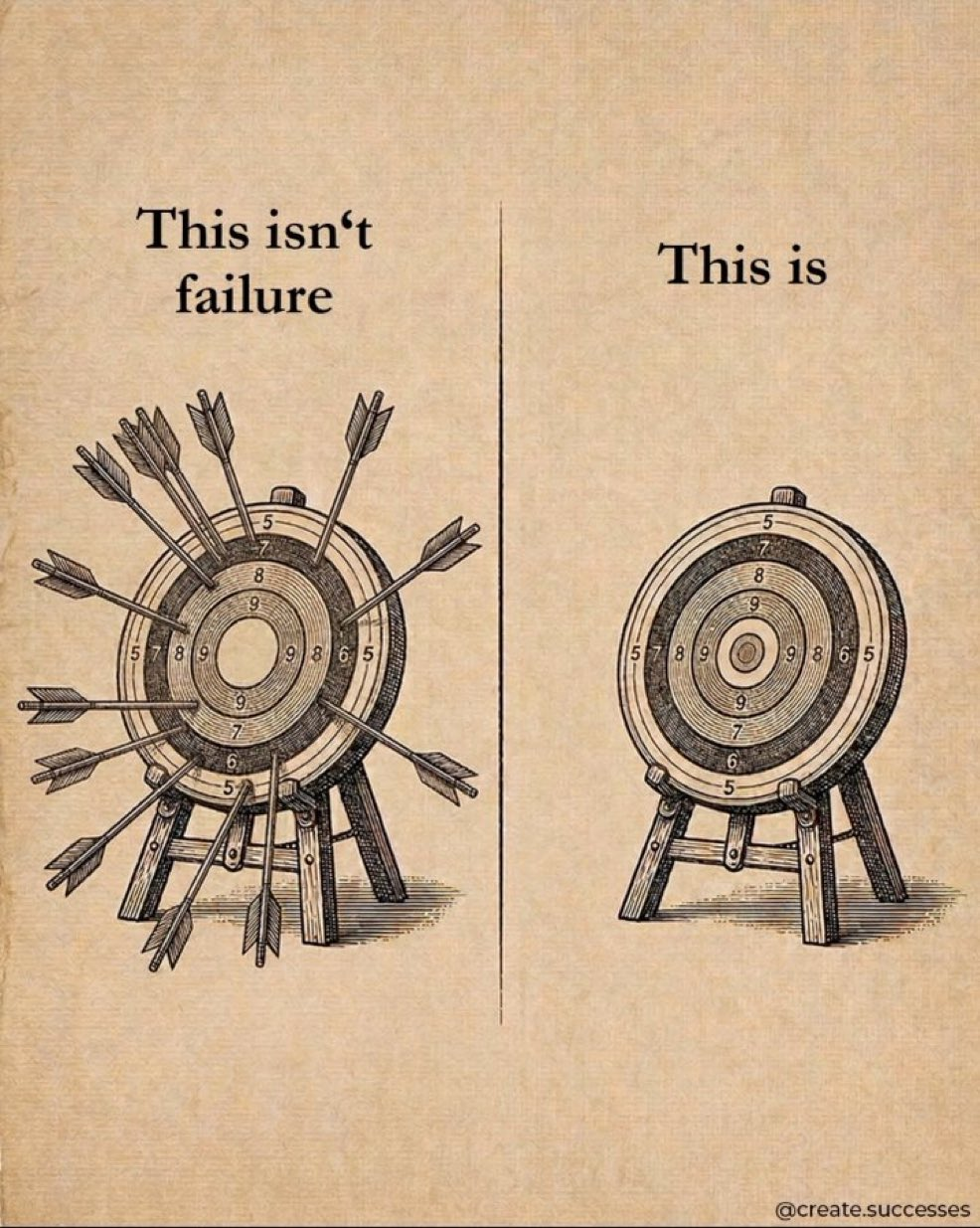
Taking Shots Beats Not Shooting
The image shows two targets: one shredded with arrows, one perfectly clean. The caption flips our usual script: the messy...

Points Transfer Cheat Sheet: Card Partners & Timing
This Points Transfer Cheat Sheet turns that giant, confusing mess of airline partners and transfer times into one clean, scannable...

Beat The Heat In Seconds With 8-Pole Inverter
This Samsung ad doesn’t just talk about cooling power, it shows it in one bold visual. A blazing desert camel...

Donut Calorie Cheat Sheet: Dunkin vs Krispy Kreme
Donuts are tiny circles of joy… and sneaky circles of calories. This cheat sheet lines up Dunkin vs Krispy Kreme...

Make Ads Physically Demonstrate Benefits
Most ads tell you the benefit. This billboard literally bites into it. Instead of saying “strong teeth,” it shows teeth...

Battery That Outlasts Your Sleep
This ad nails the feeling every traveler knows: you conk out long before your headphones do. In one sleepy snapshot,...

Call Your Product A Lemon, Build Trust
The original Volkswagen Lemon ad looks wrong at first glance: plain Beetle photo, giant defect-slur headline, tiny body copy. In...

The 8% Return Illusion Exposed
The image smacks you with the truth: the neat 8 percent line your broker loves is a fairy tale. On...

Exact Nest-Egg Targets for 3%, 4%, 5% Withdrawals
This visual nails the question every future retiree secretly Googles: How big does my nest egg actually need to be?...

5 Reasons to Upgrade Your HVAC Before Winter
This split-screen HVAC photo, half rusted and half brand-new, sells harder than a page of specs. Paired with the line...

Falling Up the Stairs: The Tech Playbook
This carousel is a punch in the gut for perfectionists. One slide at a time, you watch history almost flip:...

Focus On One Project For Real Progress
This chart punches you in the face with a simple truth: the green dot wins. One project gets almost all...