Exploring Contrast: Addiction vs. Happiness in Visual Marketing
Updated on
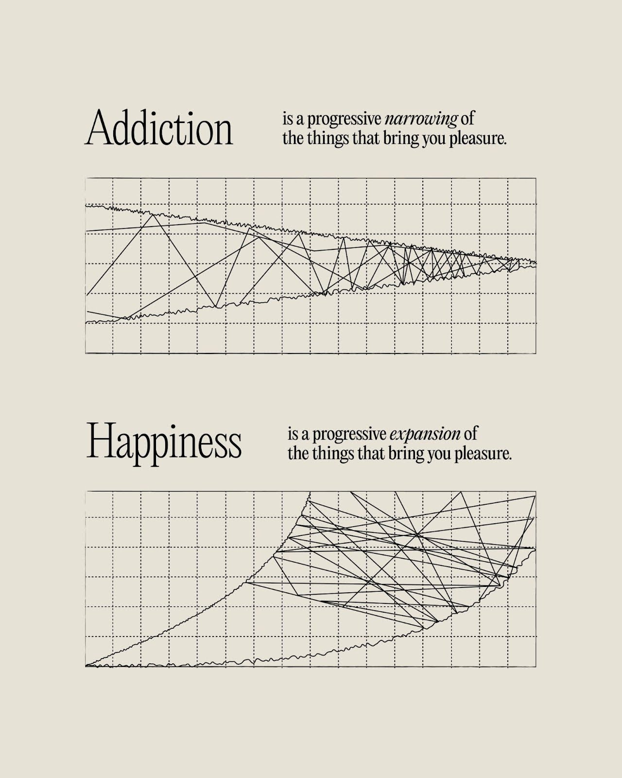
This image nails a key marketing principle: contrast sells. Two simple charts — one for “Addiction” and one for “Happiness” — tell a full emotional story without a single extra word or color. It’s minimalist, clean, and instantly understandable.
Why It Works
- Contrast makes the message pop and creates instant clarity.
- Simplicity focuses attention on the idea, not the design.
- Visual storytelling turns abstract emotion into something you can “see.”
- Memorability comes from doing more with less.
Real-Life Examples
- Apple’s ads: crisp visuals with one bold concept.
- Nike posters: one line, one image, maximum punch.
- Stripe’s homepage: minimal design that highlights one clear benefit.
- Ikea manuals: no words, just pictures — you still get it instantly.
Analyzed by Swipebot
Loading analysis...
.png?width=3840&quality=80)