Design Examples
Examples of great (and bad) design from the interwebs
Most Popular in Design

Curiosity Headlines On Tees That Get Calls
Curiosity headlines don’t have to live on blogs or sales pages. They can walk around the mall on a cotton...
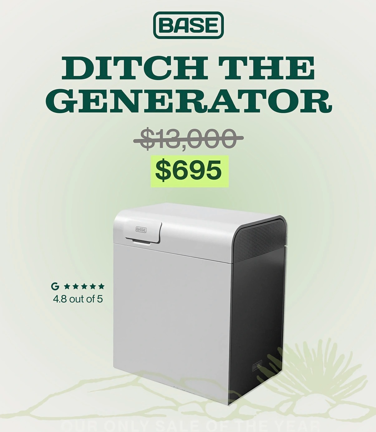
Ditch Your Generator — Backup Power $695
This ad is a masterclass in making backup power feel like a no‑brainer purchase. One clean image, one monster price...
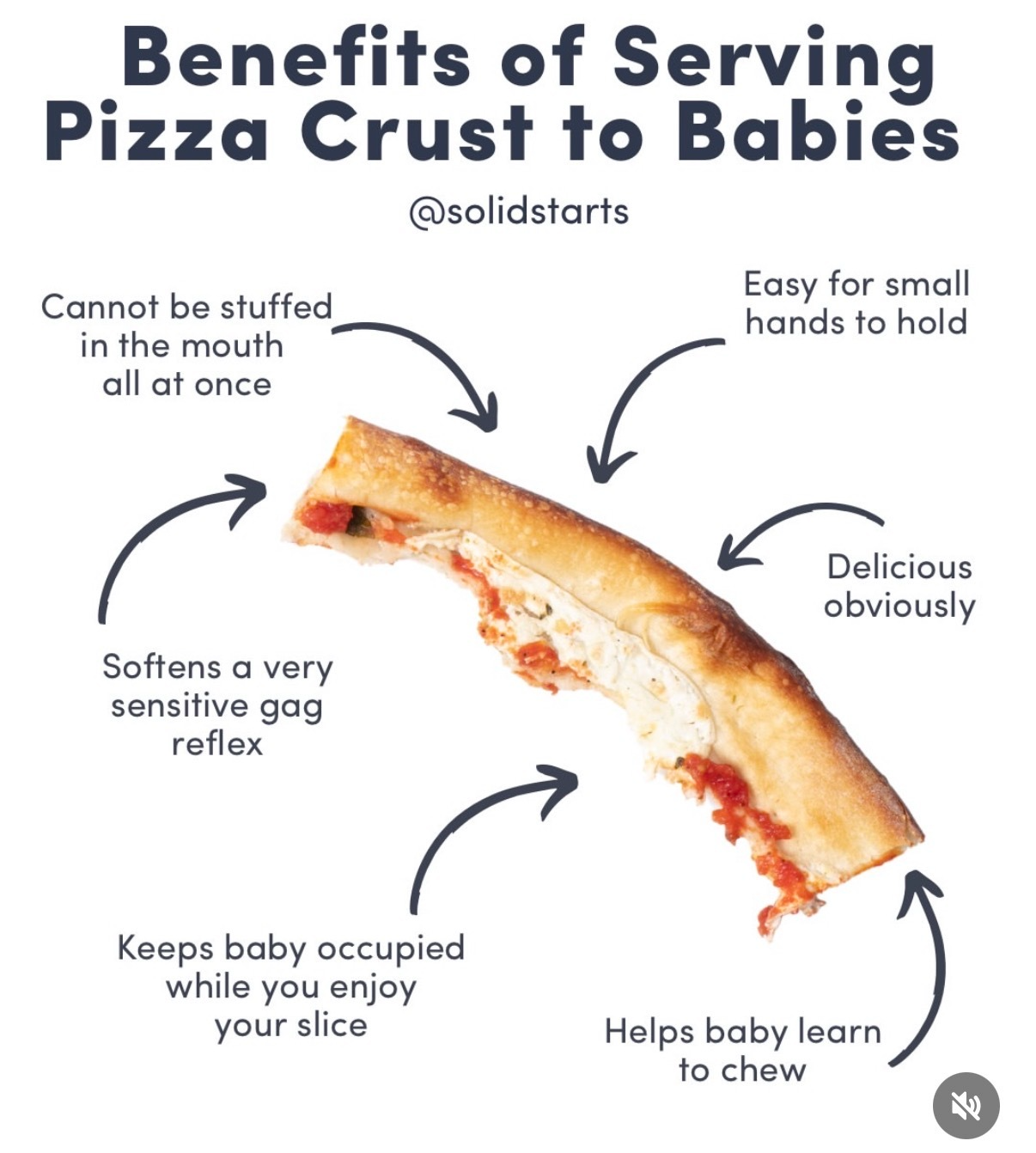
Pizza Crusts: Baby-Friendly Distraction That Sells
If your restaurant serves families, that lonely pizza crust is secretly a sales weapon. The visual from @solidstarts breaks down...
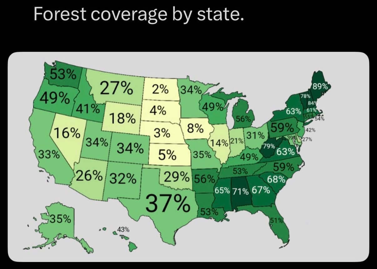
Target Ads by State Forest Coverage
This map of forest coverage by state is a goldmine for smarter geo-targeted ads. The darker the green, the more...
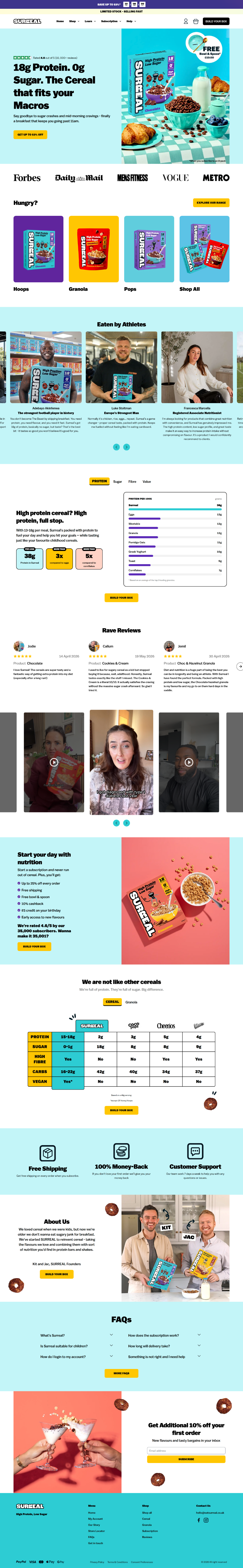
Sell High-Protein, Zero-Sugar Cereal Easily
You don’t sell high‑protein, zero‑sugar cereal by droning on about grams and macros. You sell it by making the page...
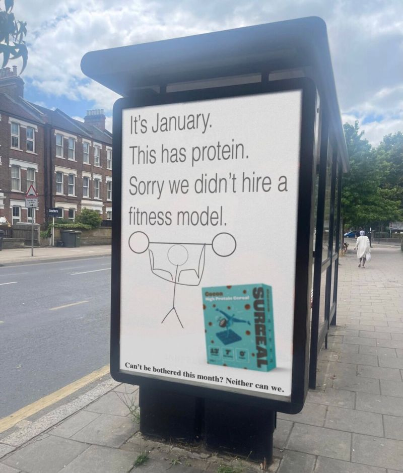
Skip Models: Honest Protein Ad That Works
This bus-stop ad for a high-protein cereal works by doing the exact opposite of every January fitness ad. No abs,...
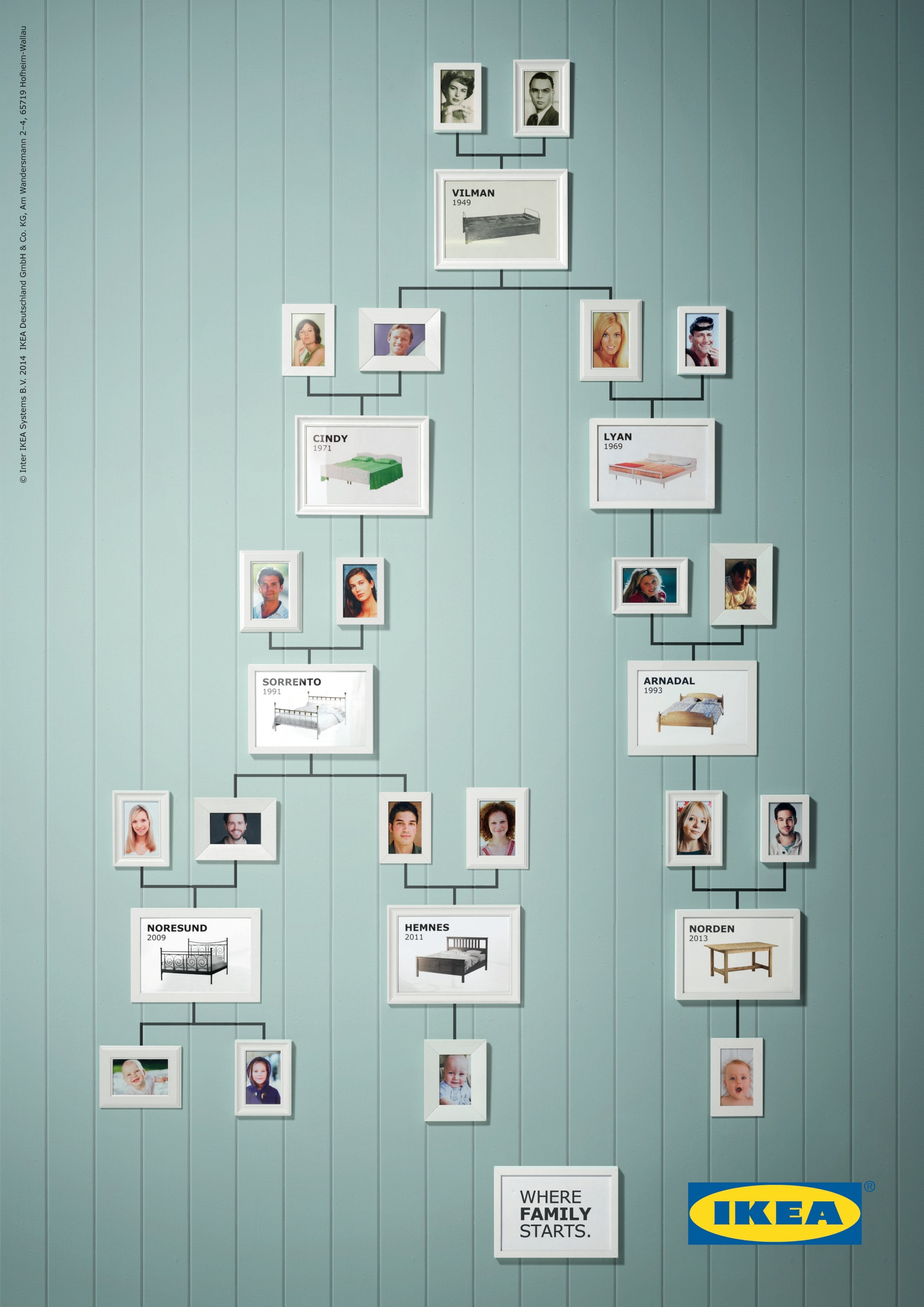
Show Product Lineage As A Family
Instead of a boring “since 1949” timeline, this ad turns IKEA products into a literal family tree. Beds and tables...
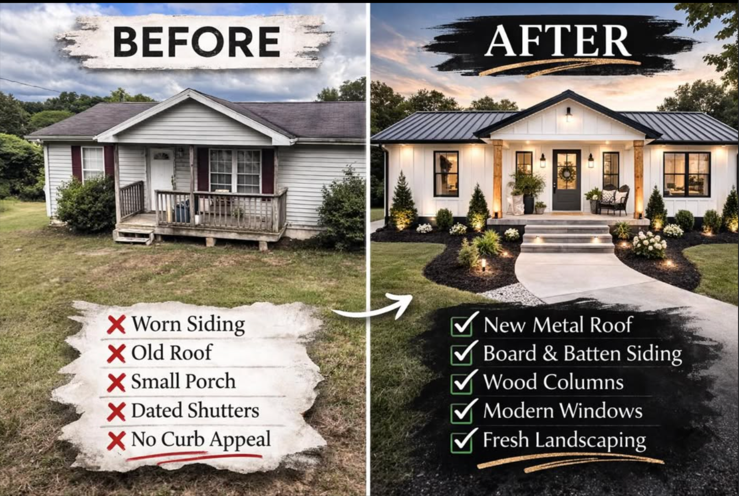
Turn Dated Homes Into High-Value Listings
That split-screen photo says it all: on the left you’ve got a tired, low-value box… on the right, a showpiece...
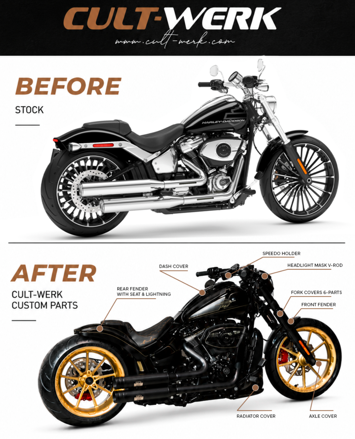
Upgrade Stock Harley: Cult-Werk Custom Parts Makeover
Look at that before-and-after shot. Same Harley, two totally different personalities. The stock bike looks fine… but the Cult-Werk version...
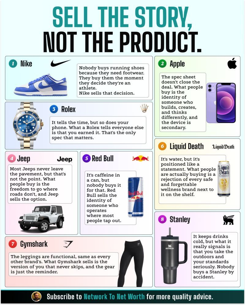
I’ll say it again: Stop selling the product. Start selling the meaning behind it.— Rohan Sheth
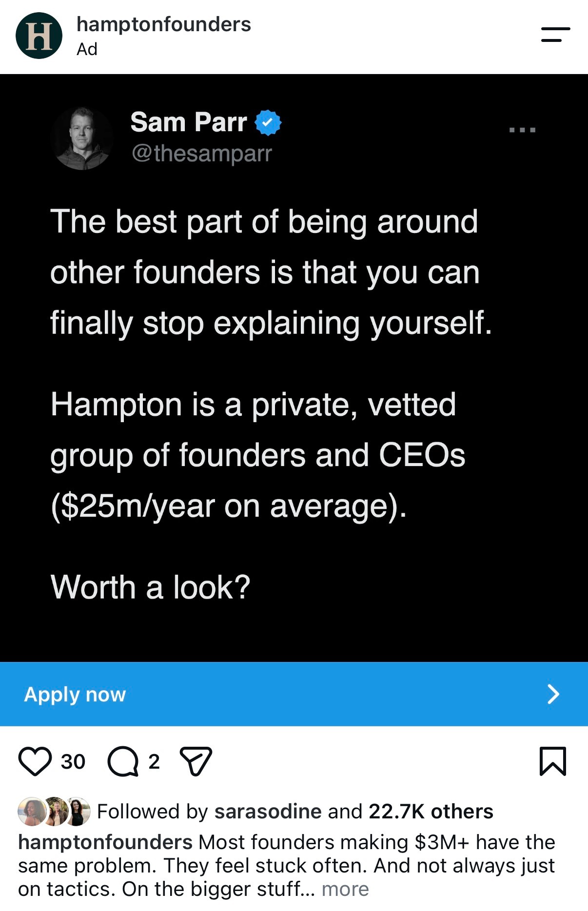
Stop Explaining Yourself: Private Founder Network
This Hampton ad is a masterclass in selling a private founder network without ever saying the word “networking.” Instead of...

Turn Flat Product Photos Into On‑Model Sales
Flat product shots don’t sell outfits, they sell fabric. On‑model images sell a lifestyle, a fit, and a feeling. The...

Create Voiceovers Without a Mic Using Camtasia
You can now crank out pro-sounding voiceovers in Camtasia without touching a microphone. The screenshot above says it all: pick...

AI-Powered Finance Orchestration Built Into Accounts
AI-powered finance orchestration sounds complex, but this hero section makes it feel as simple as opening an email. The visual...

Pocket Pools: Small Affordable Backyard Winners
Forget the giant, six‑figure cement pond. This photo shows the backyard hero most people actually want: a small, circular “pocket...

Give Customers A Head Start, Double Completions
Look at that image: same basic punch card idea, wildly different results. The blank 8-slot card gets a meh 19%...

Stop Sweating: Quiet Hydronic Bed Cooling
Stop wrestling your sheets like a sweaty alligator. This Orion ad shows how quiet hydronic bed cooling turns a brutal...
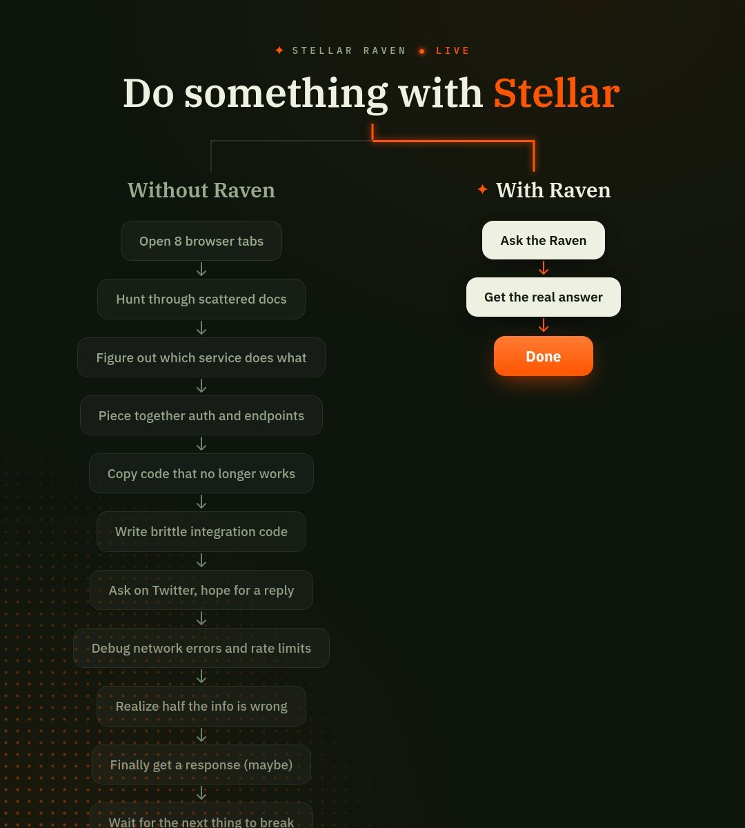
Ship Integrations in Minutes with Raven
Integrations usually feel like death by a thousand browser tabs. The Raven team nailed this pain in one brutal graphic:...
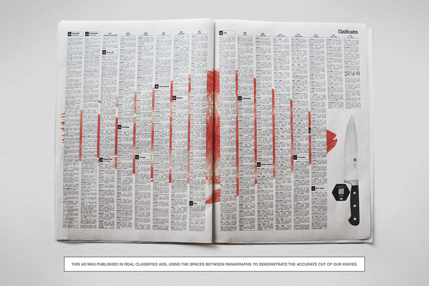
Slice Through Noise With Proof Ads
Most ads *tell* you they’re sharp, fast, or powerful. This one literally slices a newspaper to prove it. “Slice Through...

Sell More Homes With Outdoor Spaces
If you want to sell more homes, stop yelling about square footage and start showing off square patios. This door...
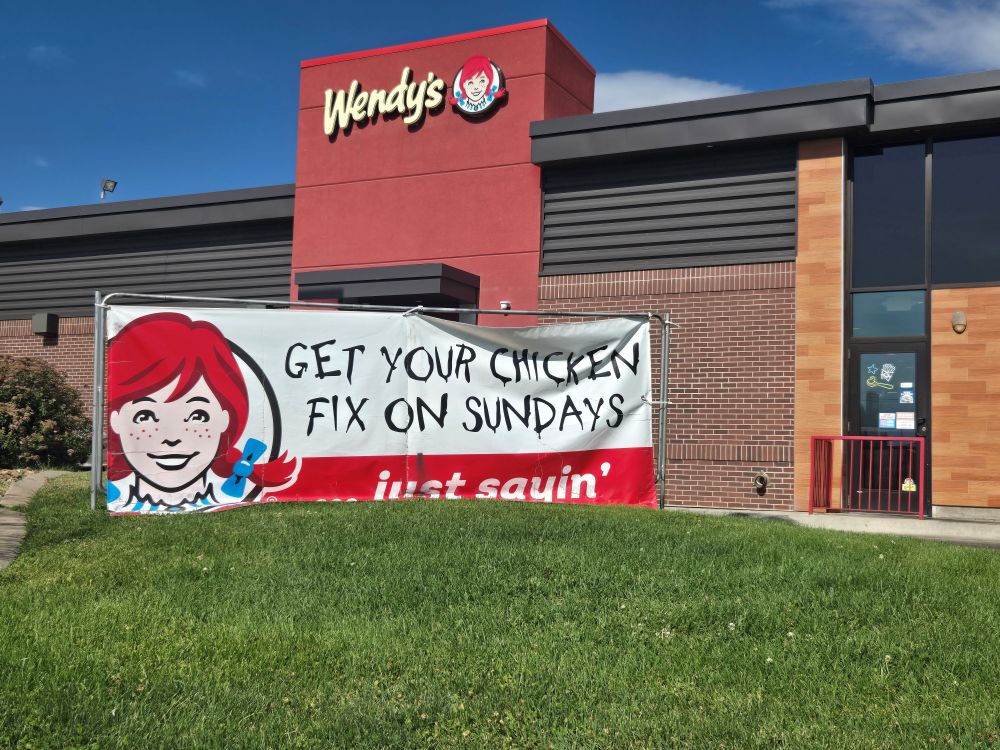
Sunday-Only Chicken: Weekend Scarcity That Works
This Wendy’s banner is a masterclass in judo marketing. Instead of pretending competitors don’t exist, it hijacks their biggest limitation—being...
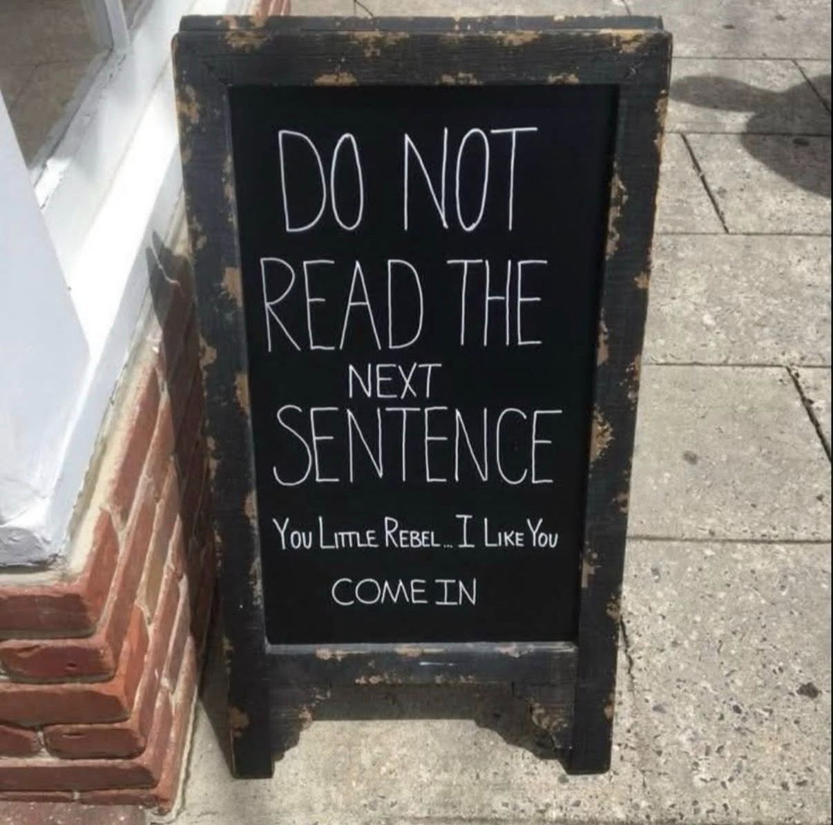
Make Customers Rebel: Signs That Get Them Inside
This sidewalk sign doesn’t brag about lattes, discounts, or Wi‑Fi. It just messes with your brain and makes you feel...
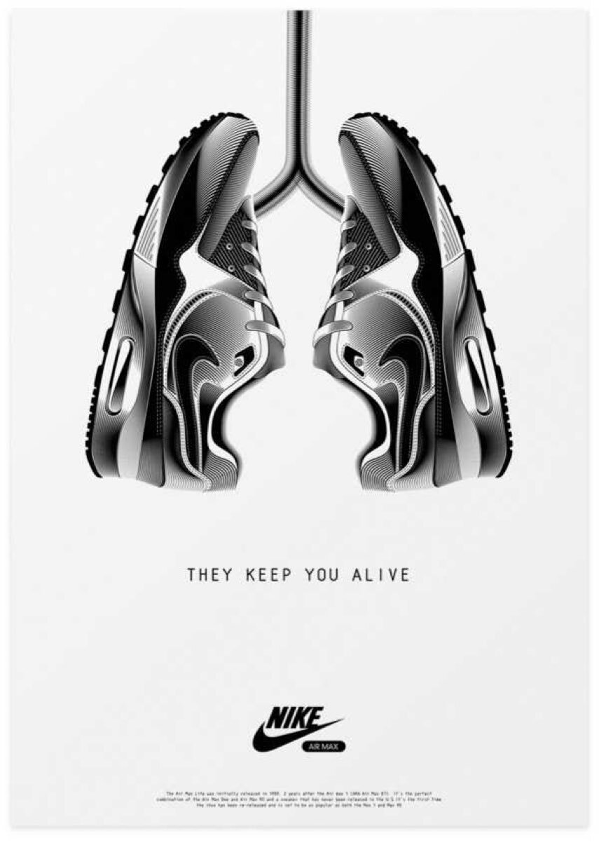
Position Your Product As Essential, Not Optional
Look at this ad: two sneakers posed like lungs, plugged into an invisible body. The line underneath says, “THEY KEEP...
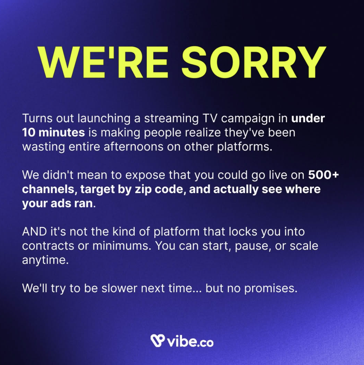
Under 10-Minute Streaming TV Campaigns Revealed
That ad you just saw is a masterclass in selling a “too good to be true” offer without sounding scammy....