How to Create Corporate Advertising That Actually Works
Published on
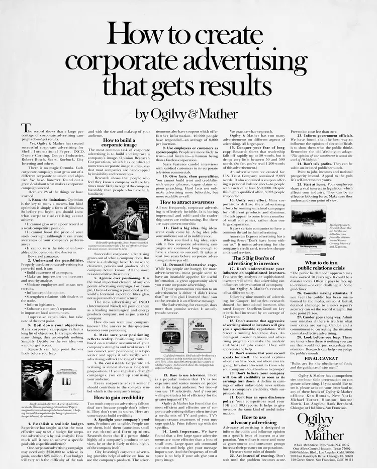
This vintage Ogilvy & Mather ad is a masterclass in how to make corporate advertising feel human. It takes a dry topic—corporate communications—and makes it look like common sense marketing.
Marketing Analysis
The design itself feels credible: a newspaper-style layout packed with useful info, not fluff. It signals authority while teaching the reader how to advertise and proving Ogilvy knows their stuff. The headline promises “results,” not “creativity,” speaking directly to what corporate clients care about most.
Why It Works
Focuses on audience problems, not agency ego
Uses education as a selling tool
Builds credibility with proof and practical tips
Balances authority (layout, tone) with accessibility (plain English)
Creative Variations
“How to write B2B ads that don’t bore your CFO”
“Corporate campaigns that don’t sound corporate”
“The 5 Commandments of Serious Advertising”
Hand-drawn pen style
Classic 1950s print ad
Futuristic style
Funny style
Analyzed by Swipebot
Loading analysis...