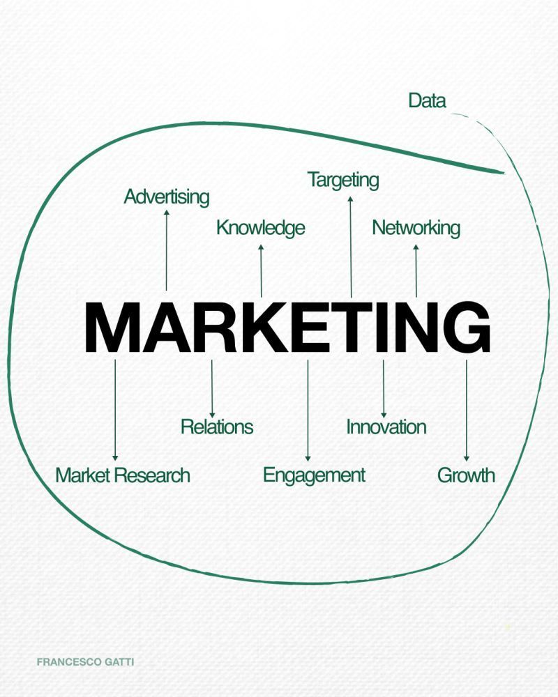
This simple diagram nails what most dashboards miss: marketing is not a pile of metrics, it’s a system. Data sits outside the whole blob, feeding advertising, targeting, networking, and everything in between. When you read it left to right, you can literally see data turn into growth. Let’s walk the map and turn those arrows into a plan you can actually execute.
Reading the Map: From Data to Growth
At the top-right, data flows in and drives targeting, advertising, networking, and knowledge. Those create market research and relationships, which boost engagement. Add innovation on top of that engagement and the right side of the map lights up as growth. If a channel or campaign doesn’t fit somewhere on this diagram, it’s probably a distraction.
How to Use This Diagram in Real Life
- Start every campaign by asking: what data is driving our targeting here?
- Tie each activity (ads, content, outreach) to a box: research, relations, engagement, or innovation.
- Measure only metrics that show movement along the chain toward growth.
- Review the map monthly and circle any step you’re skipping, then design one experiment to fix that gap.
Brands That Treat Marketing Like a Data Map
Airbnb uses guest and host behavior data to sharpen targeting, then turns that into highly tailored engagement emails that directly drive bookings and growth.
Spotify funnels listening data into market research and innovation, powering Discover Weekly and other features that massively increase user engagement.
