My most hated style of design
Updated on
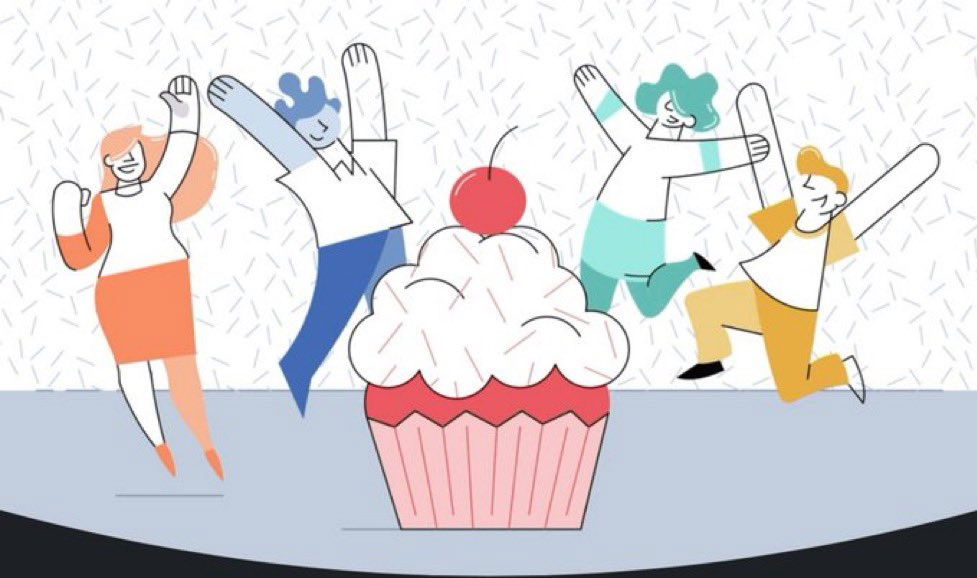
Remember this style? The flat, bubbly illustrations of cartoon humans jumping around random objects. It was on every SaaS homepage, onboarding screen, and app landing page around 2018.
Why This Design Spread Like Confetti
Marketers loved it because:
- It looked modern and “friendly”
- Anyone could drop it into a template and it would “work”
- It felt playful without needing real photography
- It masked generic messaging with visual charm
Why It Flopped
- No emotion or brand differentiation
- Same visuals across hundreds of products
- Bland messaging hidden behind “pretty” design
Better Examples
- Basecamp uses real team photos and blunt copy (“Meetings are toxic”)
- Notion’s design matches its product simplicity
- Apple visuals highlight benefits, not abstract characters
Design should support your story, not distract from it.
Analyzed by Swipebot
Loading analysis...
