Apple's Think Different Brand Playbook
Published on
50 Years of Thinking Different - Apple
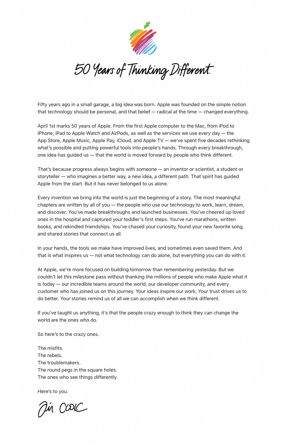
Apple just dropped a 50-year love letter to misfits, wrapped in a single headline and one simple image. You don’t need Apple’s budget to swipe this playbook — you just need their framing. Let’s dissect how one rainbow scribble, one line of copy, and a short letter sell an entire belief system… and how you can steal it for your brand.
Start With One Iconic Visual
The page leads with a loose, hand-drawn rainbow Apple mark floating on a white background. No gradients, no product glamour shots, no interface mockups. This instantly says: “We’re about ideas, not hardware.” The sketchy feel makes a trillion‑dollar company look human and creative, like the logo was just drawn on a napkin in that original garage. For your brand, pick one visual symbol and strip everything else away so the meaning, not the pixels, does the talking.
Then Hit Them With a Rallying Cry
Under the logo: “50 Years of Thinking Different.” Not “50 Years of Innovation” or “50 Years of Products.” It’s a banner for a tribe. The calligraphy-style script looks personal and celebratory, like a signature on a poster for the people who ‘get it.’ Your headline should read like a movement slogan people would proudly wear on a shirt — short, specific to your belief, and focused on how your people see the world, not what you sell.
How Apple’s Letter Turns Fans Into Heroes
- Opens with origin story in a garage, but quickly shifts the spotlight from company to customer.
- Repeats the belief: the world is moved forward by people who think different, not by products.
- Paints vivid user scenes — toddlers’ first steps, marathons, new favorite songs — to prove impact.
- Explicitly thanks teams, developers, and customers, making them co-creators of the last 50 years.
- Closes by saluting “the misfits, the rebels, the troublemakers,” turning outsiders into the main characters.
How You Can Steal This Playbook
Basecamp could feature a single hand-sketched mountain icon with the headline “20 Years of Working Different,” followed by a letter about customers who chose calm companies over chaos.
Notion could show a rough doodle of its N logo and lead with “Building Different Brains Together,” then spotlight how users wrote novels, launched startups, and ran classrooms inside one workspace.
Patagonia could use a single line-art mountain and the headline “50 Years of Wearing Your Values,” then write a customer-centric letter about the hikers, activists, and families who protect wild places.
Analyzed by Swipebot
Loading analysis...