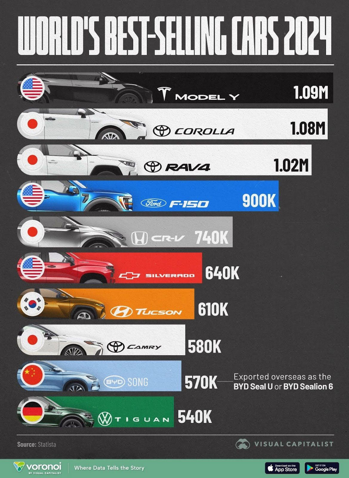
This chart from Visual Capitalist nails it. It shows the world’s best-selling cars of 2024, but what really stands out is how it presents the data. It’s not just a bar graph—it’s a mini info-nugget packed with meaning.
Why it works
- Combines image, logo, numbers, and flag for instant recognition
- Uses color to separate brands and guide the eye
- No fluff—just the essentials visualized
- Great hierarchy: model, brand, country, sales, all visible in one glance
Real-world parallels
- Apple’s product comparison charts use photos + specs to tell a complete story fast
- Spotify Wrapped compresses tons of listening data into simple, visual highlights
- McDonald’s global menu posters show flags, items, and prices side-by-side for clarity
This is what great design for data looks like—visuals that make thinking optional.
Analyzed by Swipebot
Loading analysis...
