This Vintage Advertising Layout Still Teaches Modern Marketers a Lesson
Published on
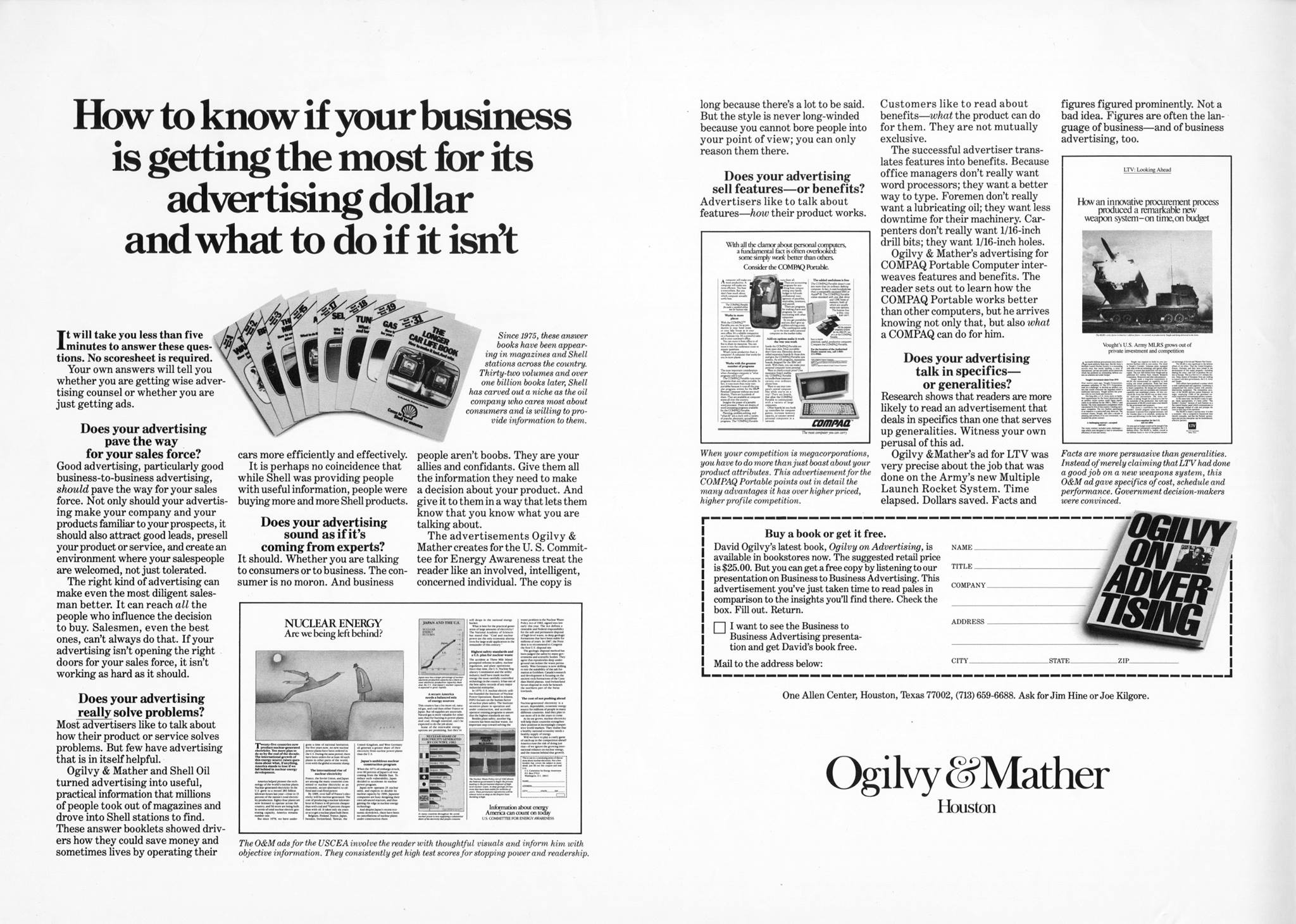
This black-and-white vintage ad layout might look dated, but it’s a masterclass in strategic copywriting. It’s filled with dense text, bold headers, and a deliberate structure—which was the hallmark of trust-building in print ads before the digital era. The design forces readers to slow down and actually read, not just skim. That’s something modern marketers could use more of.
What Makes It Work
- Long-form copy builds authority and trust by answering objections upfront.
- Strong headlines create curiosity that pulls the reader into the details.
- Consistent visual hierarchy keeps readers oriented, even in text-heavy design.
- Every inch of space is used strategically—no fluff, just persuasion.
Who's Still Applying These Principles Today
Basecamp uses long-form, thoughtful landing pages to explain their unique approach to project management.
Mailchimp relies on simple hierarchy and direct language to make complex marketing automation accessible.
Creative Variations
Analyzed by Swipebot
Loading analysis...
