This visual of the world’s biggest stock markets is basically a map of where global money sleeps at night. In one glance you see who actually moves the needle when markets twitch. Use this as your cheat sheet for which exchanges matter, and which headlines you can safely ignore.
What This Chart Really Shows
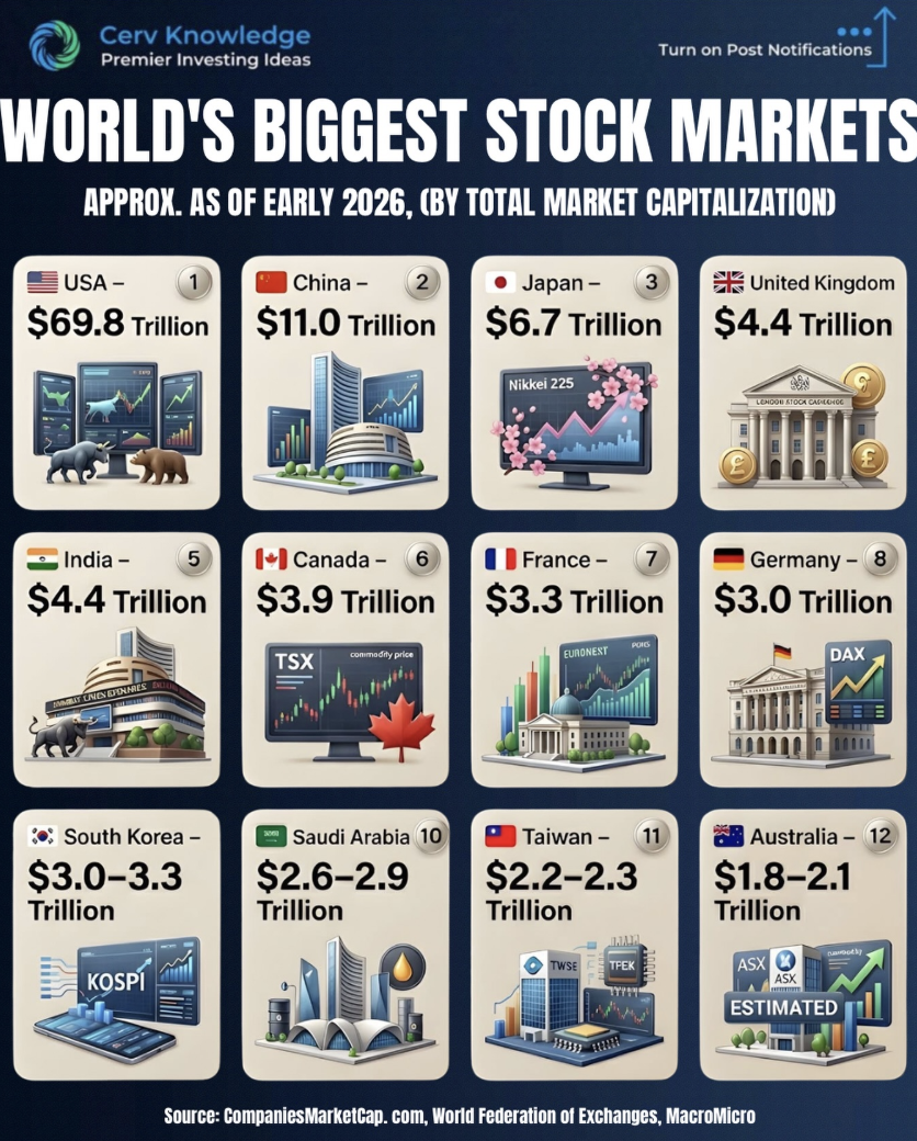
- The US absolutely dominates, with about $69.8T in market cap dwarfing everyone else.
- China, Japan, and the UK form the next power tier, each anchoring regional capital flows.
- India’s rise to a $4.4T market signals why every global fund now needs India exposure.
- Canada through Australia (ranks 6–12) are not niche; they are trillion‑dollar liquidity pools.
- Taiwan and South Korea show how technology hubs can punch far above their population size.
How Investors Use These 12 Markets
BlackRock builds core global portfolios around the US, China, Japan, and UK exchanges, then sprinkles in exposure to the remaining markets for diversification and factor tilts.
Vanguard packages these top exchanges into simple world-index ETFs so retail investors quietly hold slices of all 12 markets without thinking about individual exchanges.
Creative Variations
Analyzed by Swipebot
Loading analysis...
