When a Glitch Becomes Genius
Published on
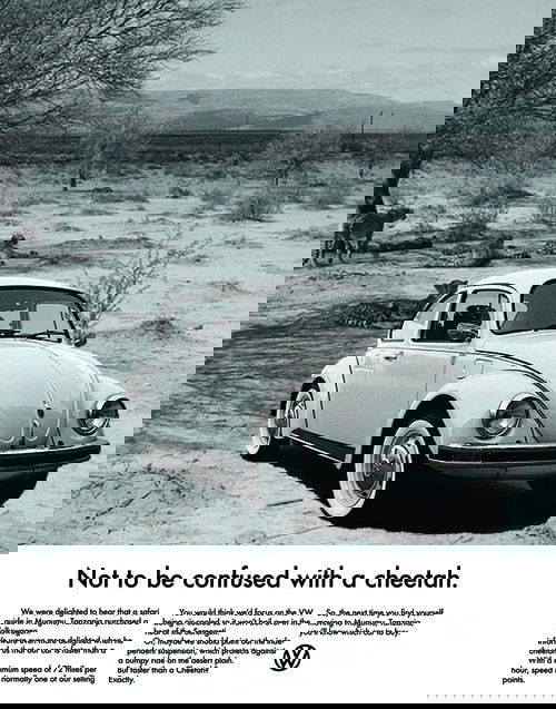
This image looks like a tech error—but it’s actually a brilliant ad for Volkswagen. The "glitch" immediately grabs attention because it breaks the norm. You stop scrolling because your brain says, “Wait, what’s going on here?”
Why It Works
Pattern interrupt: The distorted image stops you mid-scroll. An ad that looks “broken” stands out in a sea of perfection.
Curiosity gap: You’re forced to look closer just to figure out what’s happening.
Brand alignment: VW has long used self-aware, clever ideas that match their “think smart” identity.
Visual storytelling: The ad instantly communicates contrast—precision vs. imperfection.
Real Examples
Apple’s “Shot on iPhone” ads highlight imperfections that make real-life photos relatable.
Spotify Wrapped surprises users with seemingly chaotic, data-heavy graphics that tell a personal story.
Glitch-style designs in Nike and Adidas campaigns make static images feel alive.
Creative Variations
Show how this “glitch aesthetic” could work across different products or industries.
Hand-drawn pen style
Classic 1950s print ad
Futuristic style
Funny style
Annotated sketchbook style
Eye-tracking heatmap
Analyzed by Swipebot
Loading analysis...
.png?width=3840&quality=80)