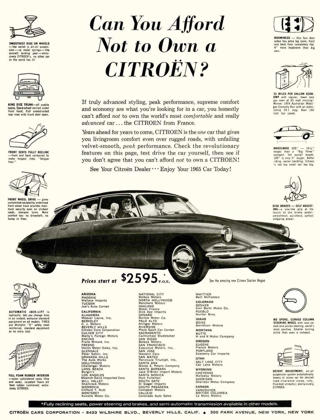
Can you afford to own a Citroen (1960) Ad
This old-school Citroën ad is a masterclass in packing features and benefits into one simple page. It’s busy, but somehow...

Brand Names Foundation "Competition" Ad
Back in 1966, if you wanted a marketing list, you didn’t set up a form—you asked people to write in...

Hughes ComSat Satellite Broadcast Ad 1965
In 1965, Hughes ran this ad announcing “Early Bird,” the first commercial communications satellite. The copy turned a technical engineering...

Poison Gas Sniff Kit
Imagine advertising a “Sniff Kit” that helps civilians identify deadly war gases. Wild, right? Yet in 1942, this ad sold...

Newsletter growth profit calculator
Beehiiv doesn’t just tell creators they can make more money. It shows them. Their profit calculator lets you punch in...

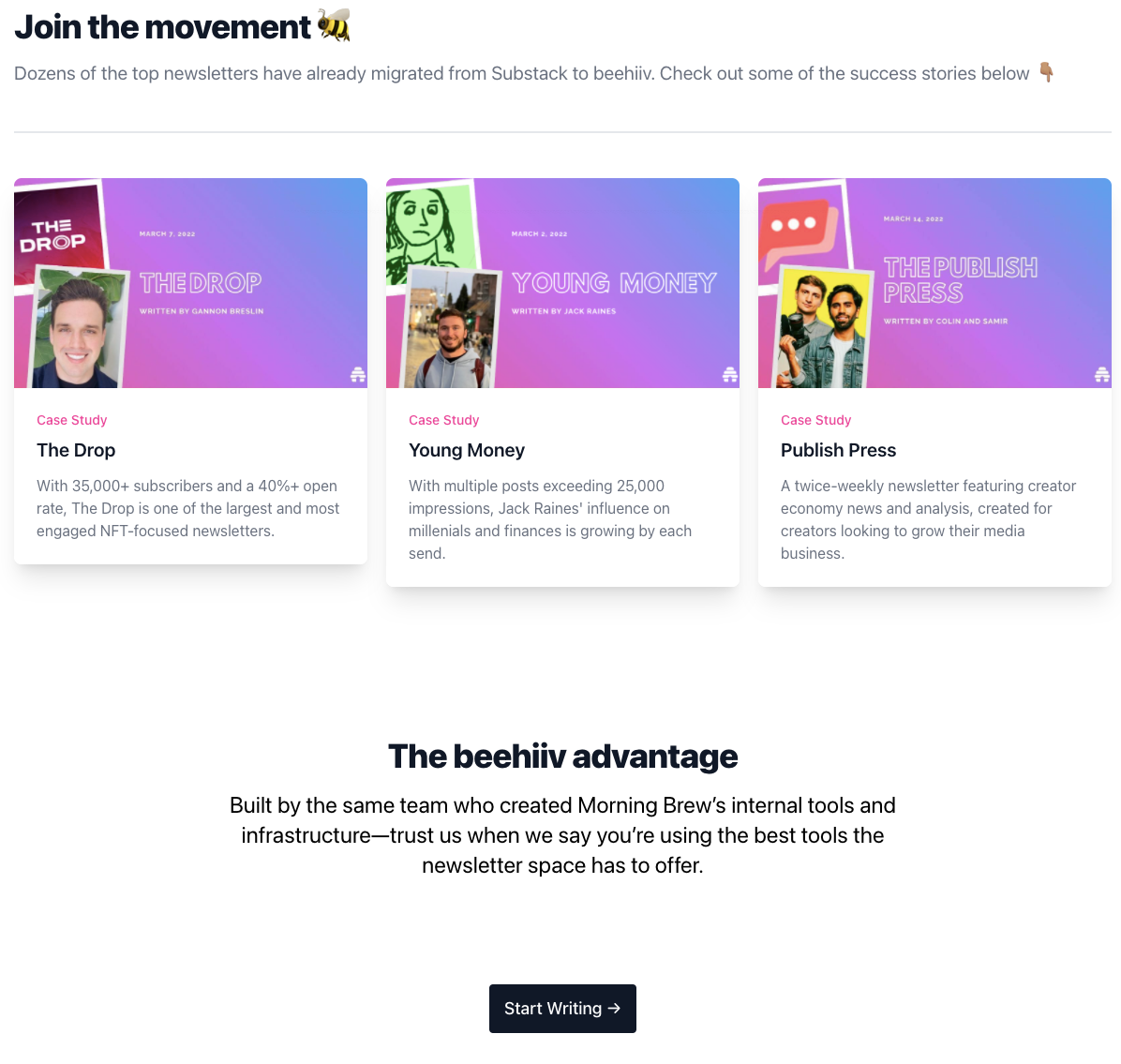
Social proof copy on newsletter host beehiiv website
Beehiiv’s landing page to convert Substack users is a masterclass in credibility marketing. It doesn’t scream, it shows—with real creators,...

Great homepage images that explain the service
Pollinate’s homepage nails the balance between clarity, proof, and motivation. Right away, you know what it does and why it...

Draftkings sports betting homepage offers up to $500 to new subs
DraftKings hits you with a $500 deposit bonus right at the top. No fluff, no confusion, just straight-up incentive to...

Book a call landing page for consultant with great copy
Ever booked a call and wondered, “How long will this take?” Exactly. Growth Sprints kills that doubt before it starts....

Artist hand written product description for bag
Tom Sachs turns a simple product page into an art piece. He handwrites every description in his signature style, making...

Artist e-com store forces sign up + quiz in order to make a purchase
Tom Sachs doesn’t just sell art. He makes you earn it. To buy something from his store, you must take...

Raise discounted gift card marketplace home page
Raise.com nails user intent right away. Instead of pushing a “Sign Up” or “Shop Now” button, they make the search...

Referral program shows great social proof
Raise nails its referral page by doing one simple thing most brands skip: showing real people with real savings. Suddenly,...

Vintage Nissan Dotson print ad
This Datsun ad nails a classic marketing move: sell the value pile-on. The headline says it all — “Almost everything...

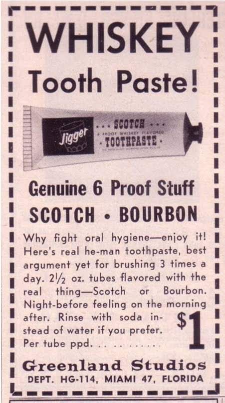
Novelty toothpaste vintage ad
This vintage ad is pure marketing gold. “Best argument yet for brushing 3 times a day.” Brilliant. It takes something...

Great copywriting for Footaction rewards program sales page
Foot Locker’s FLX launch nails one of the best questions in marketing: What’s in it for you? They lead with...

Domino's pizza rewards program landing page
Most loyalty programs confuse people with complicated tiers and fine print. Domino’s flips that by keeping it ridiculously simple: earn...

Vintage Spam ad
This old-school SPAM ad is a perfect example of visual persuasion. Instead of just saying “SPAM is versatile,” it shows...

Social proof could be improved for this agency
These charts tell a great growth story. Impressive traffic climbs, clear data visualization, and tight summaries. But there’s one big...

Refer a friend program lets users earn $5 credits
Refer-a-friend programs can be marketing rocket fuel when done right. This one from a gift card marketplace nails it by...

This copy speaks to a specific customer
Most websites shout about their features. CardCash flips that. They start by asking, “Does this sound like you?” and instantly...

Great headline and limited options for marketplace user
The moment you land here, the message smacks you: “Turn gift cards into discounts.” Boom. Clear, valuable, instant understanding. No...

Homepage for used gift card marketplace shows off features
CardCash nails the “show, don’t tell” rule on their homepage. The second you land, you see real brands, real discounts,...

Landing page image that shows feature benefits
This signup page for Capital One Shopping’s Price Protection is a masterclass in visual communication. Instead of paragraphs of text,...