
Above the fold homepage has all the elements for conversion
This Unbounce homepage nails the first few seconds of a visitor’s attention span. Every element screams clarity, confidence, and conversion....

J.C. Penny 1981 "Fox" Ad
JC Penney didn’t just make a cheaper polo. They made a wink-and-nod version of the Lacoste shirt — same vibe,...

Rolls Royce Ad
This vintage Rolls-Royce ad doesn’t shout features or performance. It whispers class. The car isn’t the focus — the lifestyle...

Pricing for unbounce landing page builder
This pricing page nails the SaaS trifecta: clarity, comparison, and conversion. Each tier has a catchy name, a clear customer...

Clear headline and great above the fold graphics
Unbounce nails the landing page formula with a clean headline, simple layout, and a touch of personality—a smiling customer GIF....

Vintage camera ad
Most people didn’t believe a camera this small could take good pictures. Kodak’s copywriters didn’t dodge that doubt—they hit it...

Dedicated page of use cases for wp theme builder
Most software sites focus on features. Thrive Suite focused on who those features help. Their “Use Cases” page breaks down...

IG ad disguised as user generated meme post
Ever think you need a pro designer for your ad? Hopper proves you don’t. Their Instagram ad was literally a...
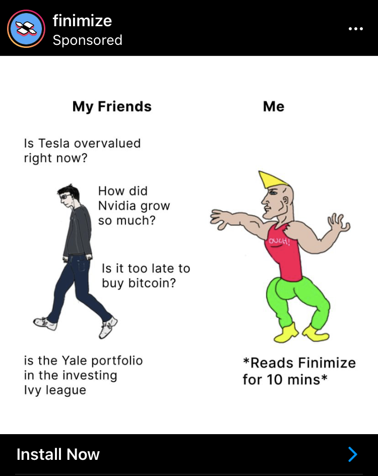
Before and after IG ad for financial newsletter
Finimize nails a classic visual formula: confused newbie vs. confident pro. But instead of using a fancy design, they use...

IG ad for newsletter shows value
Finimize nails this ad. It promises massive value (8 hours of research) for a tiny time cost (10 minutes). That’s...

Webpage dedicated to testimonials
FeedLetter nailed the testimonial game. Instead of just dumping quotes on a page, they built a visual “Wall of Love”...

Homepage that shows stats as social proof
This landing page nails clarity, trust, and action all at once. It’s a masterclass in how to hook visitors in...

Range Rover ad with a clever price call out headline
Sometimes the best ad is the simplest one. This old-school Range Rover ad nails it by showing the product, the...

Twitter ad for hooper disguised as a tweet
This Hopper ad looks like a normal tweet. No fancy graphics. No brand lingo. Just a relatable story about a...

Interactive pricing chart for Saas with CTA
Monograph nails the pricing page game. Instead of showing static prices, it asks how many people are in your firm...

Vintage Omega Ad displays social proof
Omega’s ad is marketing gold. It takes a $235 watch and makes it feel like a piece of NASA history....

Make ads like Ogilvy - Cheat Sheet
David Ogilvy didn’t just make ads—he made blueprints for persuasion. His famous layout formula was based on how people naturally...

Creatively designed sales page for art prints
Hi-Jack’s site looks like a busted storefront on a backstreet in L.A.—but that’s exactly the point. It feels raw, textured,...

Glass Guru Car Advertising Headline
Ever been stuck in traffic and read a clever ad on a van? The Glass Guru nails this with their...

Gearlight Amazon Return Warranty Card
Ever had a product that flopped, but the company made it right instantly? GearLight’s little card tucked inside Amazon packages...

Vintage Porsche ad pokes fun of the competition
Everyone dreams of owning a sports car one day. Porsche’s ad taps right into that boyhood fantasy and calls you...
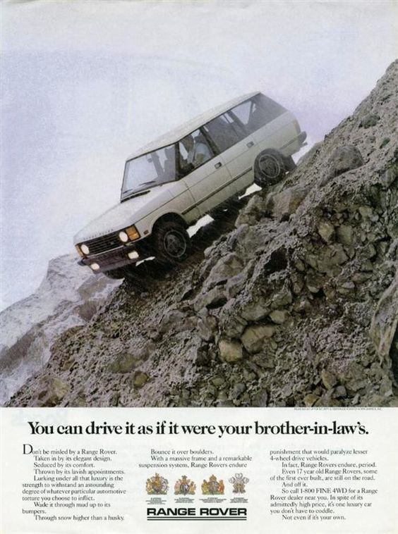
Vintage Range Rover ad with amazing headline
Range Rover nailed this one. The visual? A car practically hanging off a cliff. The headline? A wink to human...

Pop up contest to win different different discounts
This simple wheel from PacSun is genius. It taps into a universal thrill: chance. Everyone loves winning something, even if...

We don't talk enough about the power of a smiling face
This homepage nails it. Bold text, simple message, and a smiling face that makes you feel good about clicking that...