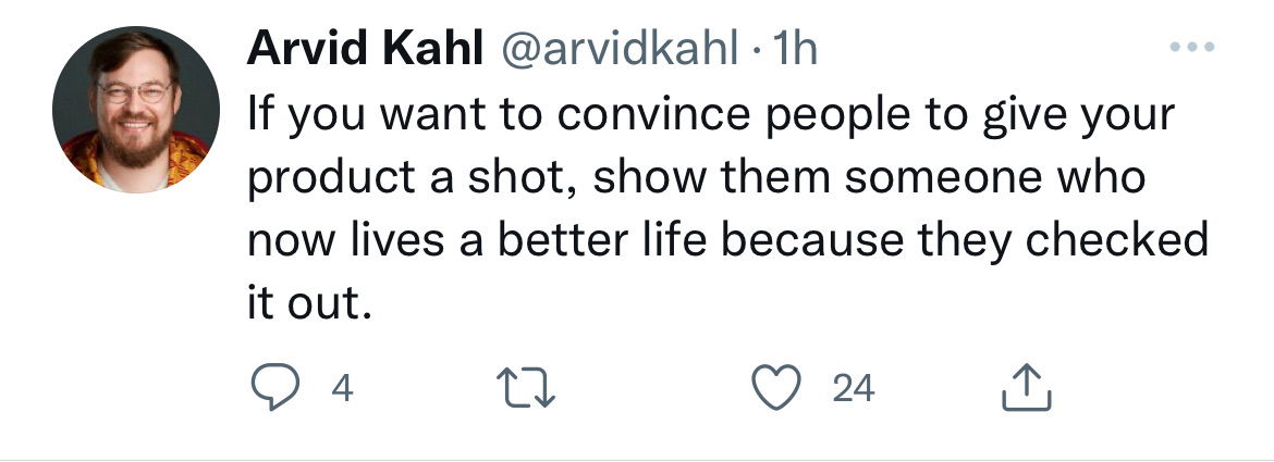
Show your product working for others
Arvid Kahl nails it here: if you want people to buy, don’t just tell them your product works—show them someone’s...

Steve Wonder Atari Ad
In 1977, Atari dropped an ad featuring Stevie Wonder joking, “If I could play video games, you bet it would...

"Creativity is the Enemy" Nike Headline
This NikeCraft ad flips what you expect from a brand known for innovation. The giant headline makes you stop and...

Hypefury low engagement support email
Ever signed up for a tool, never used it, and got a friendly “Hey, what’s up?” email? That’s exactly what...

Count to 12 on hands image
Ever think you can only count to five on one hand? Turns out, some people count to twelve. They use...
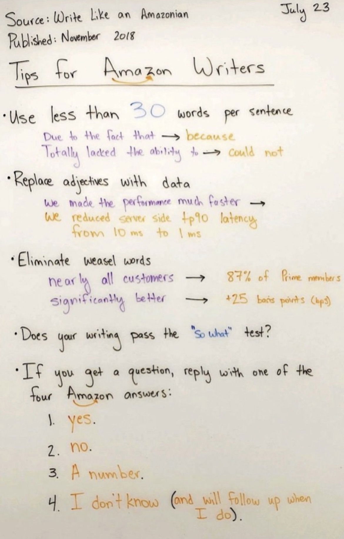
Amazon's internal writing advice
Amazon trains their writers like Navy SEALs of clarity. No fluff, no “maybe,” no filler words. Every sentence must earn...

Words to use instead of "very"
This quick chart shows how one word swap can make your writing 10x stronger. Instead of saying “very noisy,” say...
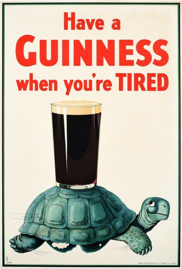
Guinness Happy Turtle
In 1936, Guinness turned a tired turtle into an icon. The ad simply says: “Have a Guinness when you’re tired.”...

Yamaha "Pass the Gas Pump" Headline
In 1980, gas prices were a national obsession. Yamaha didn’t fight the conversation—they joined it. Their ad showed three fuel‑efficient...

The Learning Pit
You know that moment when you’re learning something new and feel like your brain has turned to mush? That’s the...

Increase the price for status symbol
This cartoon nails a weird truth about marketing: sometimes higher prices make a product more desirable. The buyer even sees...

Earth Rides: Like Uber but with Teslas
Ever seen a headline this clear? Earth Rides’ car ad says: “Like Uber but with Teslas.” That’s it. Six words...

Optimize your Instagram profile mockup
Most people overthink their Instagram bios. But this one image breaks it down beautifully — every piece of the profile...

California avocados, a "sensuous" food
This vintage ad makes avocados sound downright seductive. Instead of talking about health or freshness, it leans into the feeling...

Human anatomy in form of subway map
This visual is genius. It takes one of the most complex systems on Earth — the human body — and...

Baseball Guide to Ball Park Franks Ad
This ad nails the “speak your audience’s language” rule. Ball Park Franks turned baseball jargon into a visual joke book,...

Full for 20 min -vs- Full for 2 hours
This image nails what great marketing does: tells a complex story in seconds. One banana, two timelines, and boom—you instantly...

Kraft ad gives helpful suggestions
This 1962 Kraft ad didn’t just push cheese—it gave parents sandwich ideas for their kids’ lunches. That’s clever marketing: teaching...

Vitalis Vintage Hair Workout Ad
Maurice Richard wasn’t just a hockey legend—he had “winning” hair, too. Vitalis used his fame in this vintage ad to...
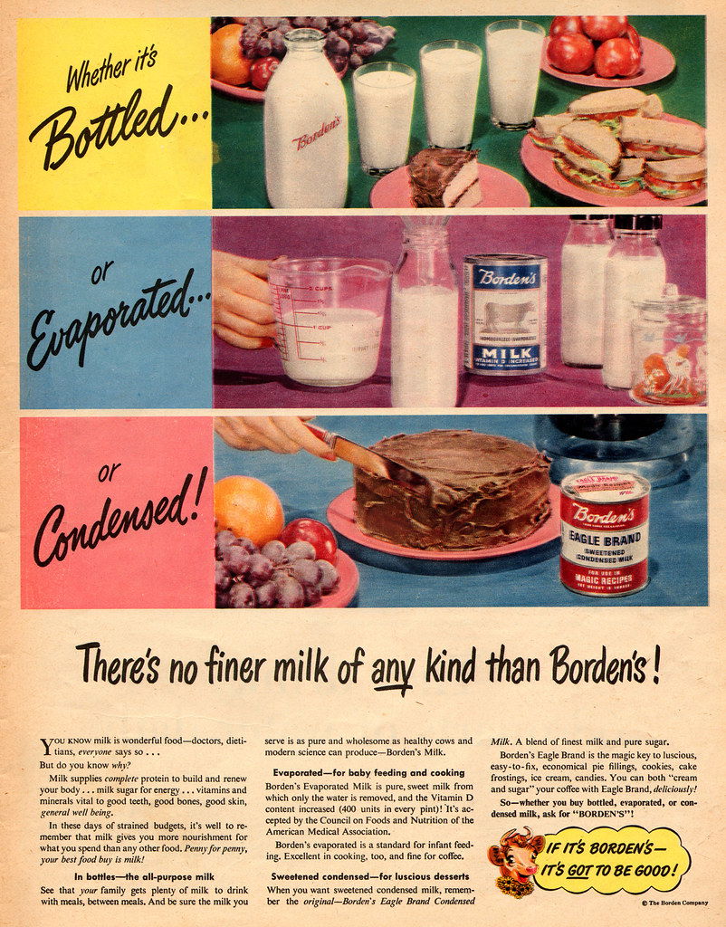
Vintage Borden's Milk Brand Ad
This vintage Borden’s ad is a masterclass in product synergy. It shows three types of milk—bottled, evaporated, and condensed—all under...

Cold email with a ton of value
This cold email doesn’t push a pitch—it launches a connection. Literally. The sender invites someone to watch a rocket take...

American Motors Eagle 2-wheel or 4-wheel option ad
This 1983 Eagle Wagon ad packs a ton of info into just a few lines — and it works. Each...

Pop up triggered on pricing page to promote free trial
You know that moment when you’re about to leave a site…and then a well-timed popup grabs your attention? This one...

Homepage graphic easily explains product
Klaviyo nails it here. Instead of dumping text about "automation" or "personalization", they show exactly how the magic happens. A...