Search for a command to run...
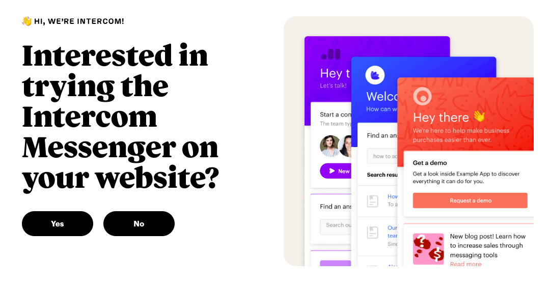
Intercom’s homepage nails minimalism and clarity. One simple question, two big buttons, and a sleek mockup of their product. That’s...
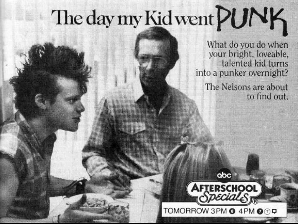
This 1987 ABC Afterschool Special ad nails attention-grabbing contrast. A clean-cut dad. A mohawked son. A family breakfast turned chaos....
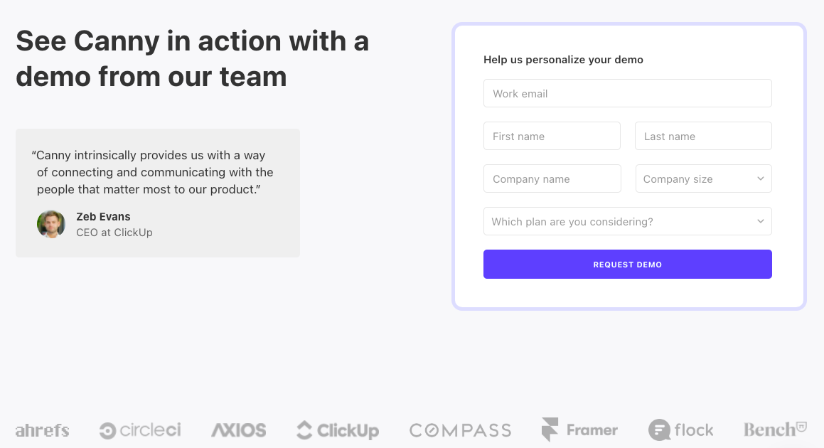
This Canny demo request page nails the art of subtle persuasion. Instead of a wordy pitch, it lets social proof...
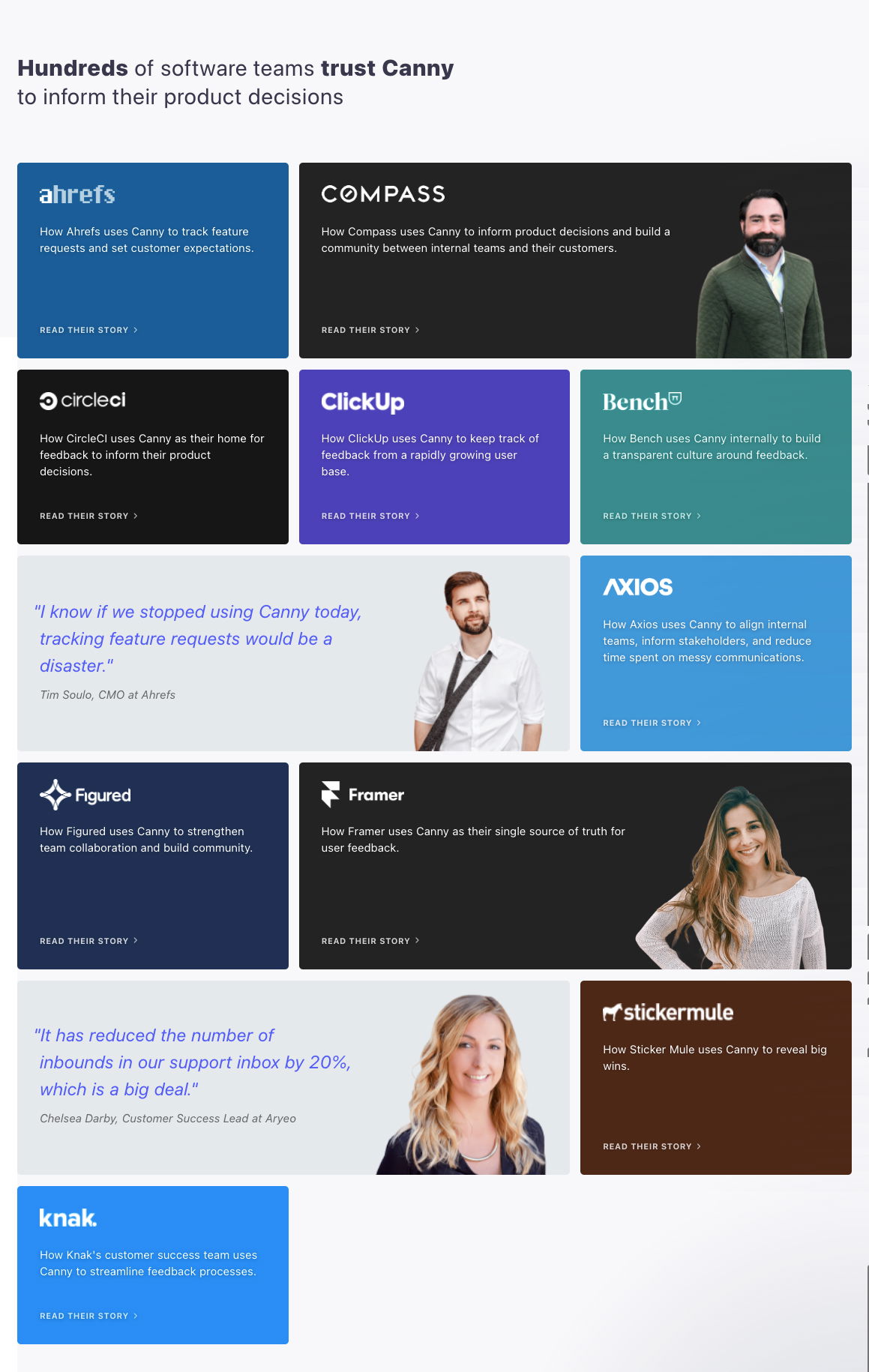
Want a quick way to show credibility? Showcase logos AND faces like Canny does. Their case study page hits all...
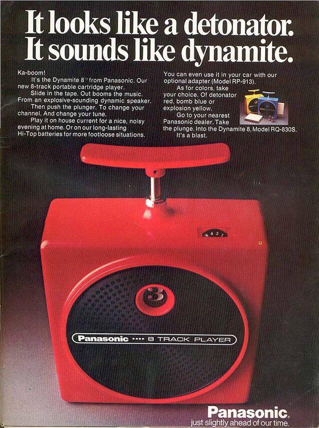
Panasonic made an 8-track player look like a stick of dynamite. And somehow, that made total sense. The tagline said...
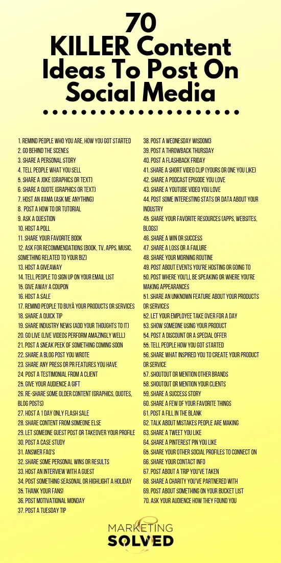
Ever get stuck staring at your blank content calendar? This list from Marketing Solved is like caffeine for your creativity....
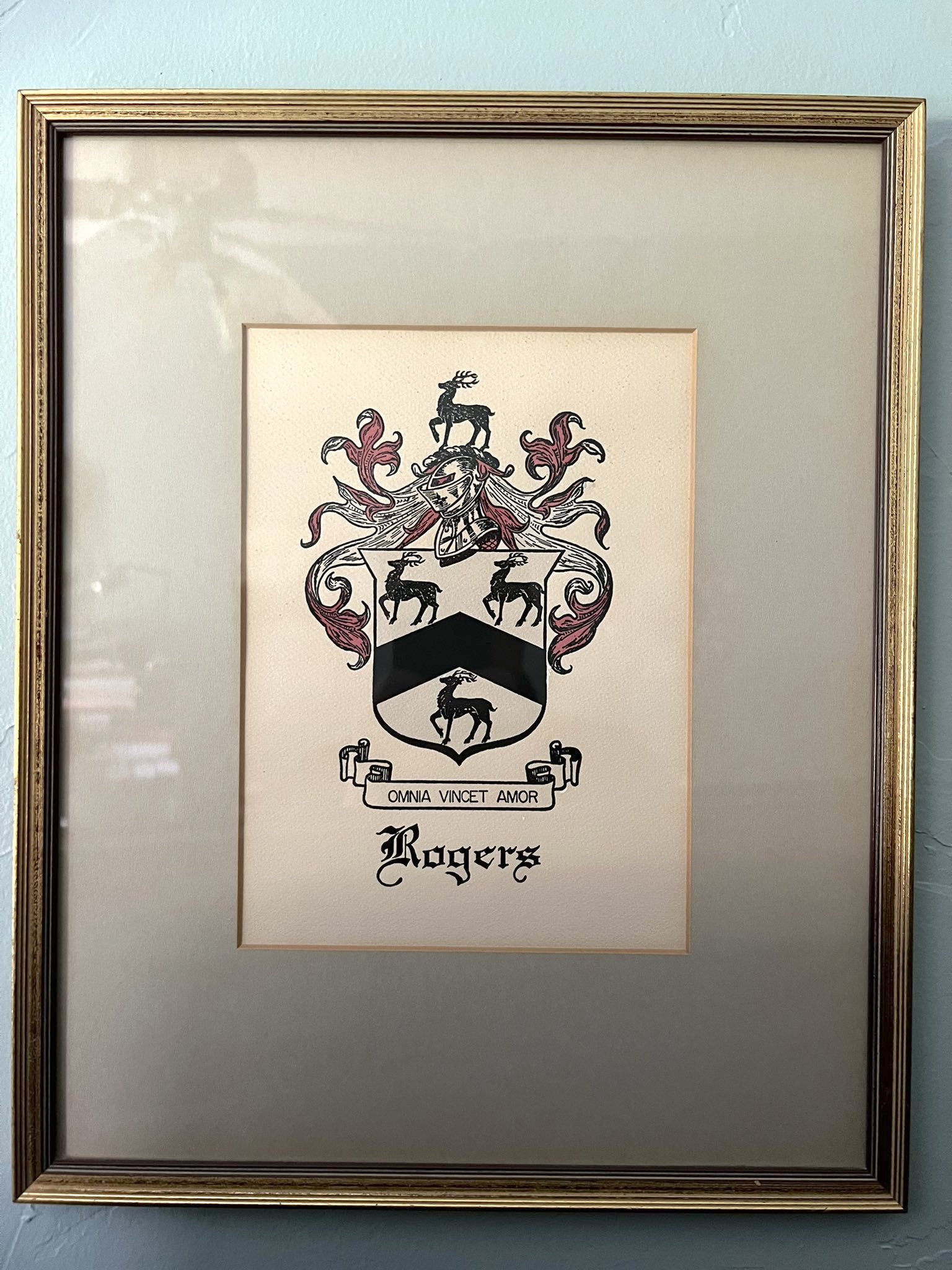
Gary Halbert’s “Coat of Arms Letter” wasn’t just direct mail—it was art worth hanging on the wall. The Rogers family...
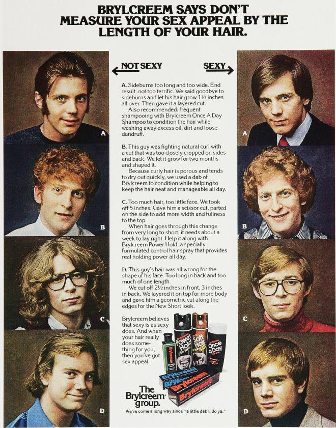
This Brylcreem ad didn’t just sell hair gel, it sold sex appeal. It showed “before” and “after” headshots—same guys, new...
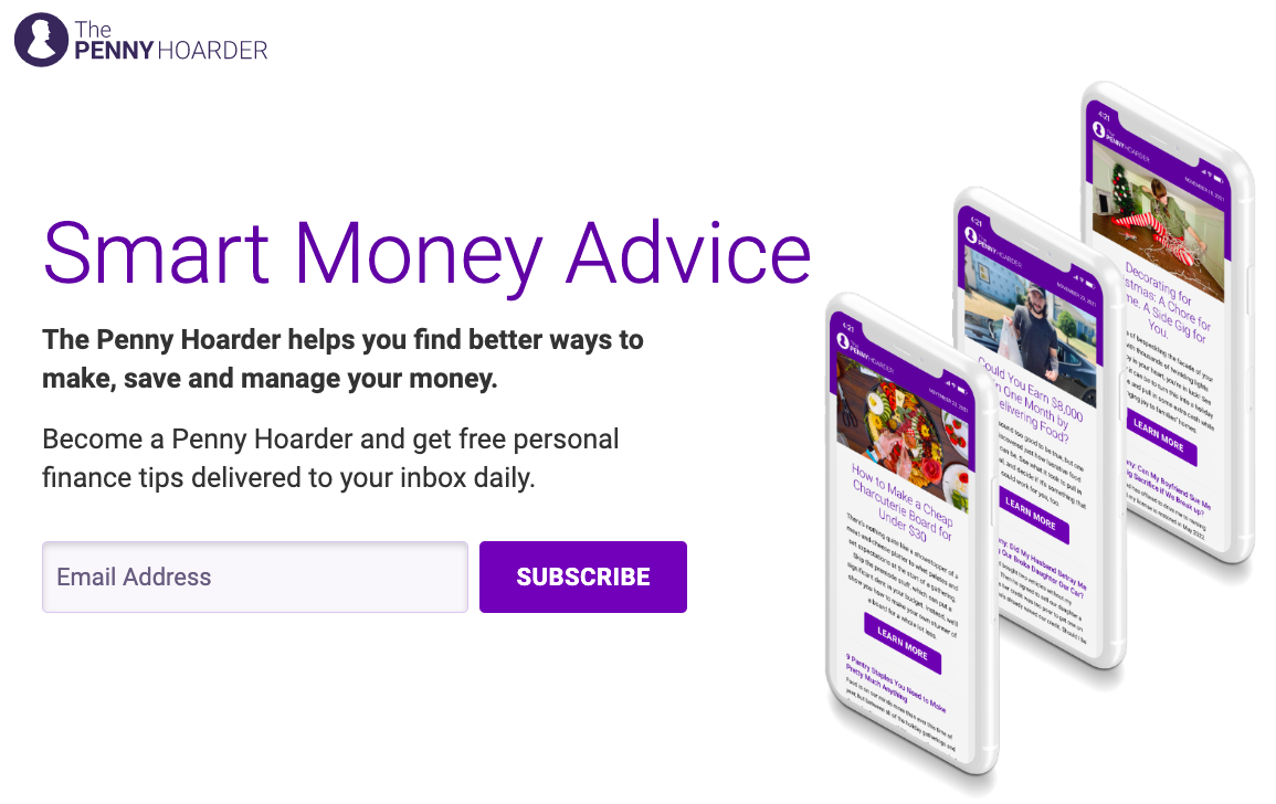
A good newsletter landing page gives visitors zero confusion about what they’ll get and when. The Penny Hoarder does this...
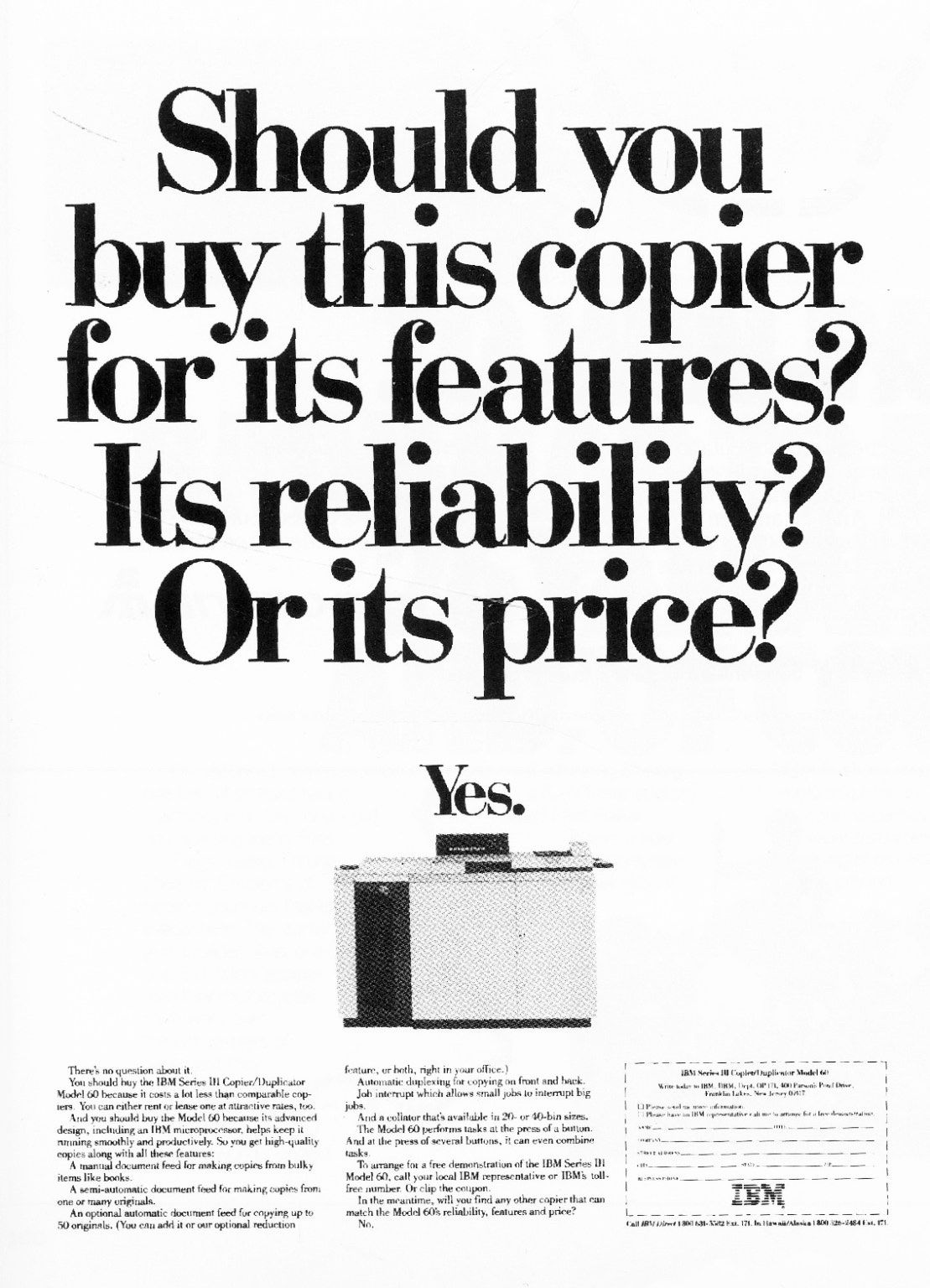
This vintage IBM copier ad nails it with a powerful twist: it asks the exact questions buyers are already thinking...
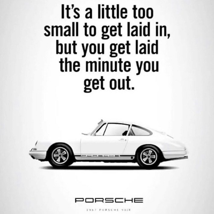
This Porsche ad doesn’t sell horsepower. It sells ego. It taps into what their buyers actually want: status, attention, and...
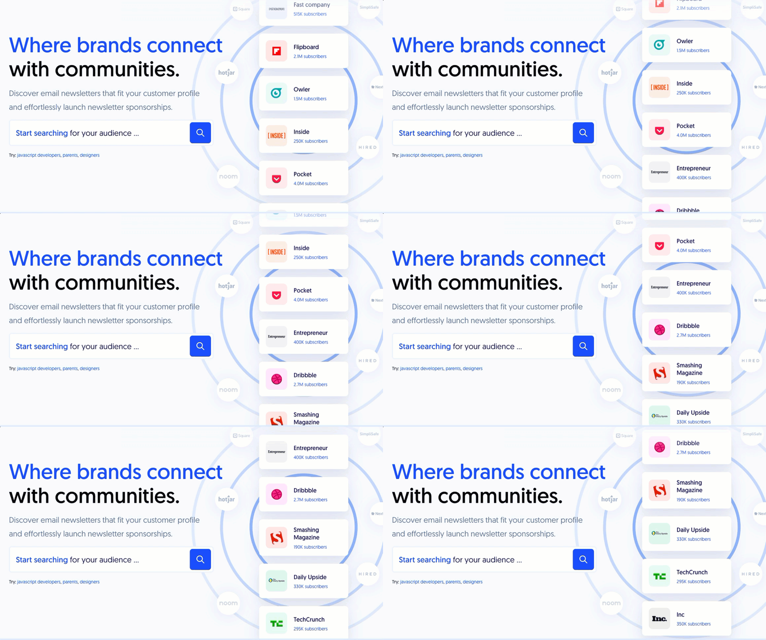
This landing page nails the mix of authority and action. The moving list of big-name newsletters (Flipboard, Pocket, Fast Company)...
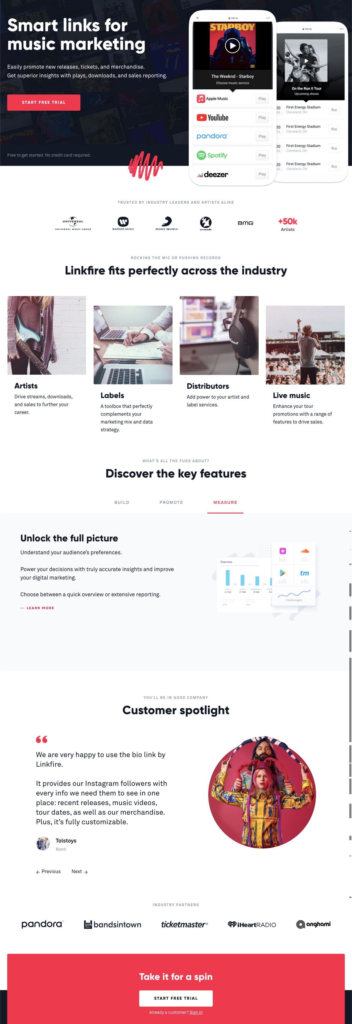
Linkfire’s landing page shows a clinic in clarity. The second you land, you see what the product does through an...
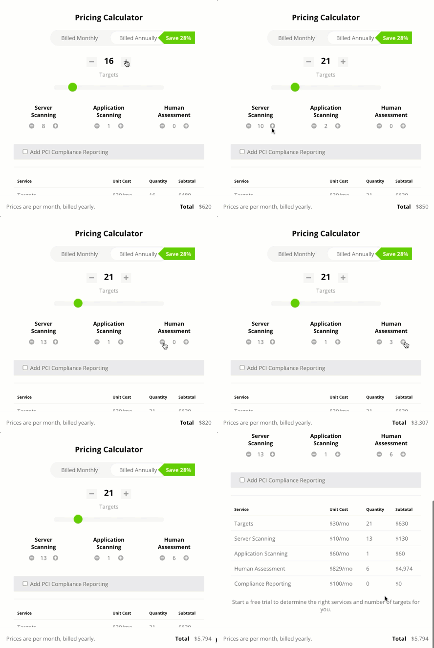
This pricing calculator nails something most SaaS companies mess up — making complexity feel simple. Instead of 50 confusing plans,...
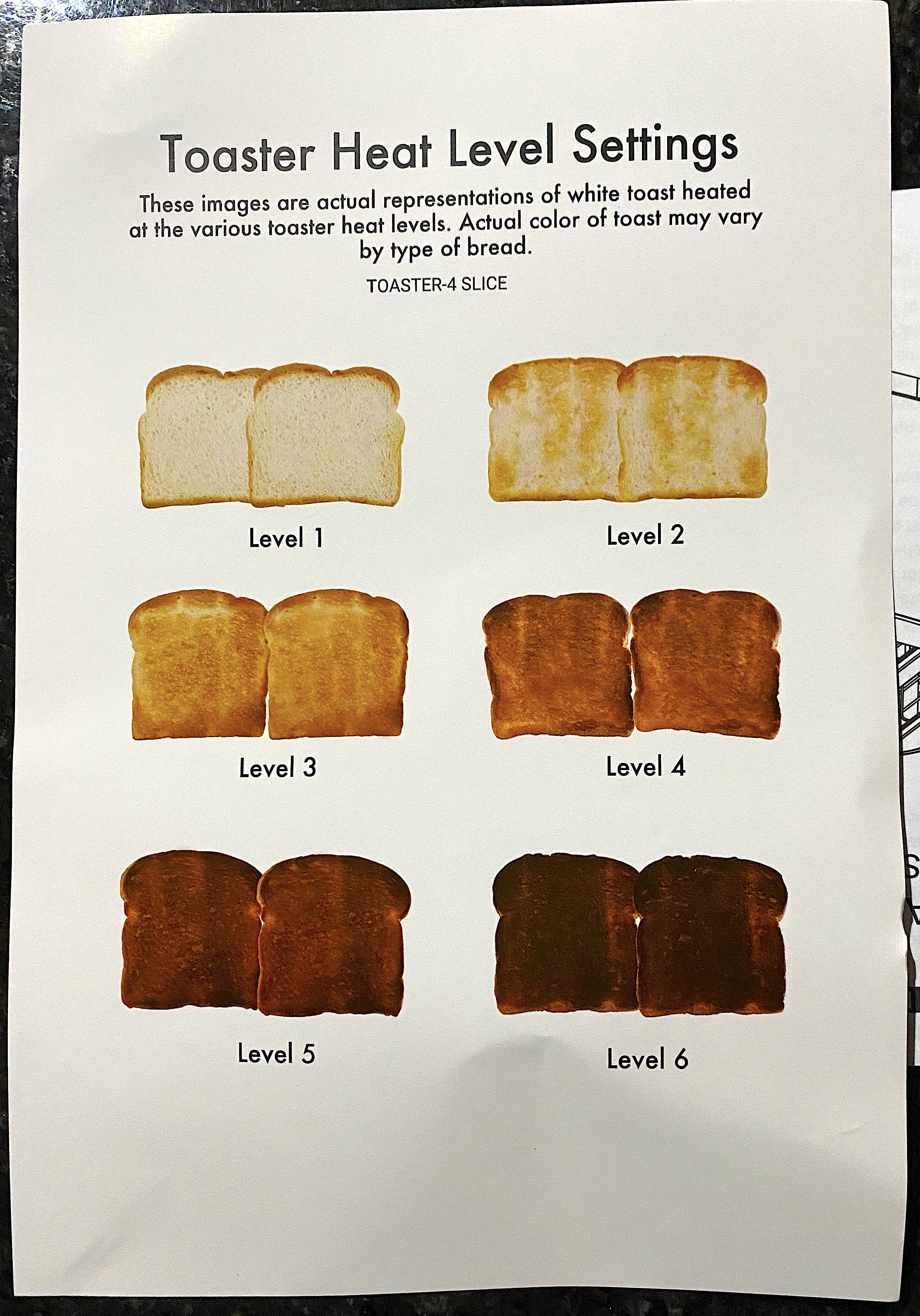
Ever wonder what those toaster numbers actually mean? This chart ends the confusion. It shows six slices of toast, each...
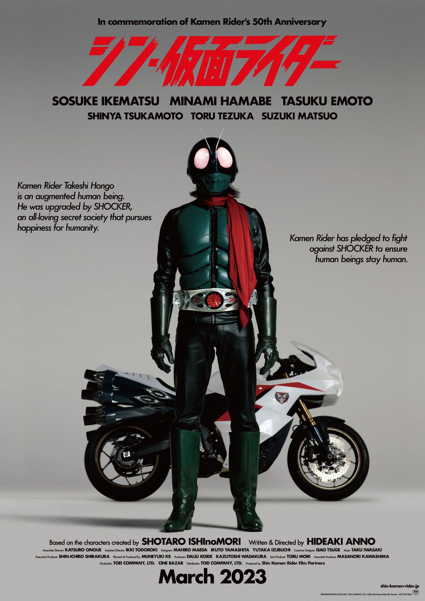
This Kamen Rider movie poster oozes confidence. It’s bold, clean, and instantly iconic — like it knows exactly what it...
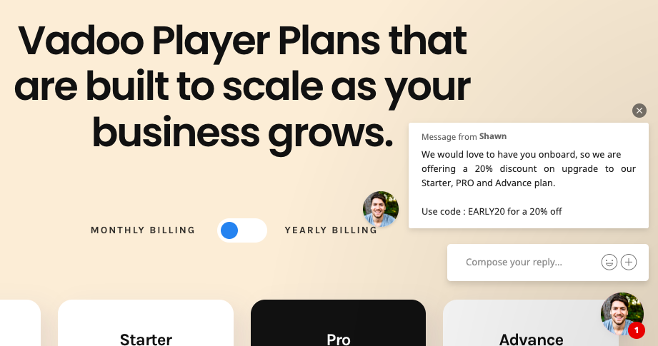
Ever land on a pricing page and suddenly get a helpful nudge from a friendly chat box offering a discount?...
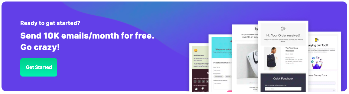
This banner ad shouts value in six words flat: “Send 10K emails/month for free.” It’s bold, simple, and instantly tells...
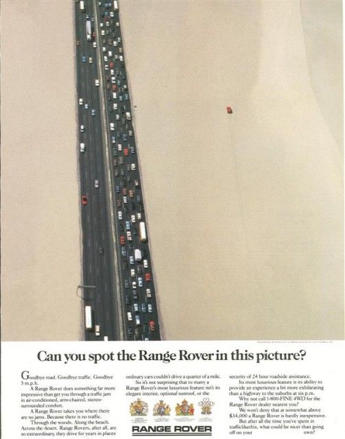
This Range Rover ad nails visual storytelling. One red Range Rover drives freely across open desert, while hundreds of cars...
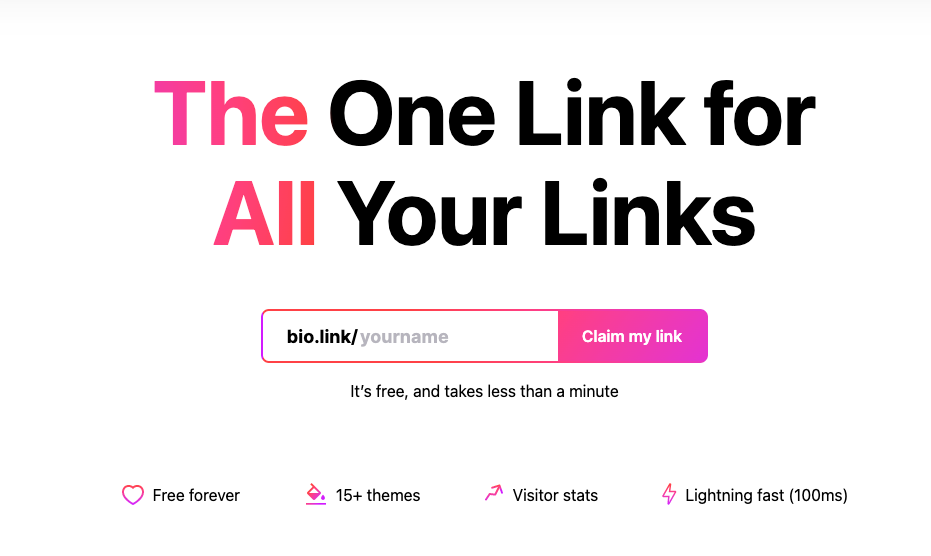
The screenshot above from bio.link nails simple, persuasive design. The big headline grabs attention and the action step feels personal...
This page hits you right where your wallet hurts: unwanted subscriptions. Truebill doesn’t waste a second explaining features. Instead, they...
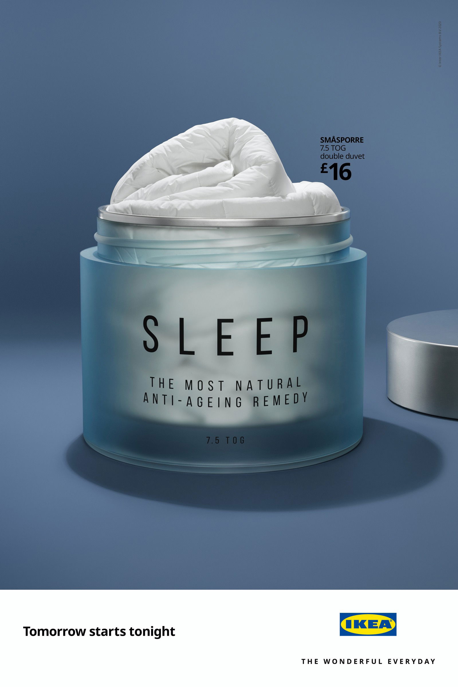
This IKEA ad looks like a fancy moisturizer, but it’s actually a duvet. The copy? “Sleep – The most natural...
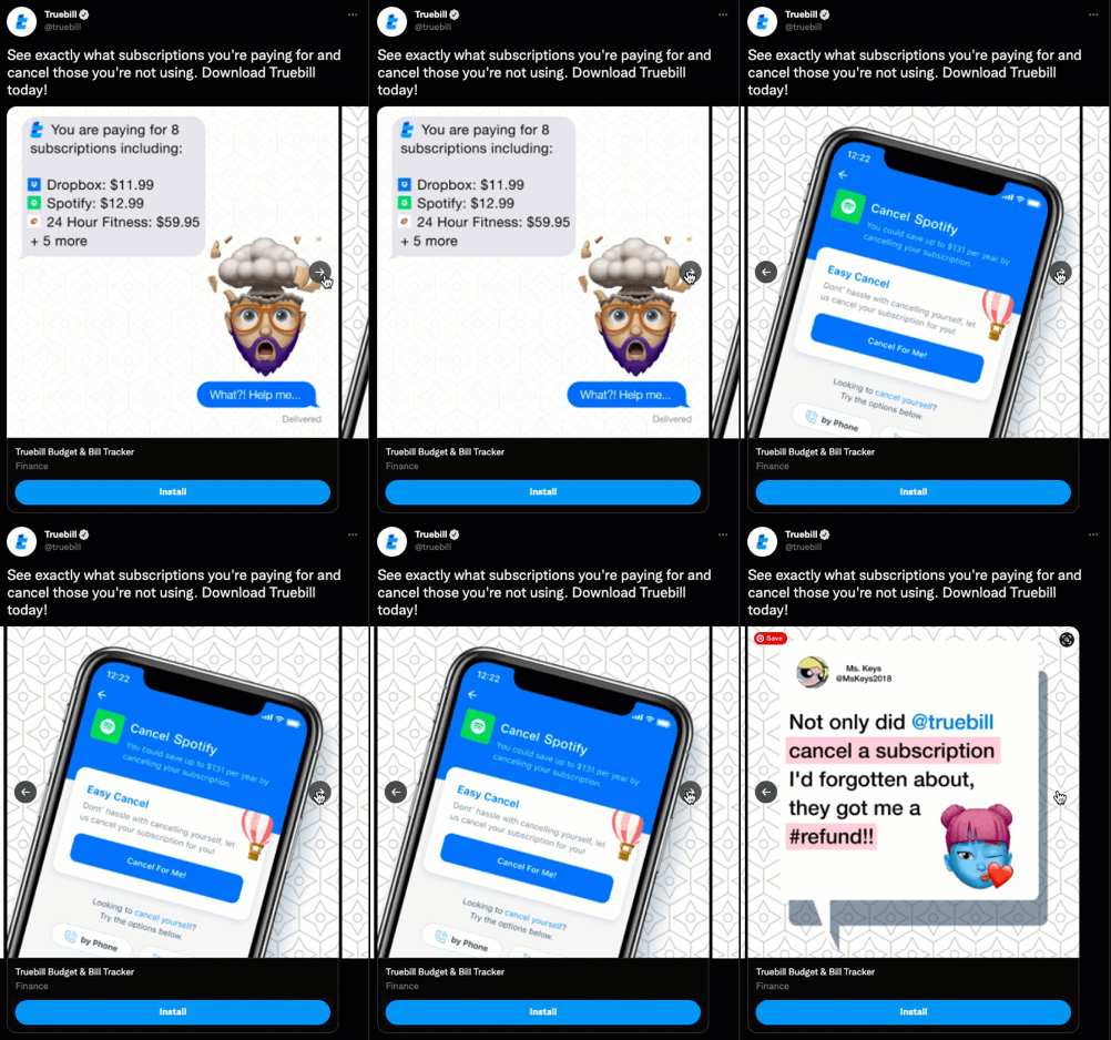
Truebill nails it with this quick three-slide ad. It hooks viewers with a “whoa” moment, shows a simple fix, and...
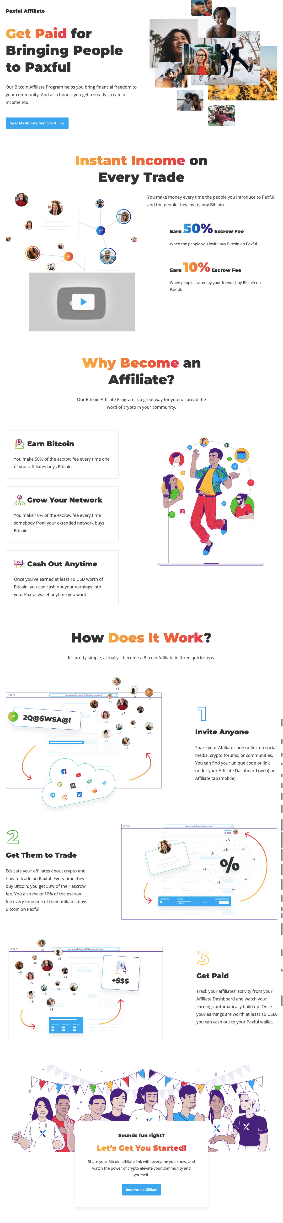
This Paxful affiliate page nails clarity and motivation in one scroll. The headline instantly tells you what you get—paid!—and why...