Reddit Ads: No Minimums, Automated Targeting
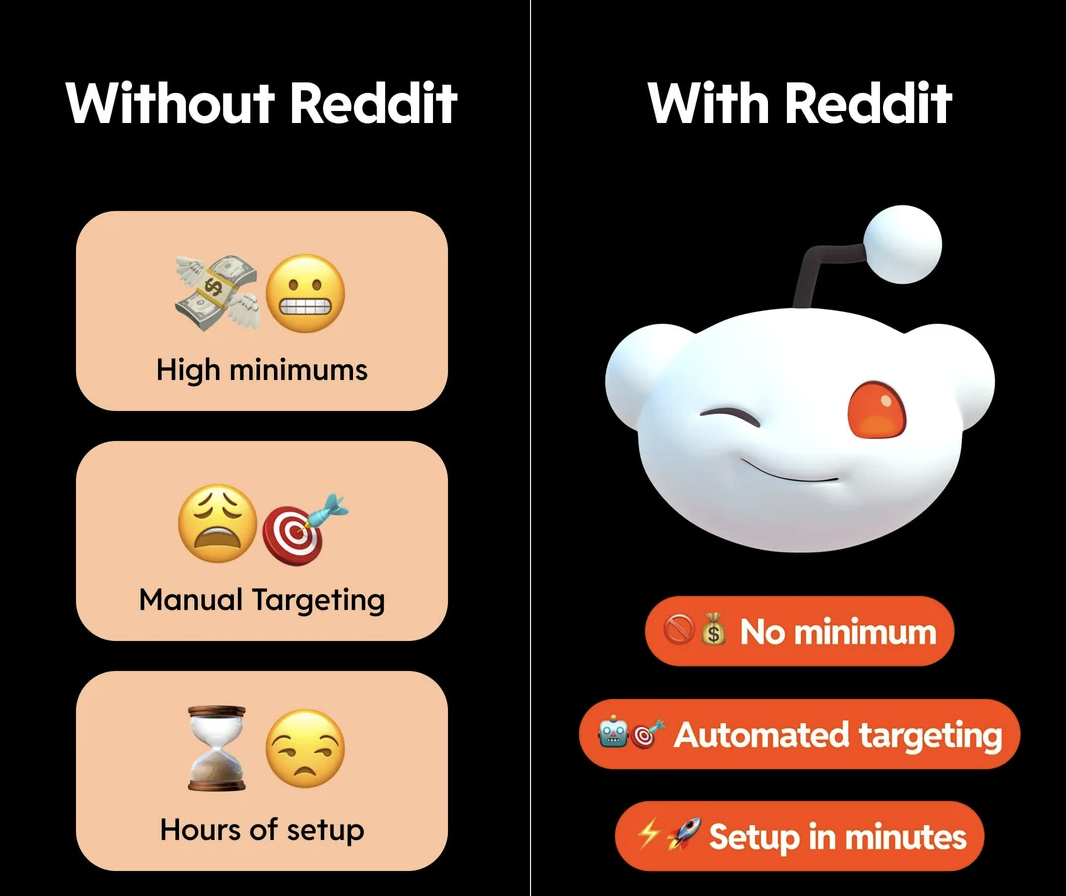
The graphic nails a feeling every small advertiser knows: buying ads usually feels like paying cover at a club you’re not even sure you want to enter. On the left, you’ve got the classic pain combo—high minimums, headache-inducing manual targeting, and hours of setup. On the right, Reddit’s little winking alien basically says, “Relax, we fixed that.” This post breaks down how to steal that contrast for your own ad messaging.
How to copy this for your own product
Pick three painful parts of your current solution—cost, complexity, and time are always safe bets. Put them in bland, sad boxes like the “Without Reddit” side: basic icons, neutral colors, unhappy faces. Then mirror each one with a bold benefit on the “With Us” side, using bright, button-style shapes and upbeat icons. Keep the text stupid simple: “No minimum”, “Done for you”, “Live in minutes”. If a stranger can glance for three seconds and tell which side they want to be on, you’ve done it right.
Why this visual hits so hard
- Simple side‑by‑side layout instantly tells a “before vs after” story without needing text-heavy explanation.
- Each pain point on the left is mirrored by a clean, specific benefit on the right: money, targeting, time.
- Bold orange benefit buttons (“No minimum”, “Automated targeting”, “Setup in minutes”) look clickable and action-focused.
- The winking mascot adds friendliness, softening the idea of buying ads into something approachable and fun.
