Tenex Homepage
Most AI websites look the same: stock robot images, buzzwords, and corporate fluff. Then you land on Tenex — black background, giant type, and straight talk. It instantly feels confident and different.
Marketing Analysis
Tenex’s site design screams authority. The massive typography isn’t decoration; it’s positioning. The whole site feels like a statement piece: “We’re not another AI company — we’re the AI company.”
Why It Works
- Big type = instant dominance and clarity
- Minimal copy = focus on what matters
- Stark contrast = visual confidence
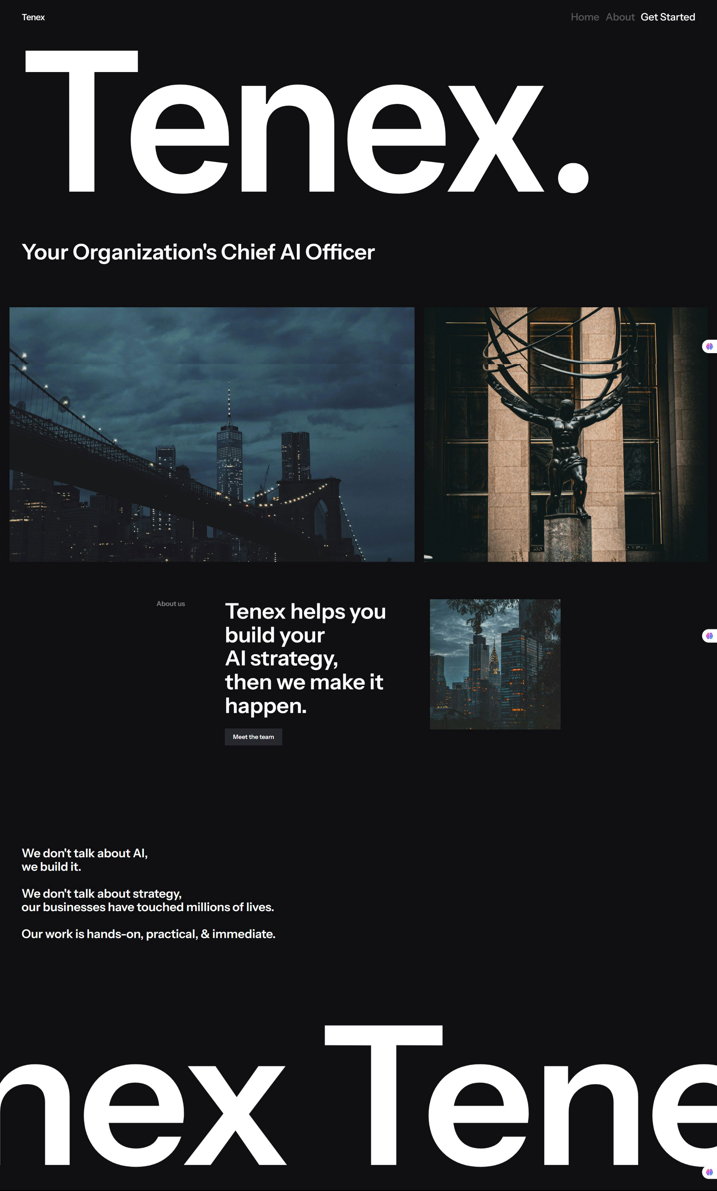
- Real city photos = grounded, human credibility
- Strong tagline = quick understanding
Examples
- Apple uses clean design and white space to project confidence
- Stripe’s homepage ditches jargon for “Payments infrastructure for the internet”
- Notion’s landing page uses bold simplicity to make productivity feel sleek and modern
Analyzed by Swipebot
Loading analysis...
