Turn Flat Maps Into 3D Population Spikes
Most population maps look like someone spilled beige soup on a spreadsheet. This Texas map does the opposite: it rips the data off the page and turns cities into jagged 3D spikes. One glance and you instantly feel where people actually live, not just where county lines happen to be.
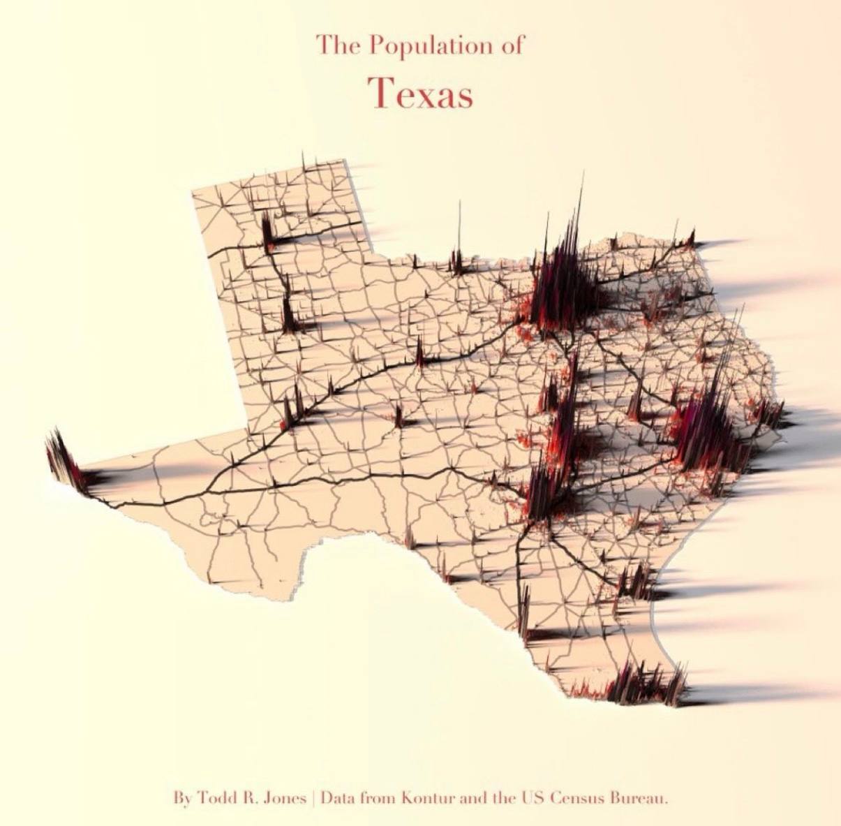
From Flat Counties To Living Landscape
Instead of coloring counties, this visualization keeps the familiar Texas outline, then extrudes population as tall, sharp spikes. The road-like crack lines guide your eyes across the state, while the blood-red spikes scream: “Here’s where the humans are.” Dallas–Fort Worth, Houston, Austin, and San Antonio become mountains; West Texas is practically a desert of data. Same census numbers, completely different impact.
Why This Spiky Map Hits Hard
- Turns an abstract stat (population density) into physical height your brain can feel.
- Keeps the classic Texas silhouette for instant recognition and context.
- Uses contrast: pale base map vs. dark red spikes to magnetize attention.
- Makes outliers obvious—metro areas tower while rural regions stay flat.
- Feels like a 3D bar chart laid on a map, so it’s both artsy and insanely readable.
Where You Could Steal This Idea

A city planning department could map 3D spikes for traffic accidents to show exactly which intersections are the most dangerous.

A real estate marketplace could use 3D spikes over a metro map to show where listing demand or price-per-square-foot is exploding.

An ecommerce brand could build a 3D customer map that turns purchase hotspots into skyscrapers rising from a flat country outline.
