When Typography Becomes Storytelling
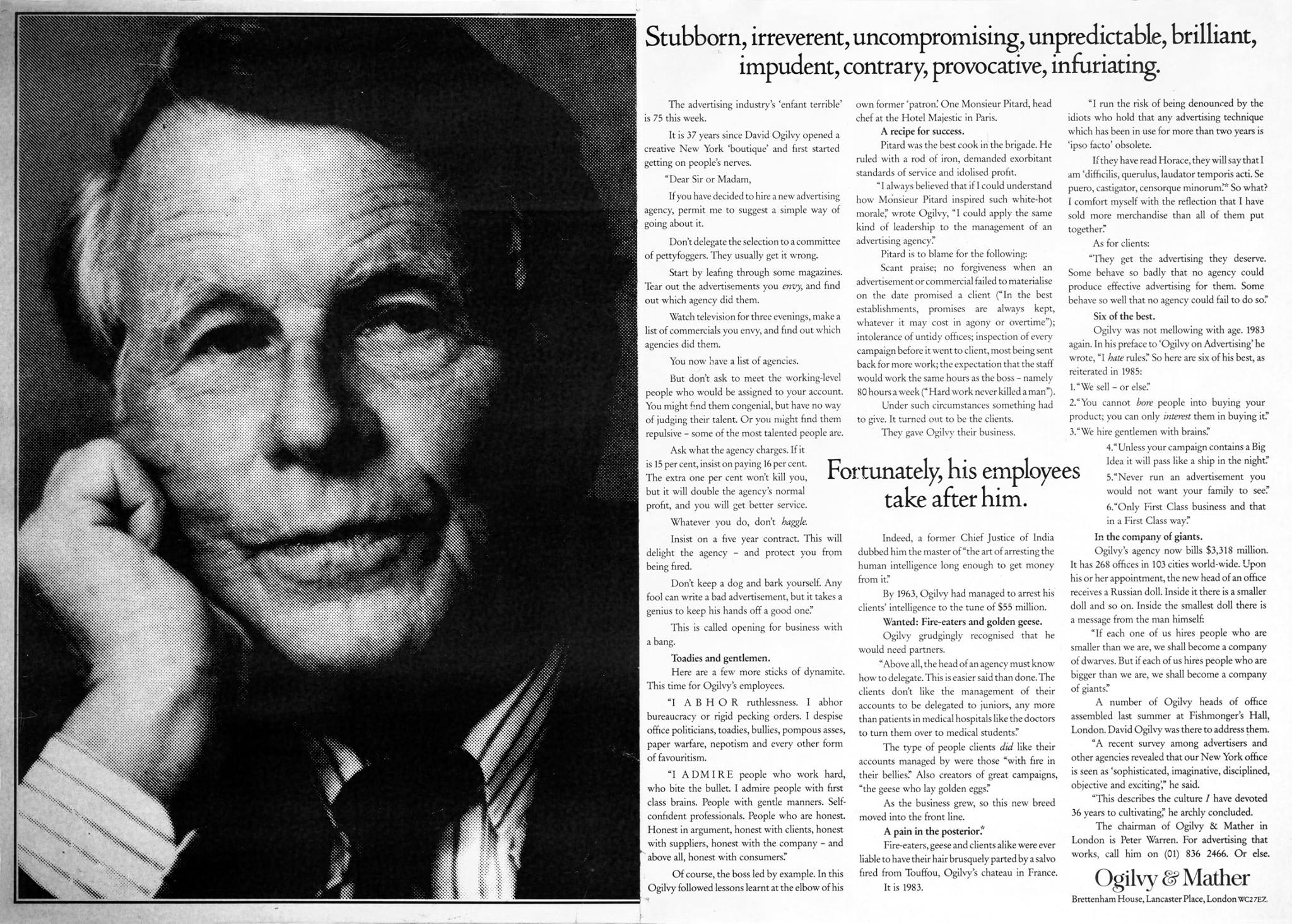
This striking image blends portraiture with typography, creating a visual dialogue between two creative minds. The diagonal composition, fragmented type, and overlaid text draw attention as much to the design as to the message. It’s a reminder that form and content can collaborate—not compete—to tell a story that sticks.
The key takeaway
Design isn’t just decoration—it’s context. When visuals and words interact, they amplify meaning. The best creative work doesn’t just say something; it makes you *feel* something before you even begin reading.
Why it catches your eye
- The diagonal layout breaks traditional reading patterns, forcing curiosity.
- Faces partially obscured by text create mystery and depth.
- Dense typography invites closer inspection and rewards attention.
Who uses similar visual storytelling
The New York Times Magazine uses layered text and portrait photography to humanize complex editorial subjects.
Apple product campaigns often merge clean typography with evocative close-ups to evoke emotion through simplicity.
