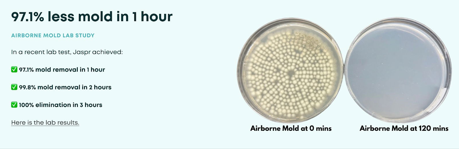
Jaspr Air before/after
This shows a very specific (97.1%) reduction in air mold in one hour with this visual with the Jaspr.
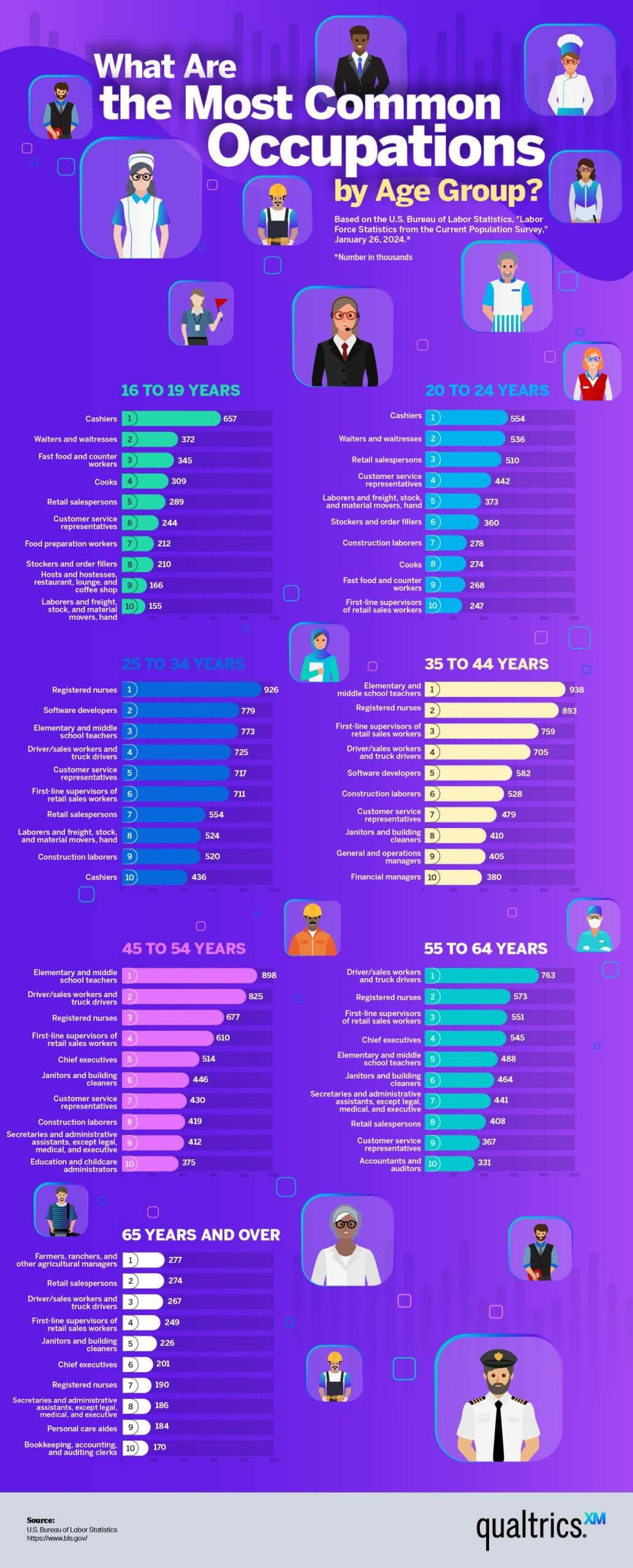
The most common jobs by age group graphic
This was an interesting way to show data of the most common jobs by AGE.The data showed:16 to 24 years:...
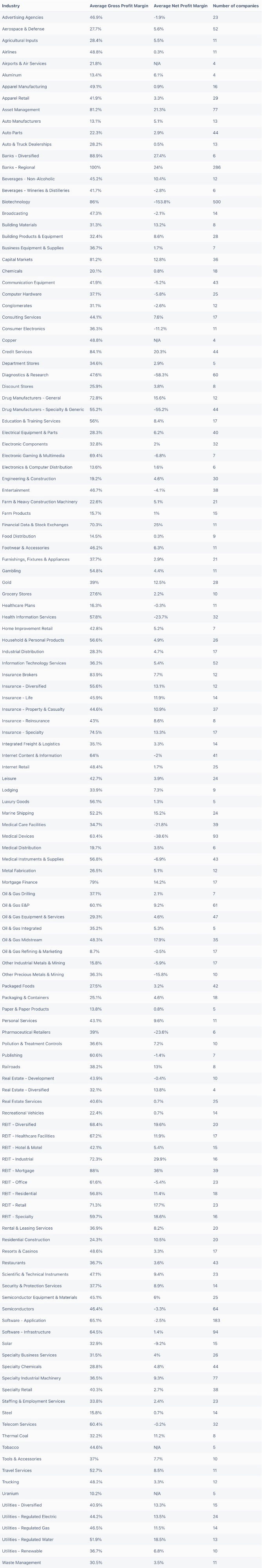
Profit Margin by Industry List
This is a cool list of the industries with the highest average profit margin.The highest average profit margin industries are:...and...
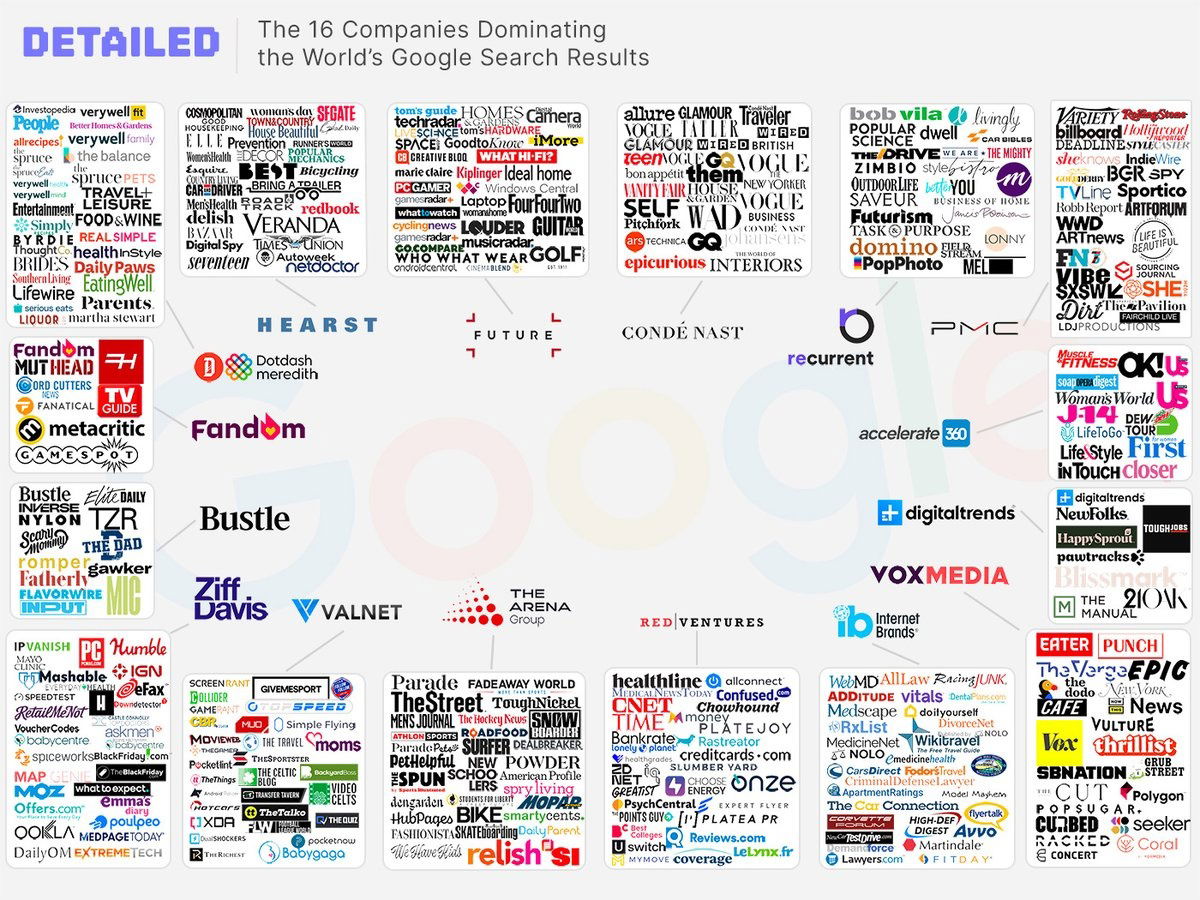
16 Companies That Dominate Google Search Results.
This image shows how 16 main brands control the SEO on google. Why I think the review industry sucks:basically 16...

McDonald's Calories vs Real Food
Eye-popping image showing what you could eat instead of scarfing down a Big Mac meal
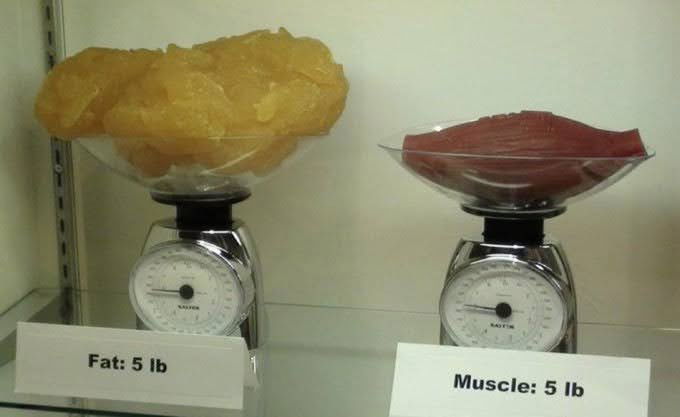
Fat vs Muscle visualization
This is a demonstration to show that 5 pounds of fat is HUGE, whereas 5 pounds of muscle is much...
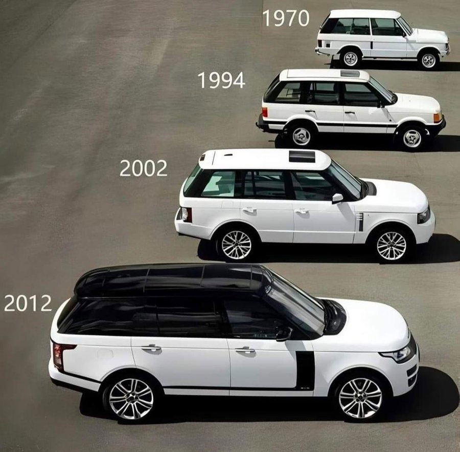
Range Rover comparison over the years (1970 - 2012)
This is a cool chart that shows the styling evolution of Range Rovers from 1970 to 2012…while each successive versions...
Speed of light visualized
Instead of saying, the speed of light is something like 300,000+ miles plus per second this demonstration shows how fast...

The High Cost of Overpaying vs. the Power of Fair Pay
This image contrasts the downsides of overpaying executives—like drained resources and stalled growth—with the benefits of proper compensation, such as...
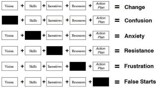
The elements of change: what happens when one is missing
Great chart showing the effects of missing a piece of the elements of change.
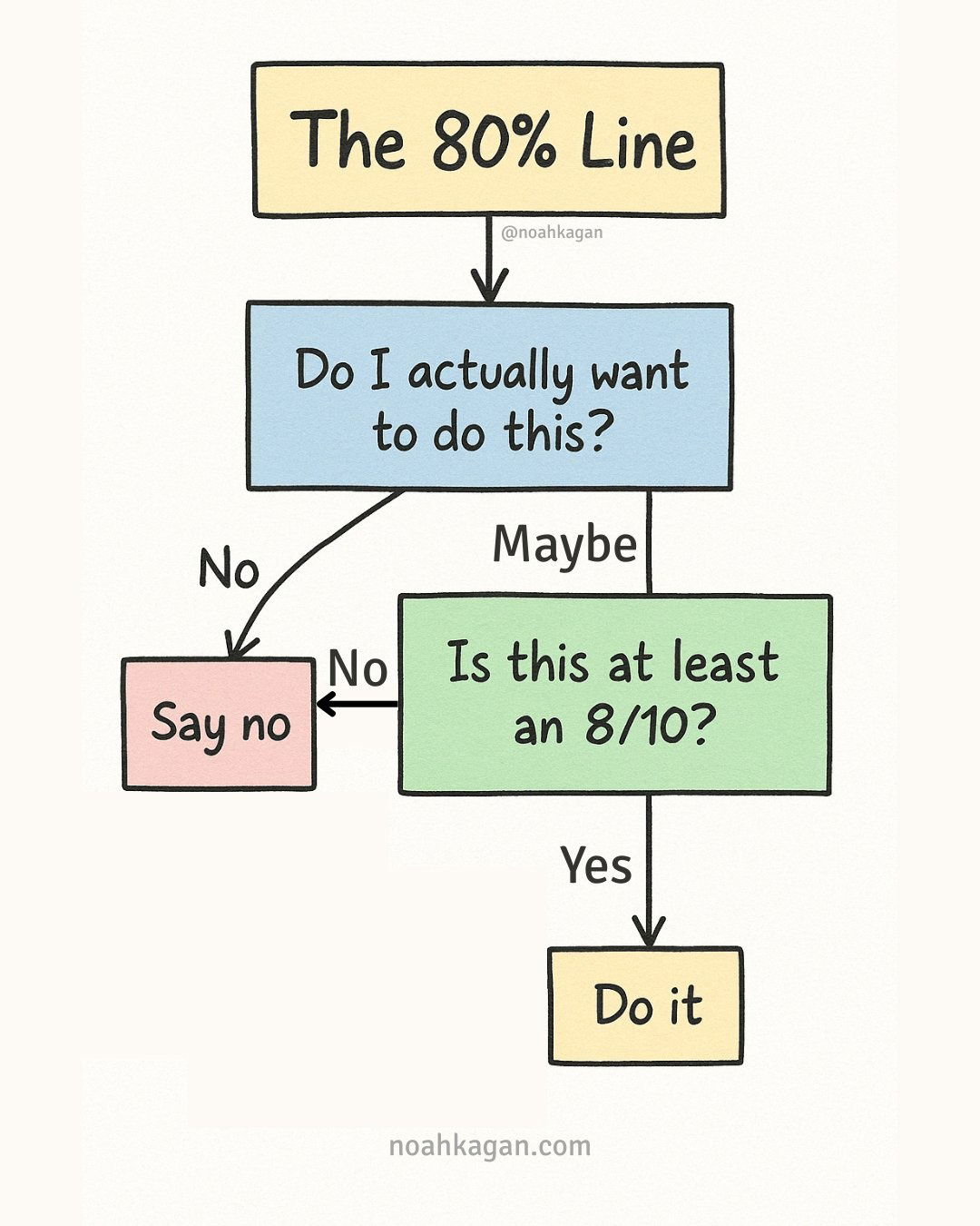
The 80% Line Test for Doing What You Actually Want
Simple flow chart showing if you should say yes or no to something using the 80% line. Noah's post: The...

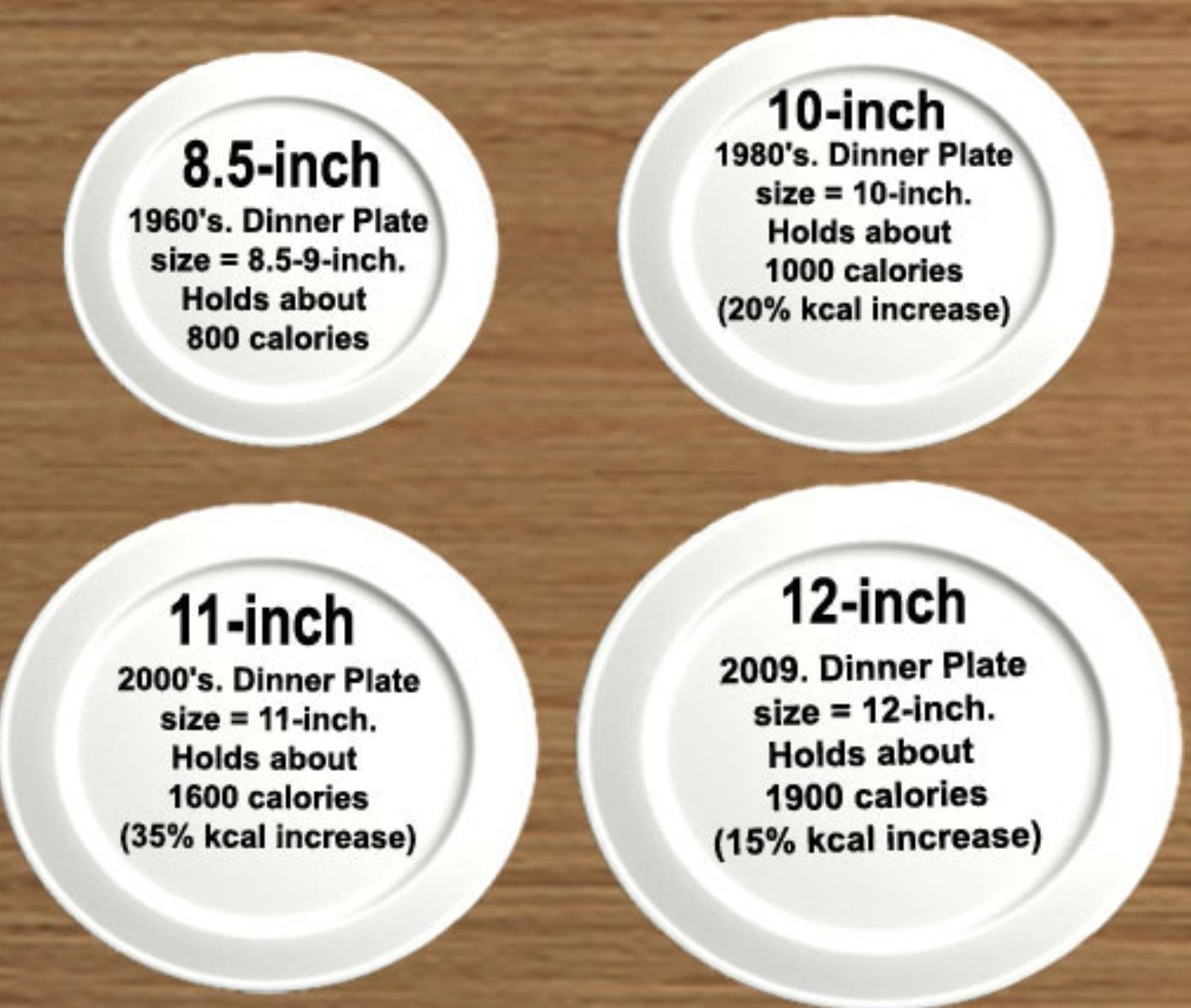
Dinner plate comparison sizes over the years
Since the 1960s, dinner plates have gotten way bigger — and so have our portions. This powerful image shows how...
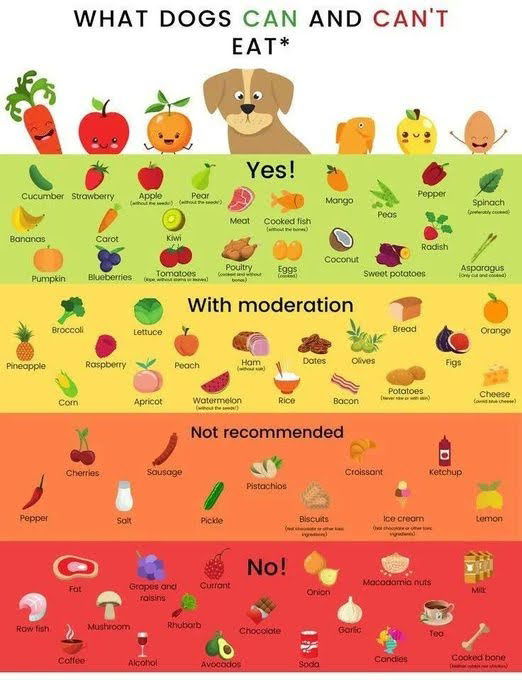
What dogs can and can’t eat
I like simple images that convey a BUNCH of data, and in one Instagram-sized post this shows what dogs can...
.png?width=3840&quality=80)
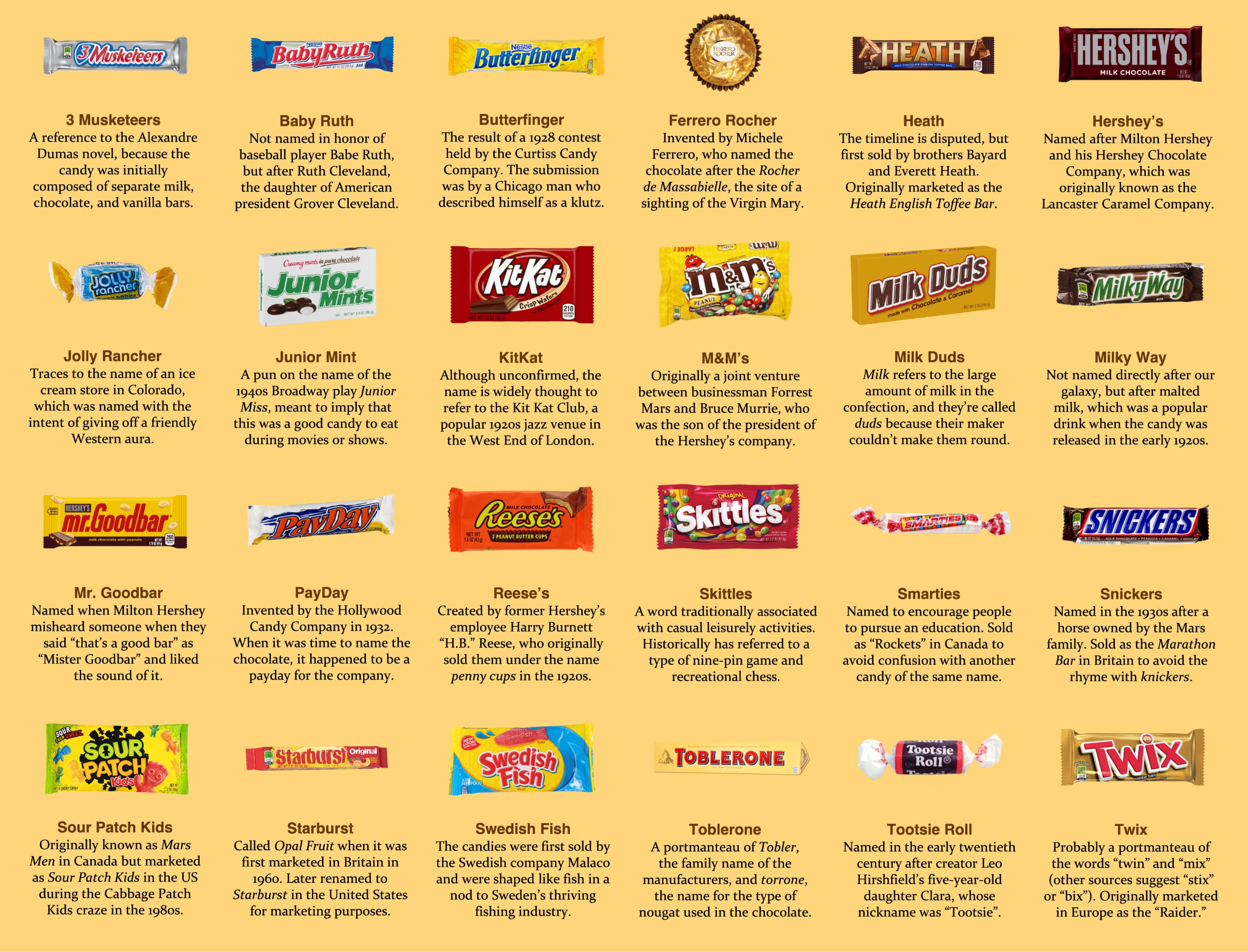
How popular candies got their name
Did you know M&M’s are called that because they were a joint venture between Mars and Bruce Murrie? Here’s how...

AI by 2027 Graph
This is an interesting case on how AI could take over or be a major part of all business by...

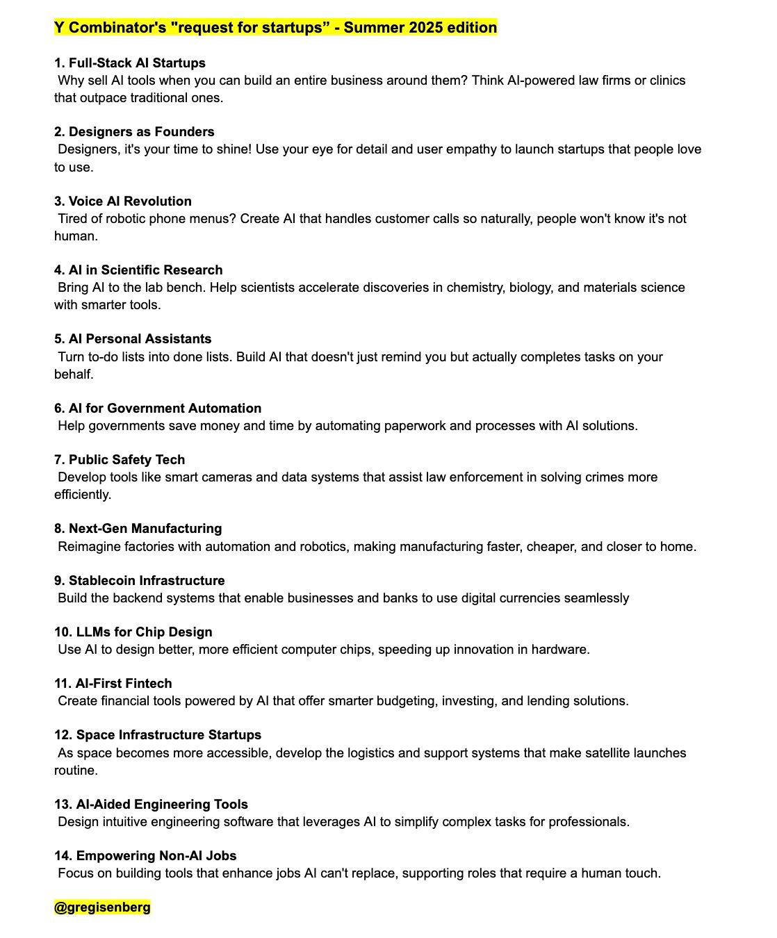
Y combinators investment wishlist 2025
This is a list from Y Combinator showing startups they want to invest in the summer of 2025.They include:1. Full-Stack...
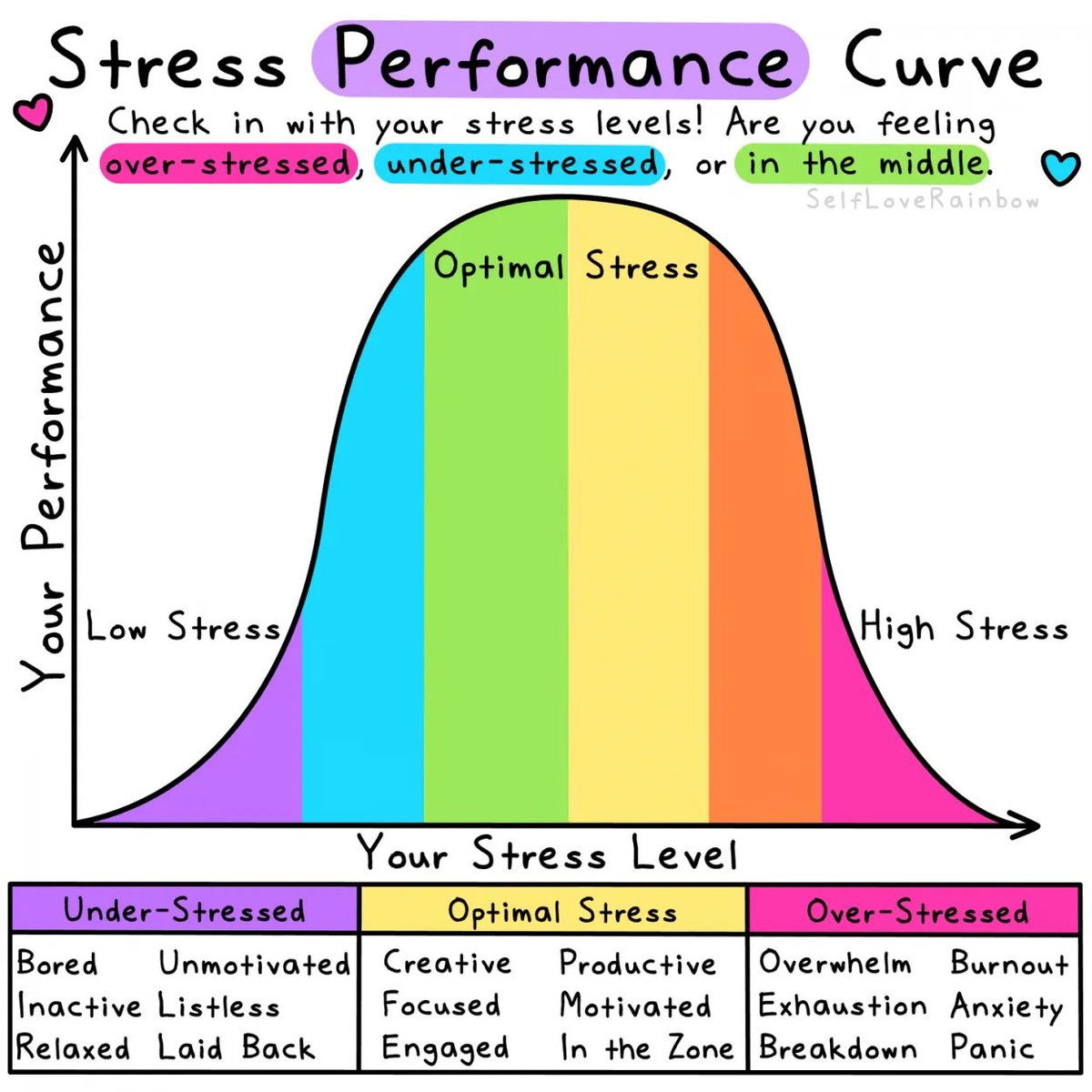
Stress Levels and Performance Curve
This colorful chart shows the different types of stress and how they affect your performance.
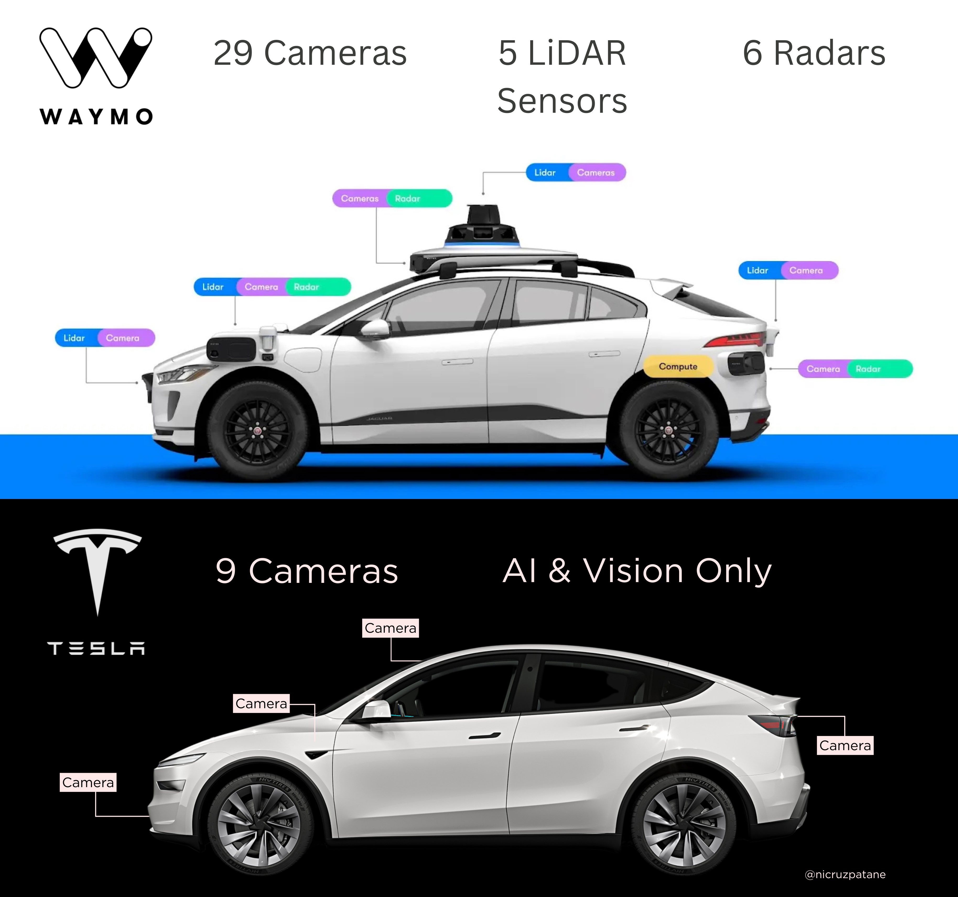
Waymo vs Tesla Sensor Suite
This shows the difference between Waymo and Tesla cameras. It shows that Waymo has a lot more cameras (29), five...
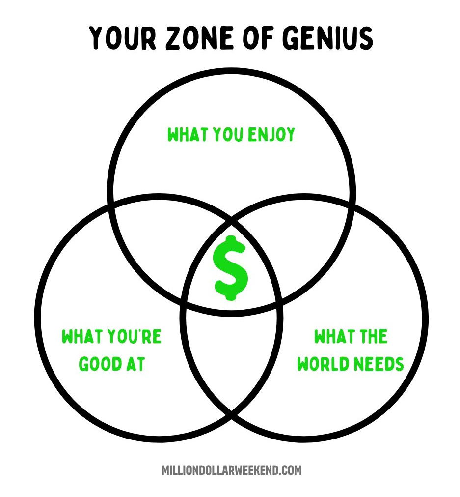
Your Zone of Genius Venn Diagram
This Venn Diagram what you enjoy, what you need and what you are good....and THAT'S where you make money!Many people...
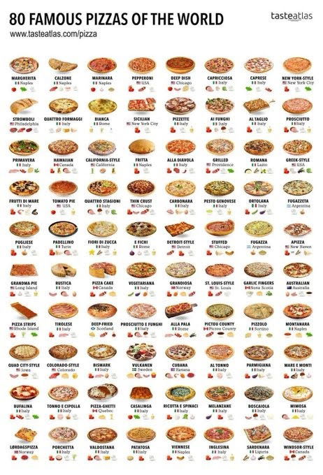
80 pizzas and where they’re from
This chart takes 80 different pizzas, lists out where they’re from and also some other qualities about them. I like...
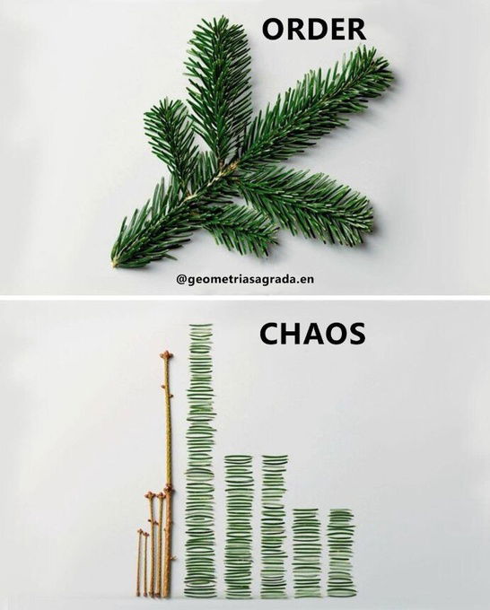
Order vs Chaos visualization
This is a cool visualization of an assembled plant in complete order, but then disassembled it looks like just random...

Showcasing best-sellers ad with text mockups
I like this Instagram ad because it just shows the top selling products and highlights what each of them are.

Cool image showing Tesla headlight progression.
This is a pretty cool graphic that shows the progression of how the Tesla headlights look from 2012 all the...

Exit Strategies for SaaS Company Founders
A snapshot from Hampton’s 2024 State of SaaS report, focusing on exit strategies for SaaS company founders.