Stop Treating Homepage Like A Landing Page
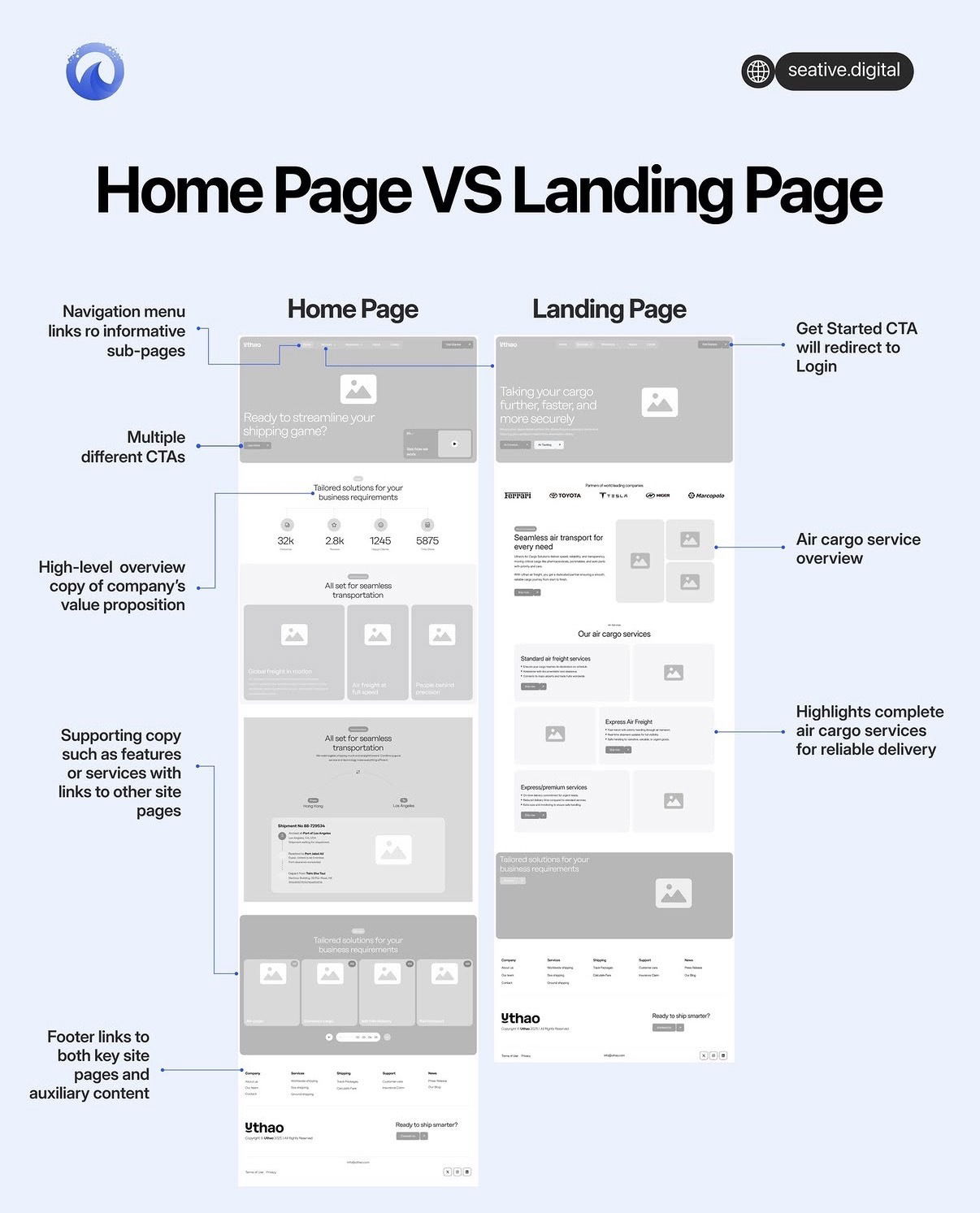
Most sites quietly kill their conversions by turning the homepage into a giant, confused landing page. The graphic above spells out the problem perfectly: a homepage is a map, while a landing page is a tunnel. When you mix the two, visitors don’t know where to go, your CTAs fight each other, and your best pages never get seen. Let’s break down what this visual gets right so you stop Frankensteining your homepage.
The Psychology Behind It
Homepages serve explorers; landing pages serve deciders. When someone hits your homepage, they’re often early in the journey and trying to figure out who you are, what you do, and where to click next. That’s why the left design leans on navigation, summaries, and lots of paths. A landing page visitor usually clicked an ad or email about one specific promise. The right design honors that intent by removing distractions and hammering one message and one action. If your homepage looks like the landing page mockup, you’re forcing explorers to make a decision they’re not ready for yet—and they bounce.
What Your Homepage Should Actually Do
- Act like the left mockup: use a clear navigation menu that routes people to informative sub-pages, not just one offer.
- Give a high-level overview of your company’s value prop instead of diving deep into a single product or promo.
- Use multiple, role-based CTAs (learn more, pricing, demo, resources) instead of one hard “Get Started” button.
- Show supporting copy blocks that introduce core services, each linking to its own dedicated page.
- Include a footer packed with links to key pages and helpful content so visitors can self-direct their journey.
How A Landing Page Is Different (On Purpose)
- Look at the right mockup: it’s built around a single air cargo offer, not the whole company story.
- The headline, body copy, and layout all push one outcome: learn about air cargo services and convert.
- Navigation is stripped down so people don’t wander—every road leads to the main CTA.
- The primary button (“Get Started”) is wired straight to a login or signup flow, not general browsing.
- Sections are narrowly focused on benefits, proof, and details for this one service, not every service you sell.
How To Stop Treating Your Homepage Like A Landing Page

Shopify structures its homepage like the left mockup by giving a broad promise up top, then routing visitors by role (merchants, enterprise, partners) into deeper pages instead of one aggressive signup flow.
Notion keeps its homepage high-level with product overviews and audience paths, while its campaign-specific landing pages focus on single messages like templates or AI and push one dominant CTA.
