Tesla Revenue & Expenses Visualized
Published on
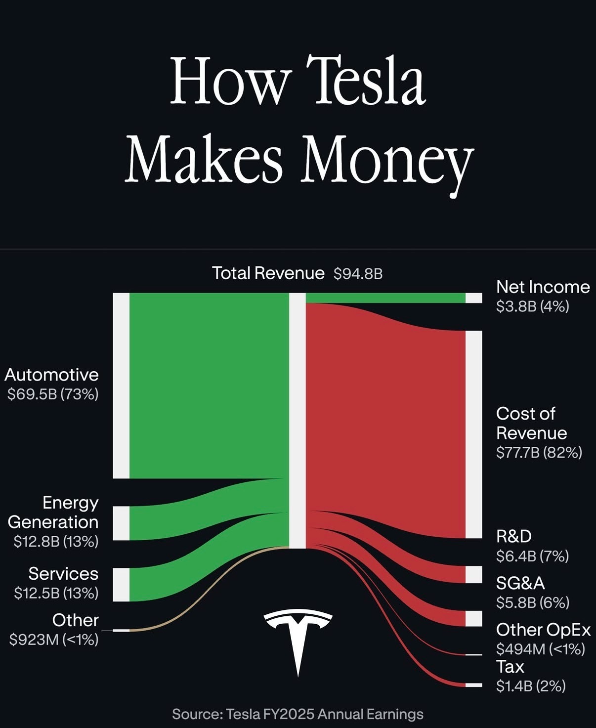
Everyone thinks Tesla is a “car company,” but this earnings graphic tells a different story. When you trace every green dollar of revenue and every red dollar of cost, you see exactly where the business actually makes (and loses) money. Let’s dissect this chart and steal a few lessons for our own businesses.
The Money Inflows: Where Revenue Really Comes From
The chart pegs Tesla’s total revenue at $94.8B. The fat green bar on the left shows 73% of that is Automotive ($69.5B). The surprises: Energy Generation is $12.8B (13%) and Services is another $12.5B (13%), while “Other” barely registers at $923M. Visually, Tesla is still car-heavy, but those two 13% side streams are already a quarter of the pie and growing into their own businesses.
The Money Outflows: Where It All Gets Burned
Follow the green river across the graphic and it crashes into a red wall: Cost of Revenue eats $77.7B, or 82% of everything. Then more red slivers slice the remaining cash: R&D at $6.4B (7%), SG&A at $5.8B (6%), Other OpEx at $494M, and Tax at $1.4B (2%). After all that, only a skinny green strip survives on the far right: $3.8B in net income, just 4% of total revenue.
Why This Chart Is So Freaking Effective
- It turns a boring income statement into a single visual story: big green river in, lots of red leaks out.
- Percentages are glued to every bar (73%, 13%, 13%, 82%, 7%, 6%, etc.), so you instantly feel scale, not just see numbers.
- Net income as a thin stripe on the far right makes Tesla’s 4% margin emotionally obvious, not just mathematically true.
- The layout forces you to notice side businesses like Energy and Services that most people ignore when they say “Tesla sells cars.”
How You Could Swipe This Visualization Style

Shopify could map every merchant dollar from subscription fees and payment processing through hosting, support, and R&D to show how little profit each store actually drops to the bottom line.
Netflix could visualize subscriber revenue flowing into content costs, tech infrastructure, marketing, and licensing to make its hit-driven economics painfully clear.
Airbnb could show how each booking’s revenue splits into host payouts, support, trust-and-safety costs, and product development to highlight why their service fee exists.
Creative Variations
Analyzed by Swipebot
Loading analysis...