Top 10 Revenue Shakeups 2020–2026
Published on
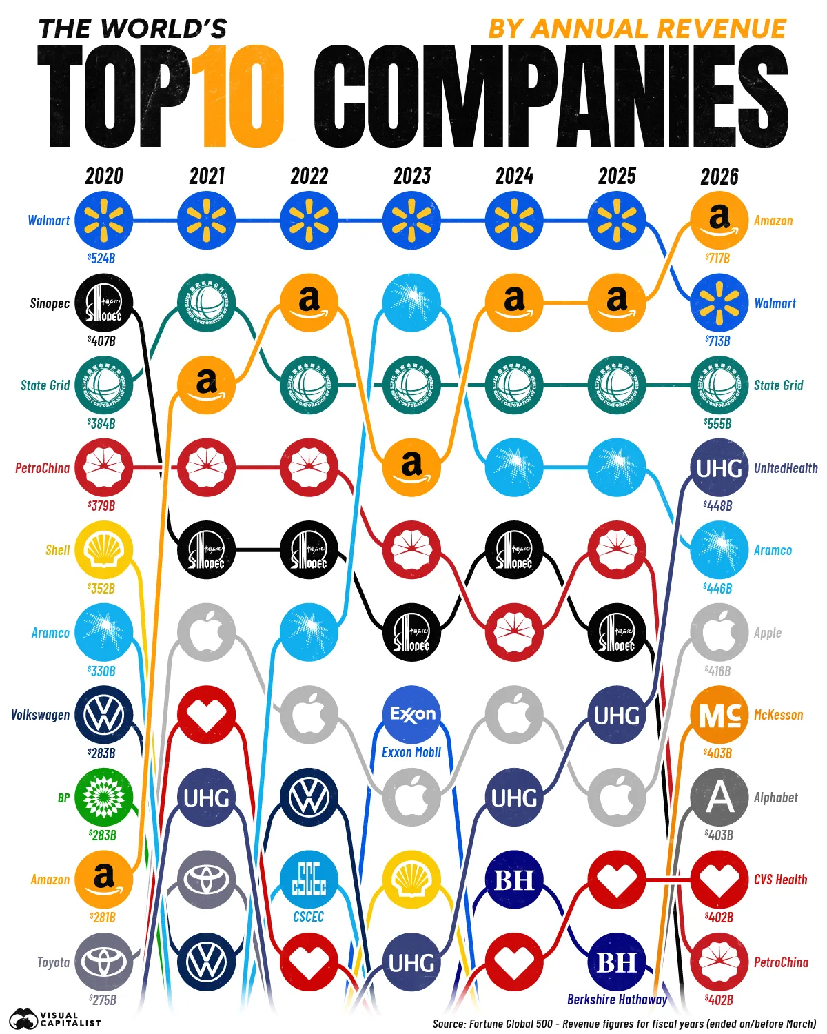
Look at this chart like a stock car race for revenue. From 2020 to 2026, logos whip around the track, some holding the lead, others sling‑shotting from the back of the pack. This is not a boring table of Fortune 500 stats; it’s a visual story of who actually grabbed the money. Let’s mine the biggest shakeups hiding inside this spaghetti of colored lines.
The Psychology Behind These Jumps
This one image quietly explains where the world decided to spend its money after 2020: less on pumping crude and building cars, more on shipping boxes, insuring health, and renting cloud servers. When you see Amazon leapfrog oil giants, or UnitedHealth out‑earning industrial behemoths, it reframes what a “big” business looks like. Use this chart as a gut‑check: are you building offers tied to rising rivers (logistics, data, health, recurring services) or clinging to shrinking ponds?
10 Revenue Shakeups Hiding in the Chart
- Amazon slingshots from 9th in 2020 to 1st in 2026 with $717B, overtaking Walmart’s long‑held crown.
- Walmart still posts a monster $713B in 2026 but finally loses an uninterrupted six‑year streak at #1.
- Chinese state giants like Sinopec, State Grid, and PetroChina slide down the rankings as tech and healthcare crowd in.
- UnitedHealth Group rockets from mid‑pack in 2020 into a top‑4 revenue machine by 2026.
- Energy reshuffles: Aramco climbs into the top tier while Exxon Mobil drops out of the 2026 top 10 entirely.
- Apple hovers just outside the very top but quietly builds to a hefty $416B by 2026.
- Healthcare surges, with CVS Health and McKesson both landing in the 2026 top 10.
- Auto titans like Volkswagen and Toyota fade from the leaderboard as services and data‑driven firms rise.
- Berkshire Hathaway sneaks into the top 10 mid‑decade, reflecting the power of diversified cash‑flow machines.
- Alphabet finally cracks the 2026 list at $403B, signaling ad‑plus‑cloud can now rival oil‑and‑steel money.
Real‑World Ripples From The Revenue Shakeups

Amazon uses its revenue surge to pour billions into same‑day logistics, AWS build‑outs, and new subscription hooks that lock in customer lifetime value.
UnitedHealth Group turns top‑tier revenue into an acquisition and data spree, tightening its grip on every step of the healthcare value chain.
Apple leverages its swelling revenue to push deeper into services like iCloud and TV+, smoothing out the hardware upgrade roller coaster.
Creative Variations
Analyzed by Swipebot
Loading analysis...
.png?width=3840&quality=80)