
Before/After shot for a product photography course
This ad nails it with one clear idea: show proof. The before/after shot of a honey bottle instantly communicates the...
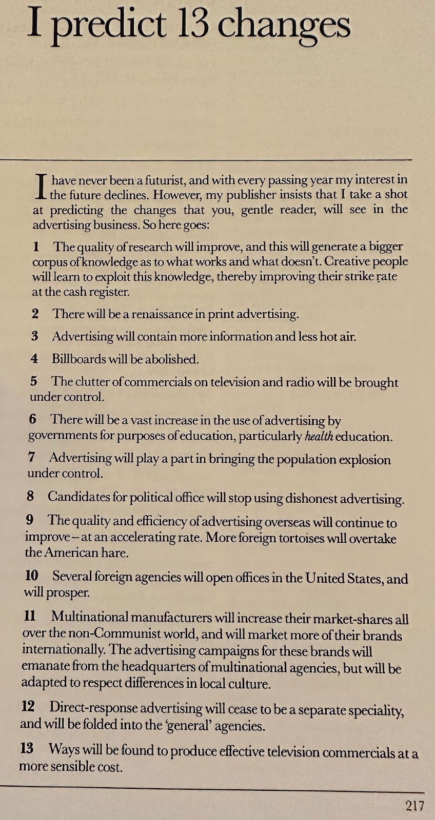
13 predictions from David Ogilvy from 1983
In 1983, David Ogilvy listed 13 predictions for the future of advertising. Some were spot on, others hilariously off. But...
Burberry logo going from simple to complex design
Over 120 years, Burberry’s logo tells a full story of design trends. It starts ornate, gets stripped down, and then...

Use images for math formulas
Marketing metrics are crucial, but math formulas can make people’s eyes glaze over. These visuals flip that problem by turning...

Simple visual + callout Twitter Ad
Ever scroll past an ad and instantly get what the product does? That’s what Monos pulled off here. Their Carry-On...

List of psychological triggers that make people buy
Joe Sugarman nailed what makes people buy. He listed 24 “psychological triggers” that explain why a product suddenly becomes irresistible....
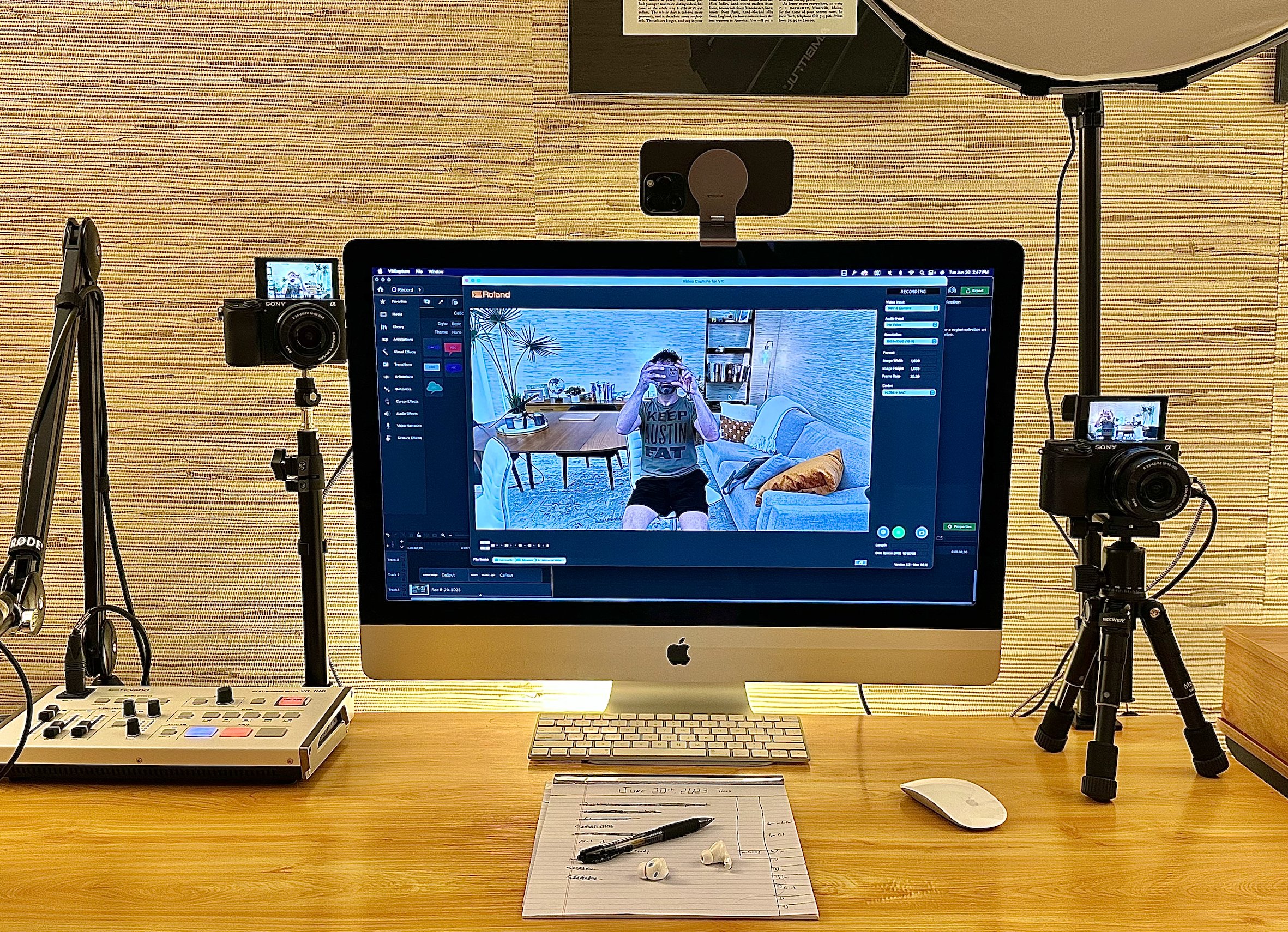
I used my iPhone as a webcam
Apple quietly made the iPhone double as a wireless webcam... and it's awesome. The GIF above shows how sharp it...

🎤 S.W.I.P.E.S. Email (Friday June 23rd, 2023)
Swipe📁 • Wisdom🧠 • Interesting🧐 • Picture🖼 • Essay📄 • Sketch✍🏼A fun email for Friday. I hope you enjoy!Edition: Friday,...
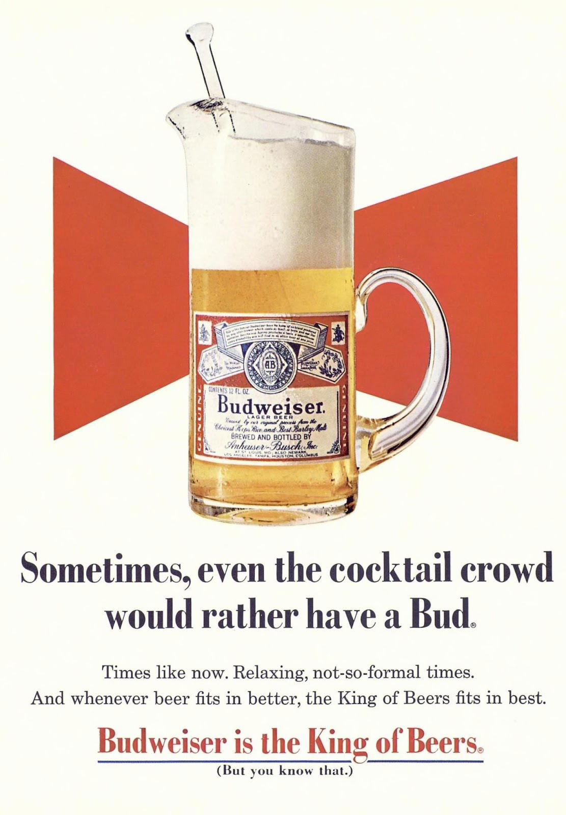
Budweiser’s ad reaching out to new audiences
In 1969, Budweiser pulled off a clever positioning trick. Instead of fighting with cocktails for attention, they joined the party—literally....

1966 version of a lead magnet download
Before email captures and landing pages, marketers had a slower lead magnet: the mail-in card. This 1966 Dodge Camp Wagon...
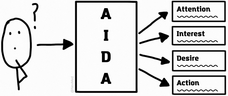
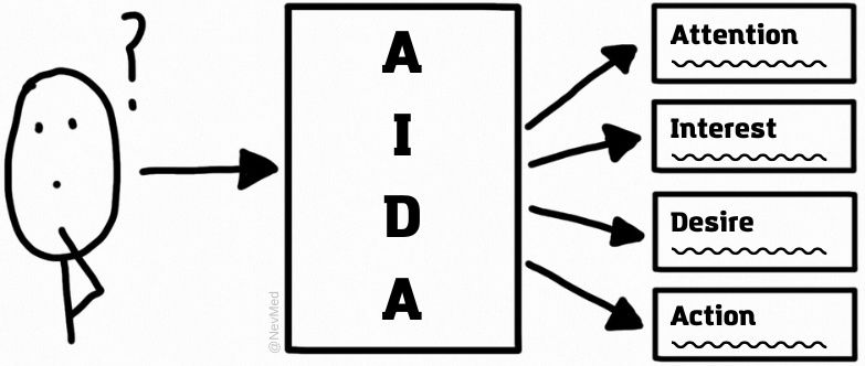
AIDA is still the best
This simple doodle nails what every marketer must master: AIDA. Attention. Interest. Desire. Action. It’s not sexy or new, but...

Pressure Washing Ad
This ad wasn’t painted or printed—it was pressure washed into a highway wall. A cleaning company literally used their own...
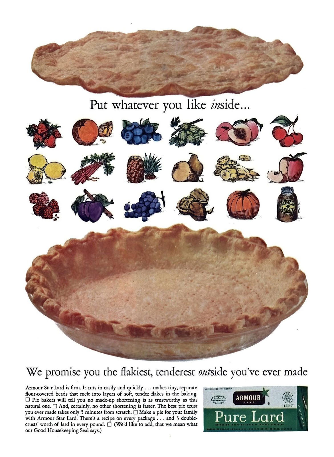
Cool way to show product possibilities
This vintage pie crust ad nails a classic marketing move: showing versatility. Instead of telling you how great their crust...
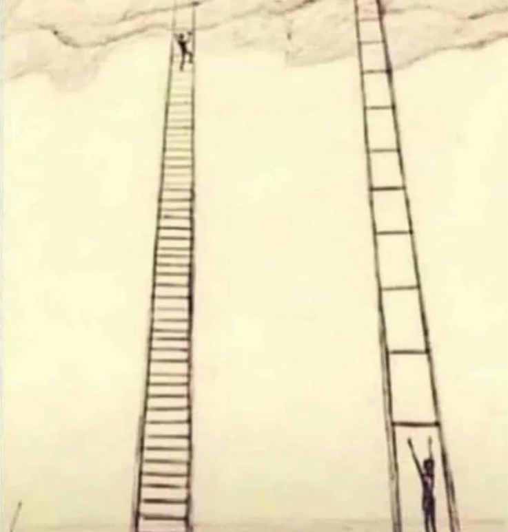
Take small steps
This image nails a simple truth: success is easier when you take small, reachable steps instead of giant, impossible ones....

Pricing the process, not the output
Most freelancers undercharge because they only price the final output — like a logo or ad copy. But as you...

The Wright Brothers Bicycle Ad
Before they built airplanes, the Wright Brothers sold bicycles. This old newspaper ad for their “Van Cleve” bike looks simple...
Copywriting Formulas
This hand-drawn chart nails one of the simplest and most powerful tools in copywriting: AIDA. It’s old-school, but it’s everywhere...
🎤 S.W.I.P.E.S. Email (Friday June 16th, 2023)
Swipe📁 • Wisdom🧠 • Interesting🧐 • Picture🖼 • Essay📄 • Sketch✍🏼A fun email for Friday. I hope you enjoy!Edition: Friday,...

Budweiser “don’t add salt” Ad
Back in the day, people thought adding salt made beer better. Budweiser wasn’t having it. Their ad shouted “Don’t!” over...

Cool Econoline Van Ad
This ad didn’t need words. Just a bright orange Ford Econoline sitting on a beach, looking like the hero of...
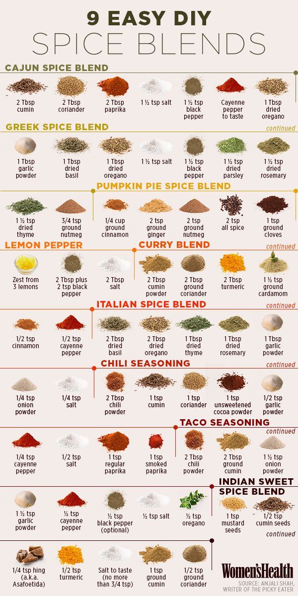
Much information, Very Small Space, Many Educational
This “9 Easy DIY Spice Blends” graphic from Women’s Health nails one thing marketers always chase: turning complex info into...

Grabbing coffee headline
This vintage Maxwell House ad is a masterclass in dramatic curiosity. The headline screams “AMAZING COFFEE DISCOVERY!” — then teases...

Kool-Aid Benefits Ad
This ad makes a simple red drink look like the smartest financial and “health” decision ever. The smiling pitcher grabs...

Meme Ad from HeroPost
This ad from Heropost uses a popular meme format to make a strong pricing statement. Instead of boring charts or...