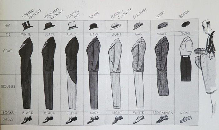
Cool style guide for 1920’s man
This 1920s men’s style guide is marketing gold in disguise. One image, zero fluff, and an instant understanding of an...

CRO -vs- Copywriting -vs- Digital Marketing
This Google Trends graph says it all. While “copywriting” and “conversion rate optimization” barely budge, “digital marketing” skyrockets like crazy....

How women and men see colors differently
This graphic nails a marketing truth: people see the same thing differently. Literally. What looks like “red” to one person...

Simple ad for getting an Instagram username
This ad nails it. It's just a plain white square with text telling you exactly what you get: an Instagram...

🎤 S.W.I.P.E.S. Email (Friday August 4th, 2023)
Swipe📁 • Wisdom🧠 • Interesting🧐 • Picture🖼 • Essay📄 • Sketch✍🏼A fun email for Friday. I hope you enjoy!Sponsored by:...
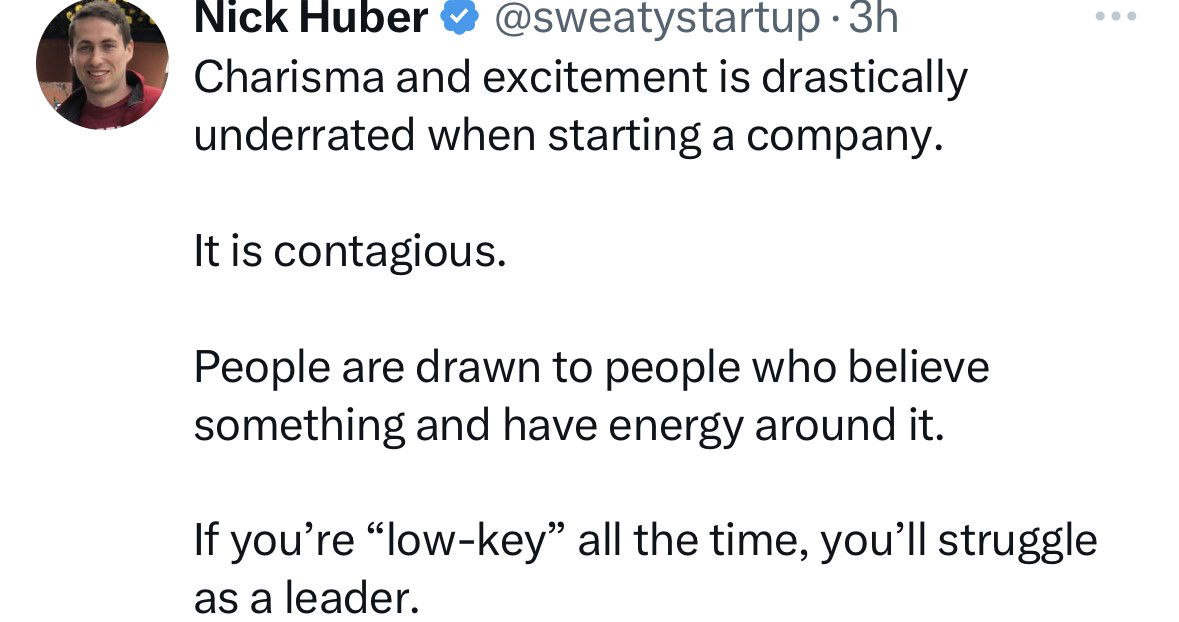
Charisma and excitement

20 year price changes of goods & services in the United States
Look at this chart. It’s 20 years of U.S. price changes. Hospital bills, college tuition, and childcare have gone through...
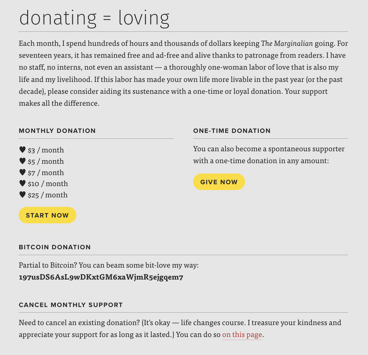
Donation subscription page
Maria Popova’s donation page for The Marginalian doesn’t shout, it whispers. It feels like a letter from a friend, not...

Age of the founding fathers of the USA
Crazy, right? Most of the Founding Fathers were in their 20s and 30s when the U.S. declared independence. This graphic...

“What is inflation” cool visualization
Ever tried to explain inflation? Most people glaze over. But this photo nails it in one shot: a mountain of...

Great Newsletter Signup Pop-Up
This pop-up from Copywriting Course nails the basics: a clear offer, a friendly face, and an easy action. It’s direct,...
Super easy product explainer video
Ever seen a complex tool explained in less than a minute? This product automatically creates YouTube chapter timestamps and uses...
🎤 S.W.I.P.E.S. Email (Friday July 28th, 2023)
Swipe📁 • Wisdom🧠 • Interesting🧐 • Picture🖼 • Essay📄 • Splurge✍🏼A fun email for Friday. I hope you enjoy!Sponsored by:...
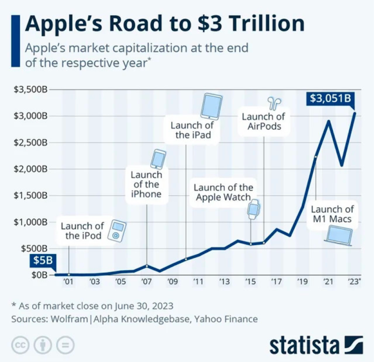
Apple’s Major Product Milestones to $3 Trillion
This chart shows Apple’s growth from $5B to $3T, plotted alongside its biggest product launches. Each major spike mirrors a...
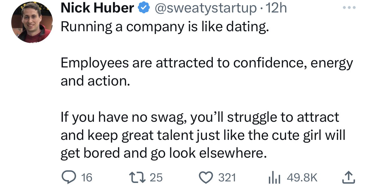
Running a company is like dating

Bitcoin to Fiat Transfer Graphic
This image explains complex technology in seconds. It shows how sending Bitcoin is a direct, peer-to-peer process, while fiat payments...
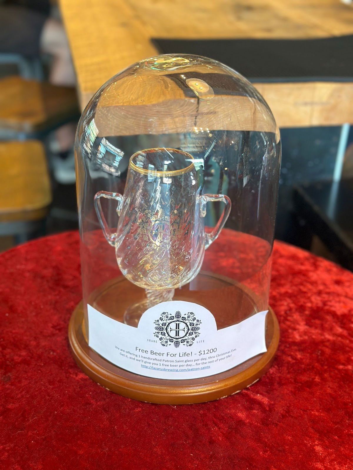
Free beer for lif
During the pandemic, Lazarus Brewing pulled a clever stunt: buy this fancy “Patron Saint” glass for $1200 and get one...
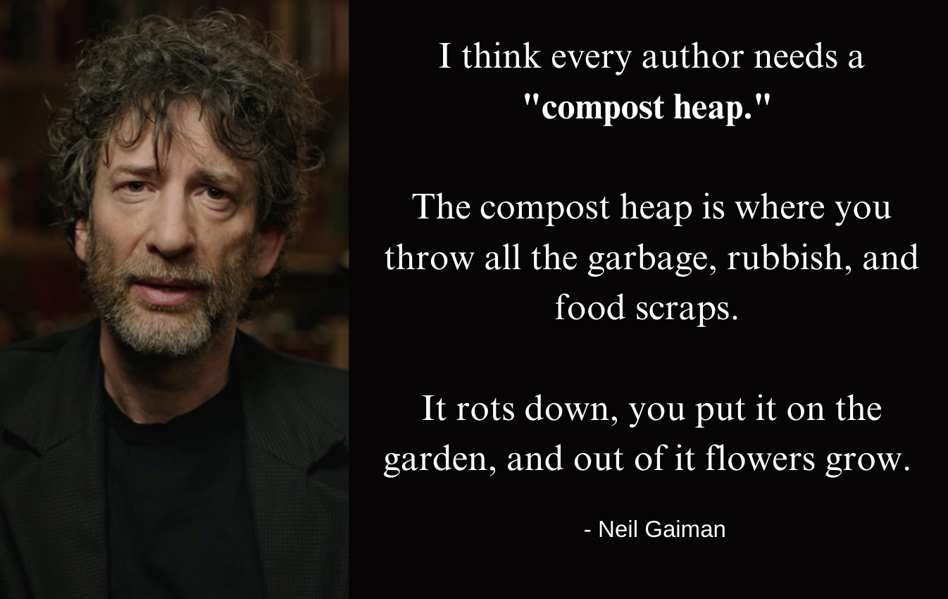
Neil Gaiman quote
Neil Gaiman talks about every creator needing a “compost heap” — a place to throw all your creative scraps. For...

MasterClass “high touch” sales sequence
MasterClass doesn’t just drop a pricing page in your face. Instead, it walks you through a 6-step “pre-purchase journey” that...

Synthesia home page
Synthesia nails the “show, don’t tell” rule of marketing. In one glance, you get what the product does, how fast...
🎤 S.W.I.P.E.S. Email (Friday July 21st, 2023)
Swipe📁 • Wisdom🧠 • Interesting🧐 • Picture🖼 • Essay📄 • Sketch✍🏼A fun email for Friday. I hope you enjoy!Edition: Friday,...

Great “Ours vs Other’s” product image
Ever seen a visual that just ends the buying debate? This Amazon image nails it. One side clearly says, “Here’s...
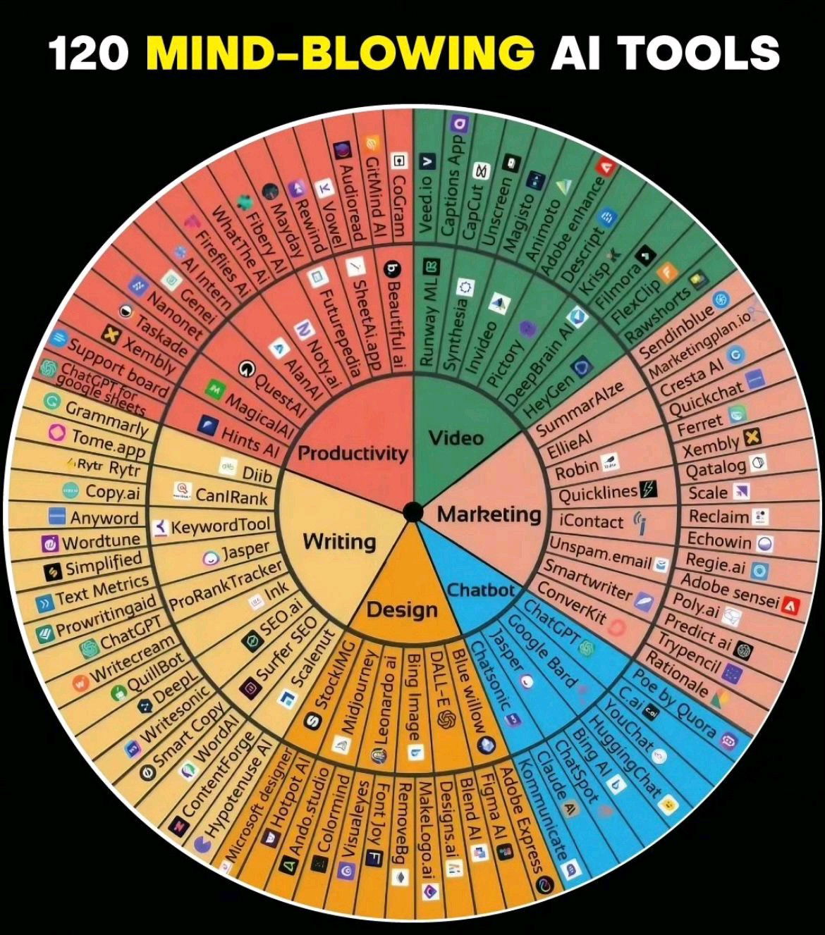
AI Wheel Chart
Someone took the “Feelings Wheel” (yes, the one from therapy offices) and remixed it into a wheel of 120 AI...

200 calories in different foods visual data
This image hits you instantly: same calories, wildly different portions. A Snickers bar or twelve clementines? The message lands before...