Why authors go with big publishers for their 1st book
Choosing between self publishing and a traditional publisher is like picking between a startup and a corporate job. One gives...
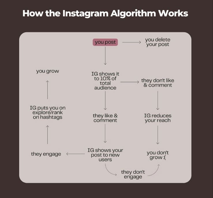
How the Instagram Algorithm Works Flowchart
This flowchart nails how Instagram’s algorithm really works: post → test with a small audience → boost if people engage...

Before & after graph for software.
This side-by-side chart from Waldo instantly shows why it beats ChatGPT for agencies. No long pitch. No jargon. Just clear...

Cool headline: Finding trends before they take off
Exploding Topics nails their homepage with one killer line: “We help companies find exploding trends before they take off.” The...
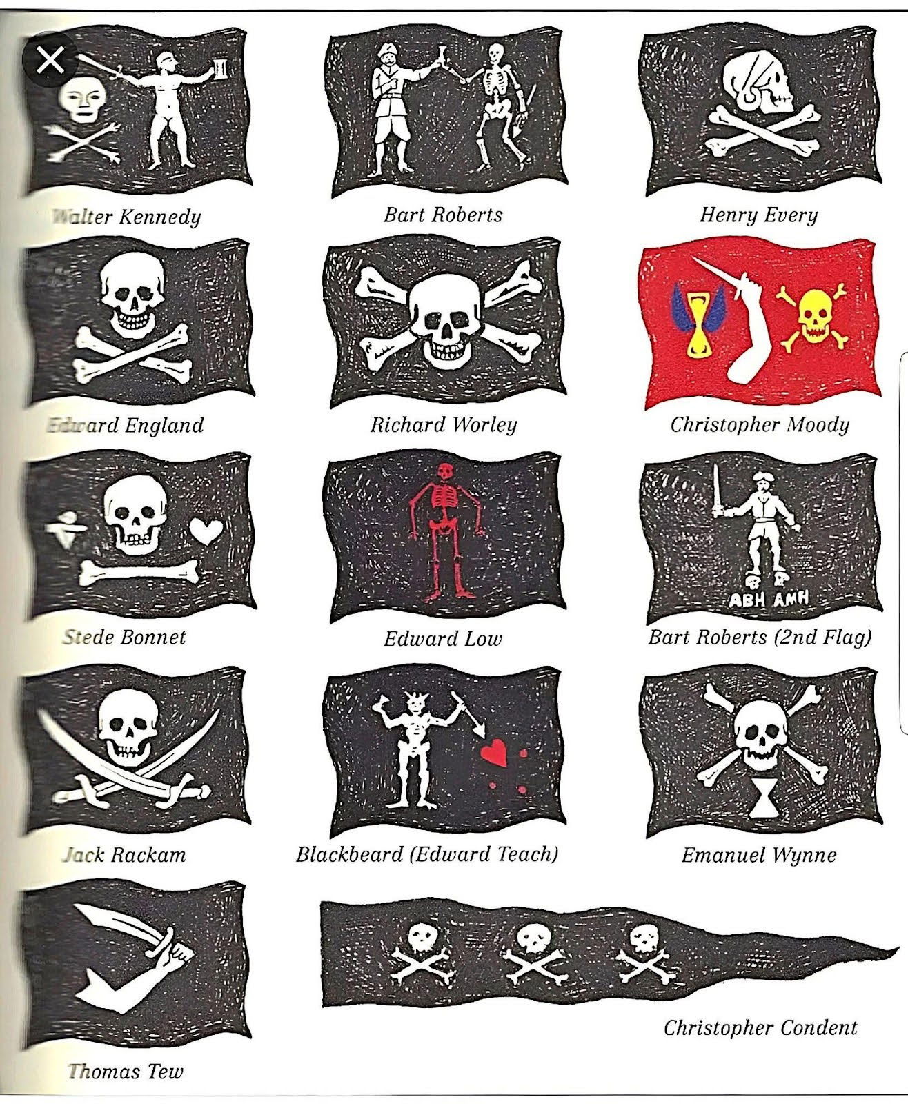
Different types of pirate flags
Pirates were masters of branding before branding was a thing. Each flag in this image told a story at a...
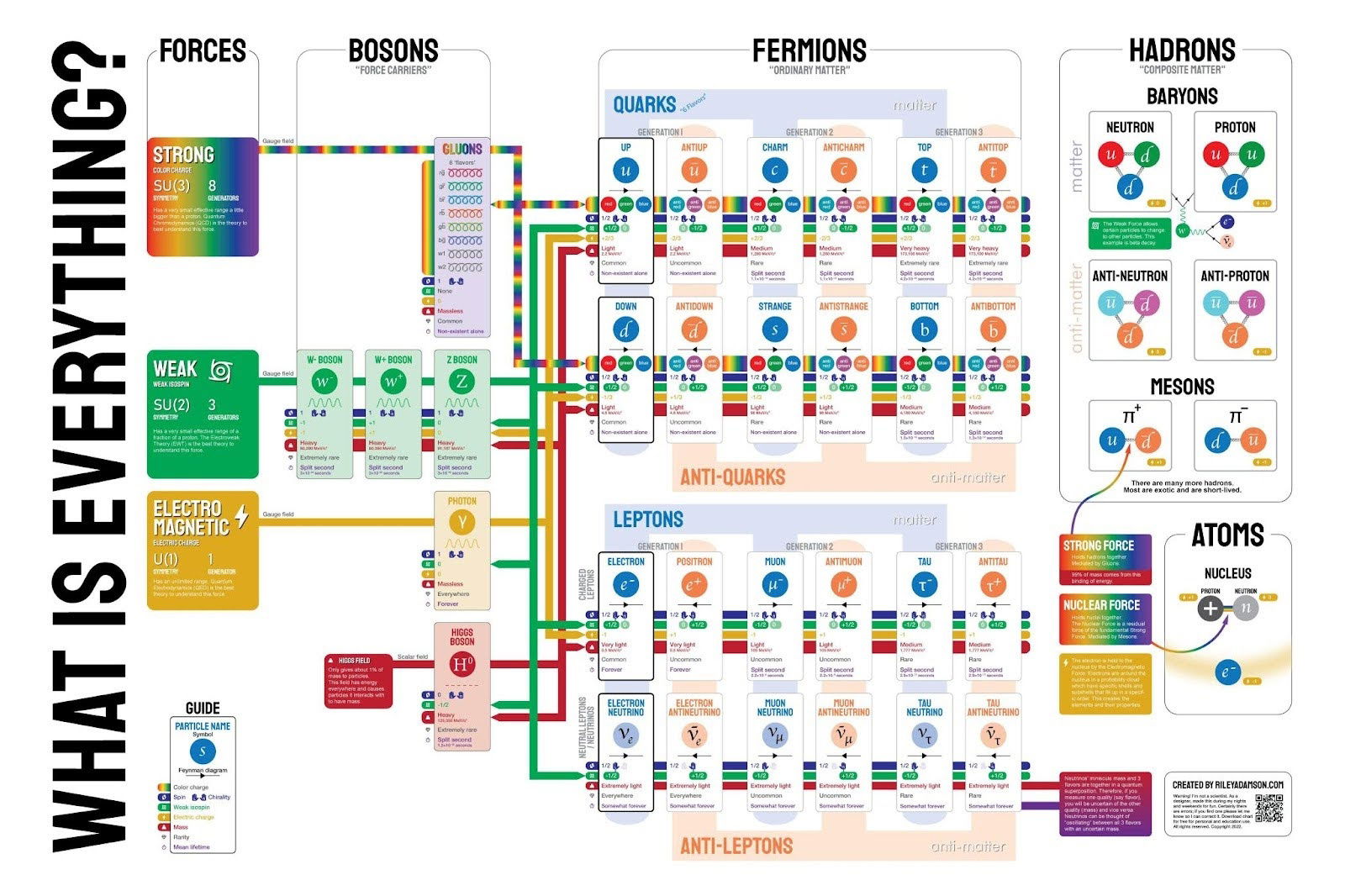
What is everything in Physics
This wild-looking infographic explains what literally everything is made of—down to quarks and leptons. It’s nerdy, detailed, and a bit...
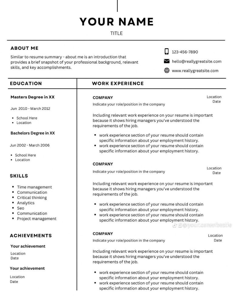
Simple Resume Outline Template
This resume outline nails what every marketer should love: clean, clear, and instantly scannable design. No fluff, no clutter, just...

Design Buildathon Timeline
This Design Build-a-Thon nailed its event timeline. Each date feels like a chapter in a story, from registration to the...
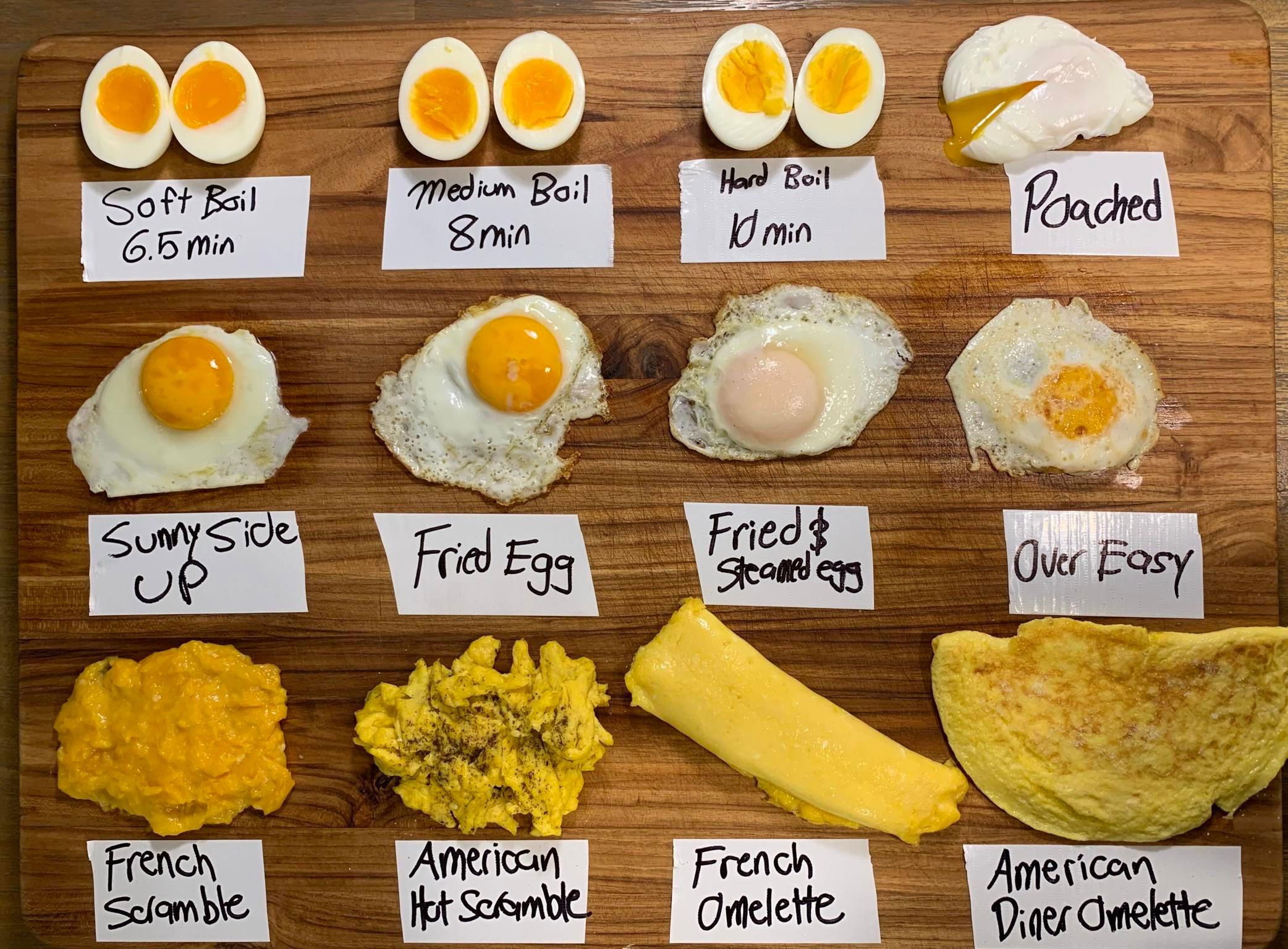
Different ways to make eggs
This egg chart is pure marketing genius. It shows twelve ways to cook an egg in one glance. No long...
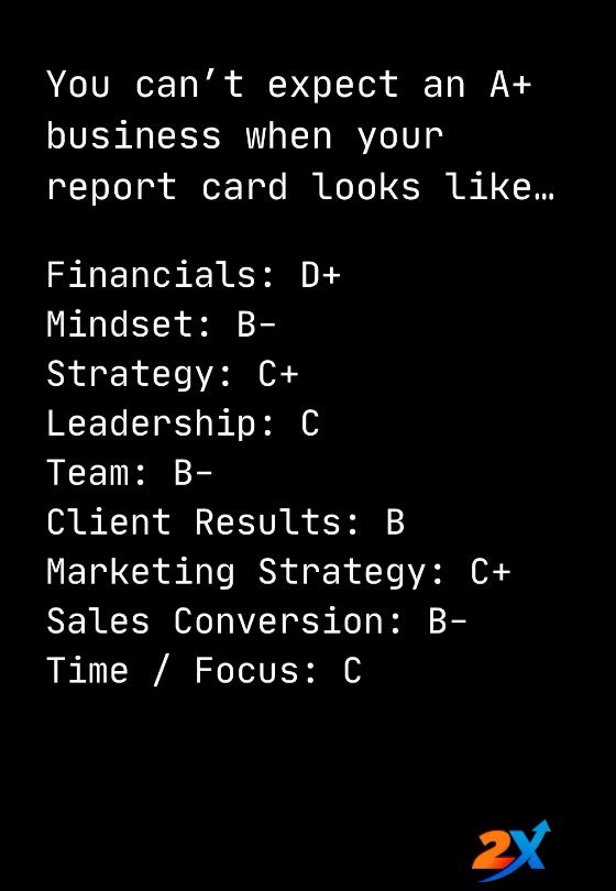
Wanting an A+ business with D+ financials
Ever seen a “business report card” like this one from Austin Netzley and 2X? It’s a gut punch in 12-point...
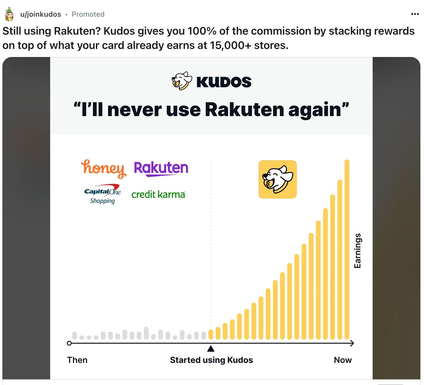
Kudos Earning's Chart Ad Posted on Reddit
This Reddit ad from Kudos nails the “show, don’t tell” principle. Instead of a long pitch, one glance at the...

Fill Your Calendar With Customer Calls
Hiten Shah’s calendar is packed—and he’s thrilled about it. Why? Because many of those meetings are customer calls. He calls...

What Do Americans Spend the Most on Each Year
Ever wondered where your target audience’s wallet really goes? This chart from Qualtrics shows that the biggest slice of American...
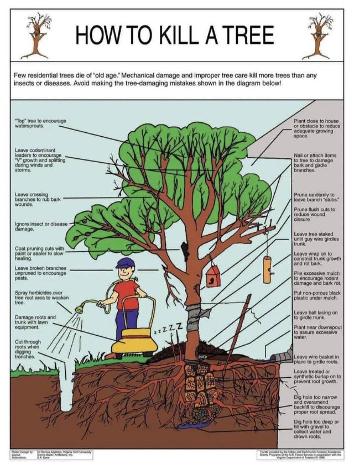
How To Kill a Tree (what not to do when growing a tree)
This tongue-in-cheek diagram doesn’t actually teach you how to destroy trees—it highlights how small mistakes can slowly kill them. It’s...
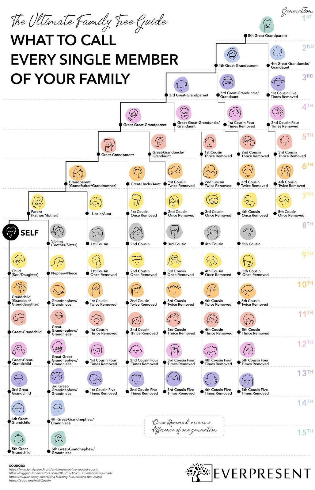
What to call every single member of your family chart
This Everpresent “Family Tree Guide” is a masterclass in making complicated info feel fun and understandable. Family connections across 15...

Pod 5 new upgrade ad for Eight Sleep
Eight Sleep nails the “upgrade offer” with this clean, visual email comparing the Pod 3 to the new Pod 5...

Kudos vs Rakuten comparison ad
Kudos didn’t make a fancy brand film. They made a side-by-side chart calling out Rakuten and showed why they’re better....

No matter how rich and famous you become you just end up hosting a podcast
This El Arroyo sign nails it: everyone rich and famous eventually hosts a podcast. The joke is funny because it's...
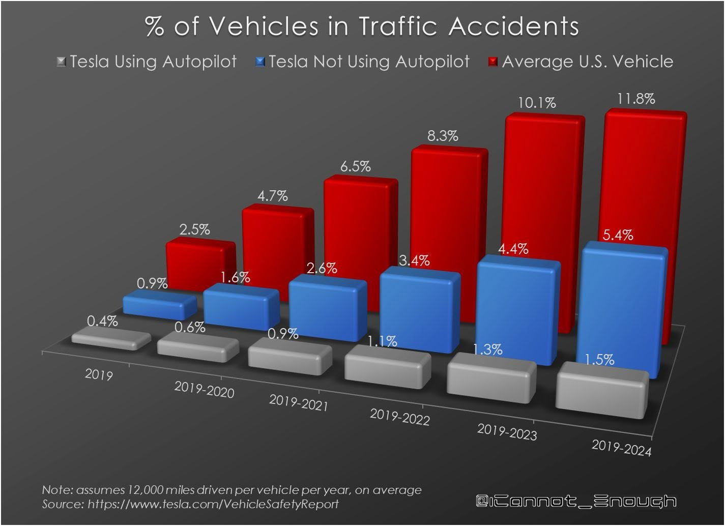
Percentage of vehicles in accidents
This Tesla chart shows something wild: accidents drop the more the car drives itself. Humans cause more chaos than code....

Jaspr Air before/after
Look at that: “97.1% less mold in 1 hour.” That’s ultra-specific. Not “kills mold fast” or “almost all mold gone.”...
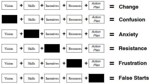
The elements of change: what happens when one is missing
This chart nails it: lasting change only happens when every ingredient is in place. Miss one, and things go south...
What do you think of this marketing take on unemployment?
AI isn’t coming for all marketers—just some. The game has split into three levels, and knowing where you play determines...
Hire slowly, fire quickly. But always with empathy.— Ayman Al-Abdullah
You can get people to pay for your product before building a bunch of marketing.
Jason Cohen (founder of WP Engine) said he had 30 people ready to pay $50/month before he had a name,...