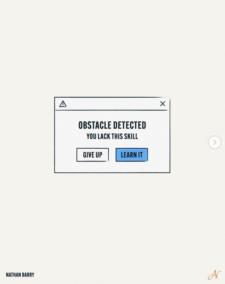
That image says it all: a fake error box pops up with two buttons when you hit a wall — “Give Up” or a bright blue “Learn It.” Most people think obstacles are a stop sign. This turns them into a shiny button you almost *want* to click. Make learning feel that obvious in your life and business, and suddenly every roadblock becomes a feature, not a bug.
Turn Every Error Message Into a Menu
The tiny popup reframes failure as a choice screen, not a verdict. “Obstacle detected: you lack this skill” is just diagnostic text. The moment you label the gap, you can either emotionally alt+F4 out of the project, or hit the blue “Learn It” button and upgrade yourself. The design trick here is how binary and visual it feels. No drama, no story, just: pick a button.
The Psychology Behind the Blue Button
Notice how the “Give Up” button is plain and the “Learn It” button is bold and blue. That tiny visual nudge mirrors what you should build into your environment: make quitting boring and learning attractive. Default bookmarks, auto-enrolled trainings, standing office hours, even small rewards for finishing a tutorial all act like that blue button. You’re not becoming more disciplined; you’re just making the better choice look clickable.
How to Make Learning Your Default Button
- Pre-write your internal dialog: when you hit something hard, say “Ah, skill gap detected” instead of “I’m bad at this.”
- Add a literal “Learn It” step to your workflow: one bookmarked course, doc, or mentor you go to before quitting.
- Shrink the click: commit to 10–20 minutes of learning, not a full reinvention of yourself.
- Track “skills unlocked” like achievements so your brain links obstacles with progress, not pain.
Creative Variations
Analyzed by Swipebot
Loading analysis...