Palantir’s Biggest U.S. Government Customers
Published on
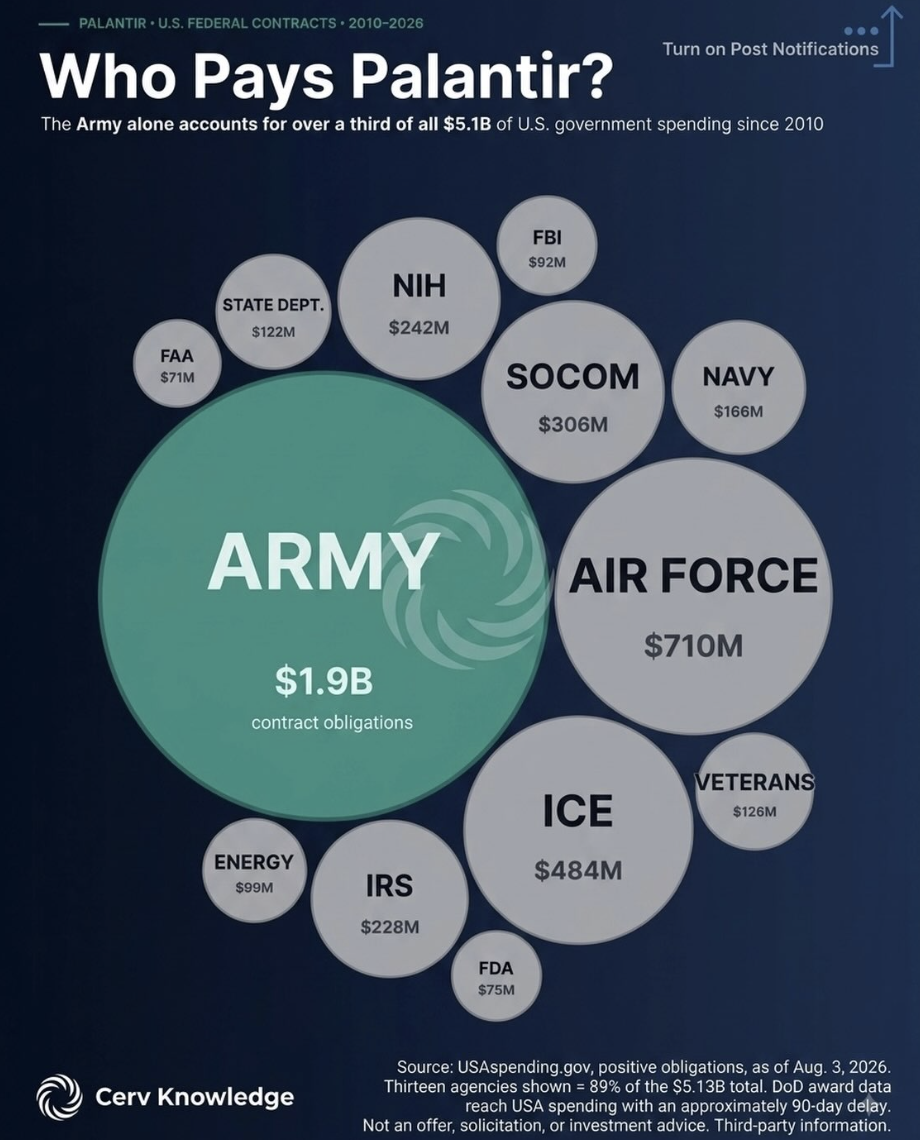
If you want to understand Palantir’s future, stop staring at stock charts and stare at this bubble chart instead. One giant green circle screams the story: the U.S. Army is Palantir’s cash cow, dwarfing every other agency on the board. This is not a cute diversification graphic… it’s a dependency diagram. Let’s pull out the takeaways hiding in plain sight.
What the chart is really saying
- The Army’s $1.9B commitment is over a third of Palantir’s $5.1B U.S. government haul since 2010, making one buyer the core business.
- The next closest spender, the Air Force at $710M, isn’t even half the Army bubble—everyone else (ICE, SOCOM, NIH, etc.) are just supporting characters.
- Thirteen agencies make up 89% of spend, but visually the design forces your eye to the Army, proving how powerful one oversized customer narrative can be.
- For investors and marketers alike, this graphic is a reminder: if one circle dominates your revenue map, your story (and risk) starts there.
How to steal this visual for your own story
Palantir turns a dry government-contract dataset into an emotional, one-glance story by letting the Army’s $1.9B bubble visually crush every other agency on the chart.
Cerv Knowledge packages public spending numbers into a shareable slide that instantly communicates customer concentration without a single buzzword.
Creative Variations
Analyzed by Swipebot
Loading analysis...