Riverside Stack Comparison Ad
Published on
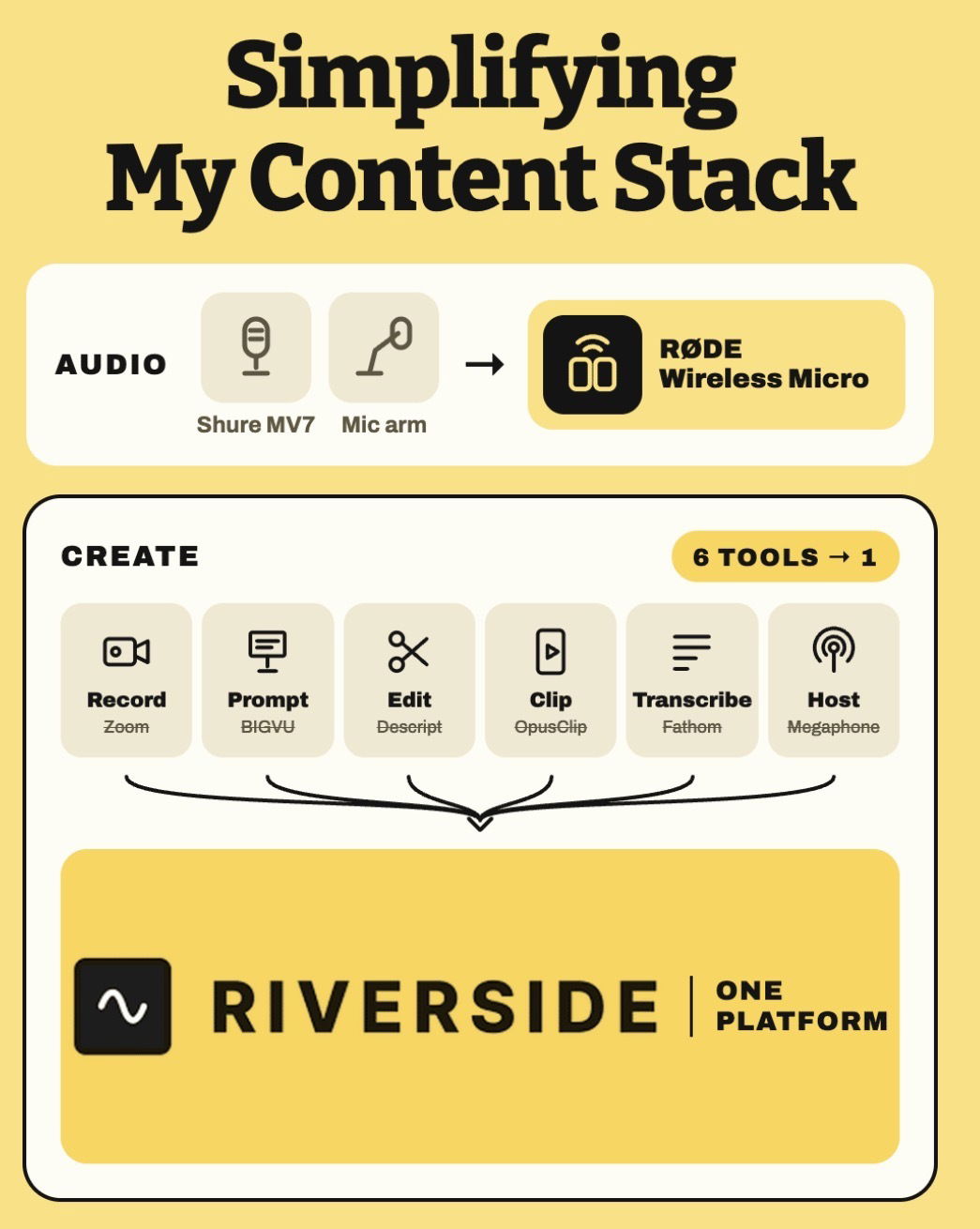
This graphic is a before-and-after of a chaotic content stack getting steamrolled into one clean lane called Riverside. Instead of juggling hardware, apps, and tabs, everything collapses into a single yellow box. If your workflow currently looks like a software junk drawer, this is what simplification actually looks like on-screen.
From Six-Tool Circus to One Platform
The image walks through a full creator workflow: recording on Zoom, prompting in BIGVU, editing in Descript, clipping with OpusClip, transcribing via Fathom, and hosting on Megaphone. All six logos sit in a row, then a pair of arrows drag them straight into one big Riverside block labeled “ONE PLATFORM.” Even the audio gear gets simplified, swapping a Shure MV7 plus mic arm for a single wireless mic. The whole visual screams: fewer tools, same outcome, less hassle.
Why This Visual Hits So Hard
- Side‑by‑side icons make you instantly count how many tools you’re overpaying for.
- The big yellow Riverside box is visually larger than any single tool, signaling “this replaces all of them.”
- Simple arrows create a clear transformation story: many scattered steps condense into one workflow.
- The matching color palette ties hardware and software together, selling a fully unified setup, not just another app.
How Other Brands Could Steal This Layout
Notion could show five scattered apps for docs, tasks, wikis, notes, and databases all funneled into one clean Notion workspace block.
Canva could line up separate tools for stock photos, fonts, presentations, and social posts then merge them into a single bold Canva canvas.
Creative Variations
Analyzed by Swipebot
Loading analysis...