1,913 Images and Illustration Examples That Teach Things
Drawings and illustrations and photography can transmit more information from human-to-human than text can. This board is perfect for designers and marketers seeking visual inspiration.

High converting product page
Ever wished you had a formula for turning any webpage into a sales machine? This ConversionWise breakdown nails it. It...
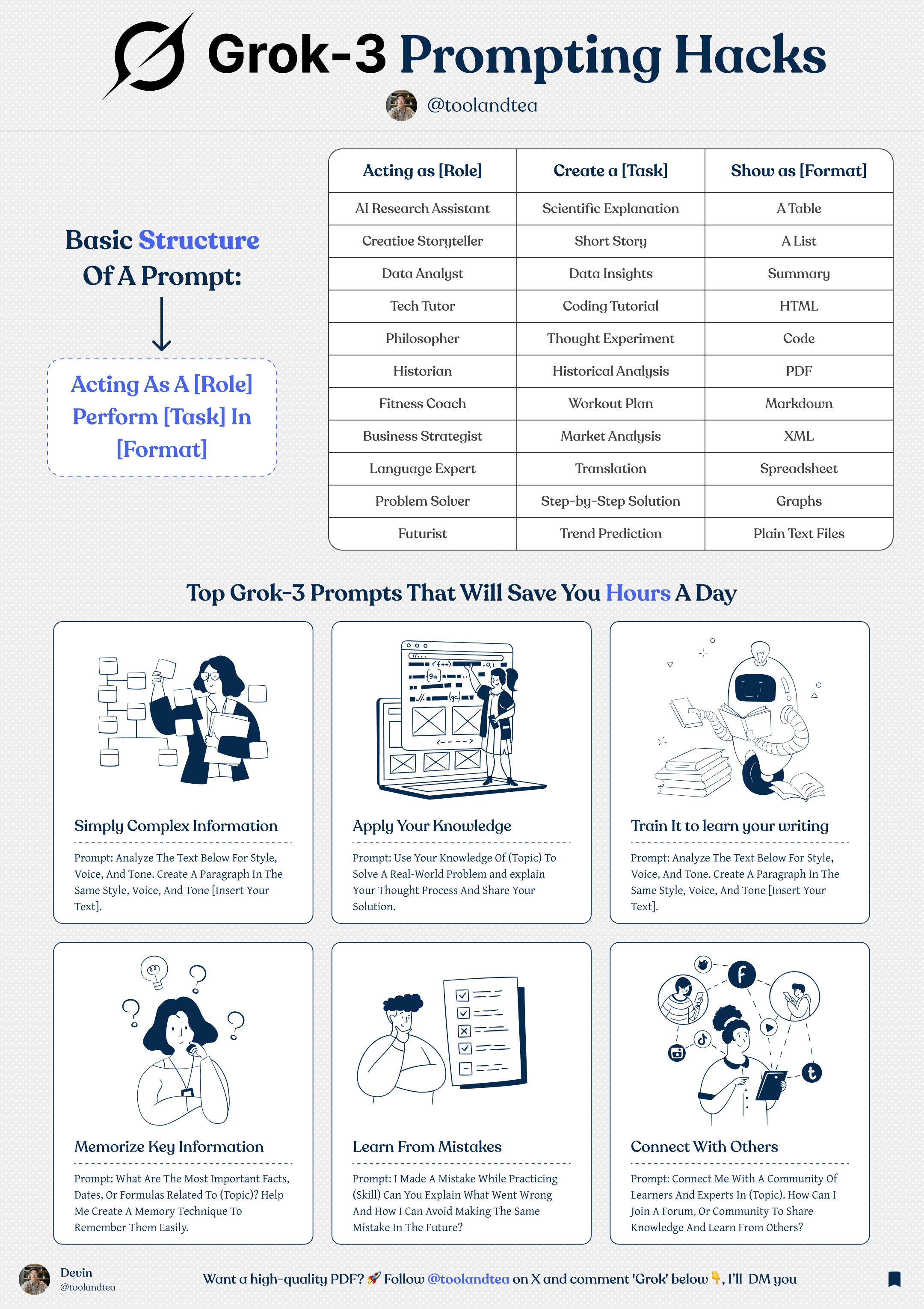
Grok 3 AI Prompting Hacks
Want better answers from ChatGPT (or any LLM)? Use this simple prompt formula from @toolandtea’s visual guide: Acting as [Role],...
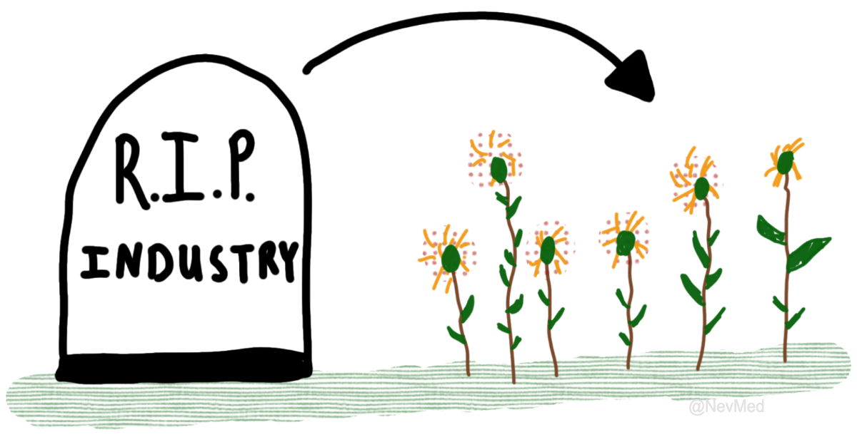
Death of an industry then re-birth of another industry
That drawing nails it: industries don’t just die—they compost into something new. For marketers, that’s a signal to spot opportunity...
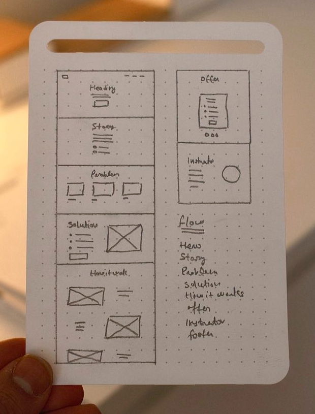
Hand drawn website wireframming
Before diving into Figma or Webflow, grab a pen. This hand-drawn website mockup shows the power of sketching ideas out...
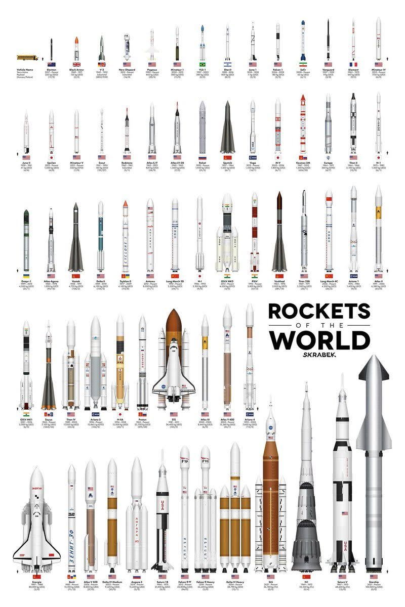
Rockets of the world
This amazing graphic shows rockets from all over the world side-by-side. Each one represents years of engineering, iteration, and competition....
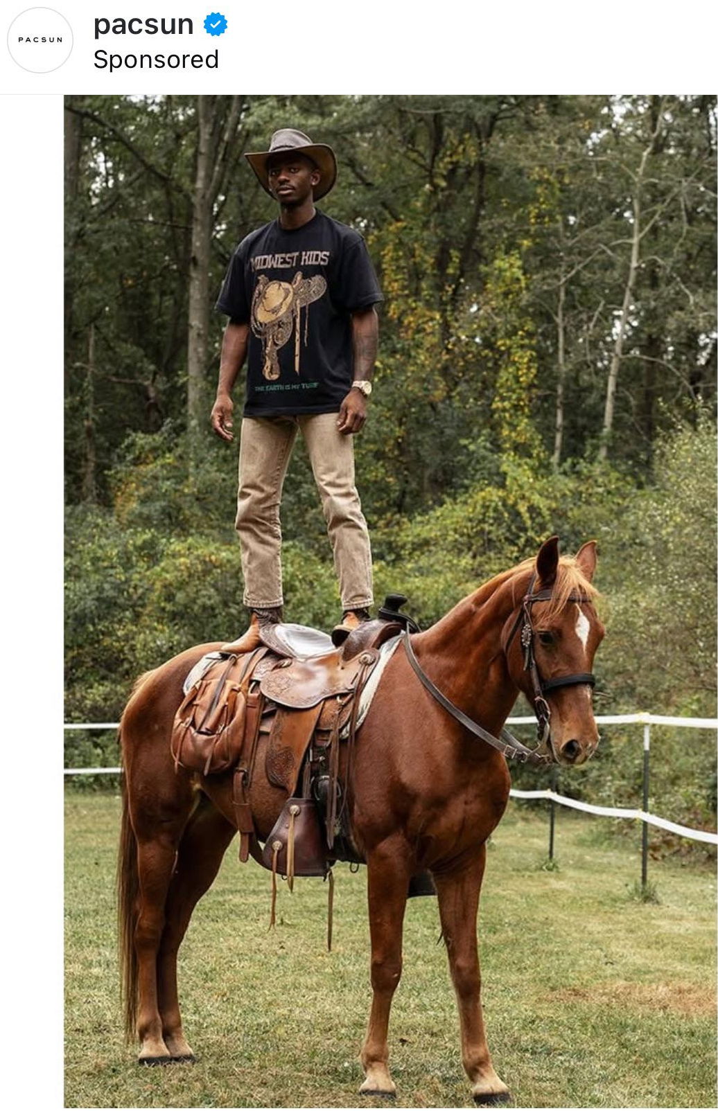
Pac Sun Standing on Horse Ad
Ever scroll through your feed and suddenly freeze because something looks “off” in a cool way? That’s what PacSun nailed...

Strawberry.me Coaching Ad
Ever feel like you're spinning your wheels? This ad nails that feeling with one simple image: a turtle flipped on...

Texas tiny pools social media image
This post from Texas Tiny Pools nails it. All they did was show a freshly plastered pool with the new...
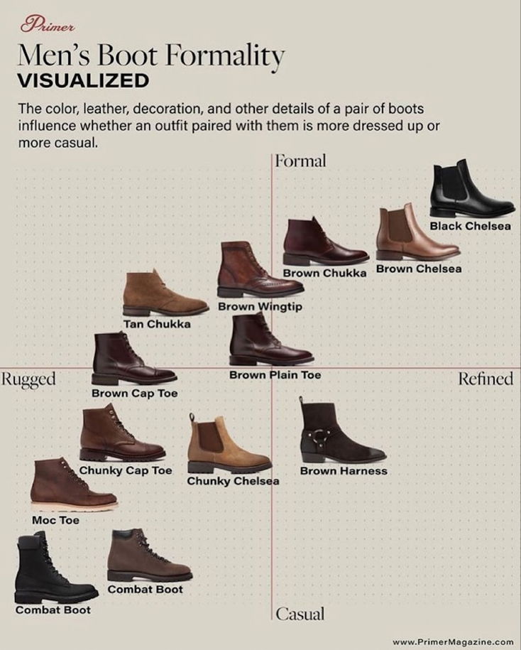
Men's Boot Formality Chart
This visual is a masterclass in product positioning—it literally maps out the customer’s options. You can see the scale from...
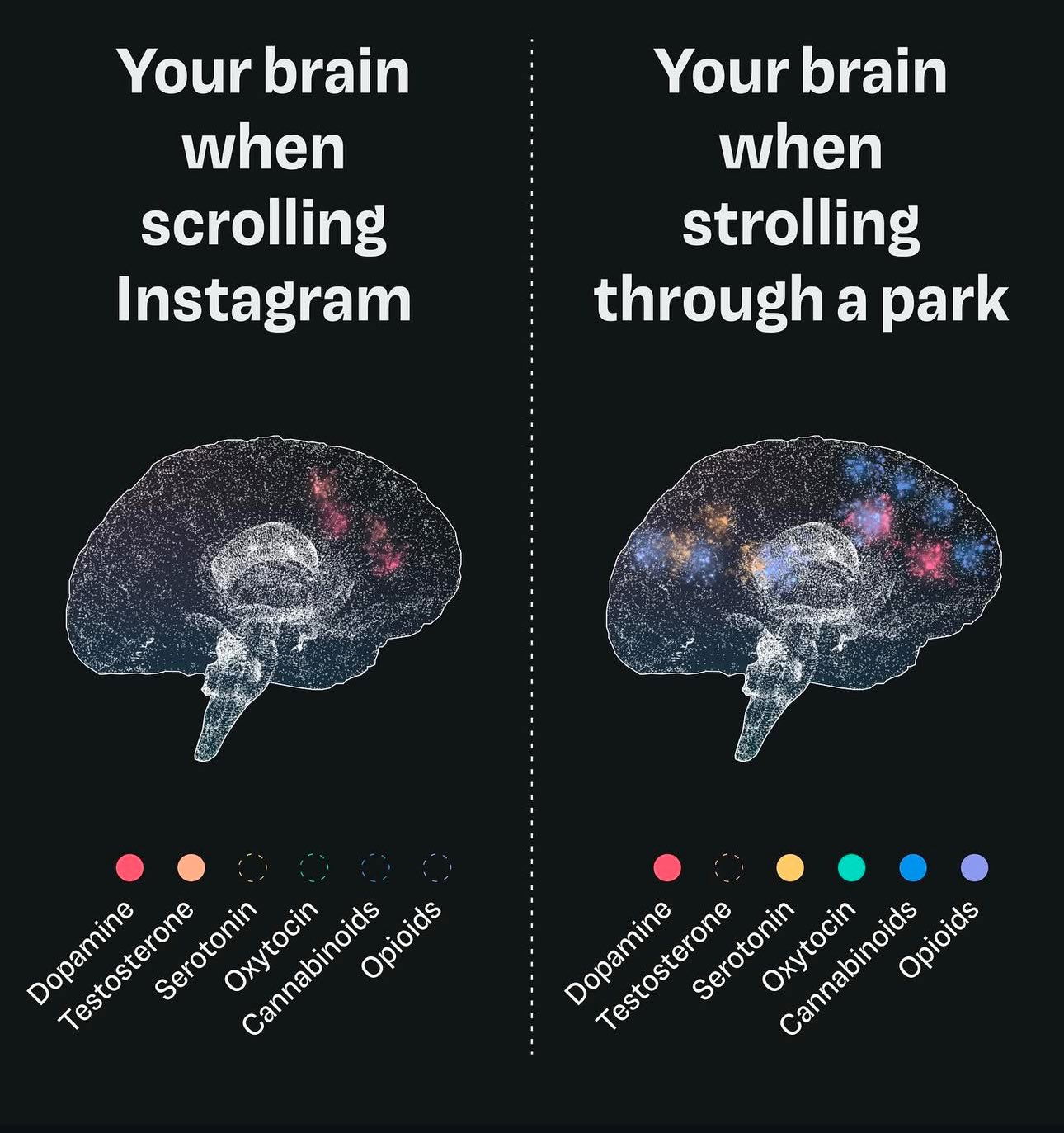
Your brain scrolling Instagram -vs- walking
This image nails what happens to your brain when you scroll versus stroll. One floods you with quick dopamine hits;...

Brick & Batten home transformation
Brick & Batten nails it with this before-and-after of a home makeover. One glance and you instantly get the value...
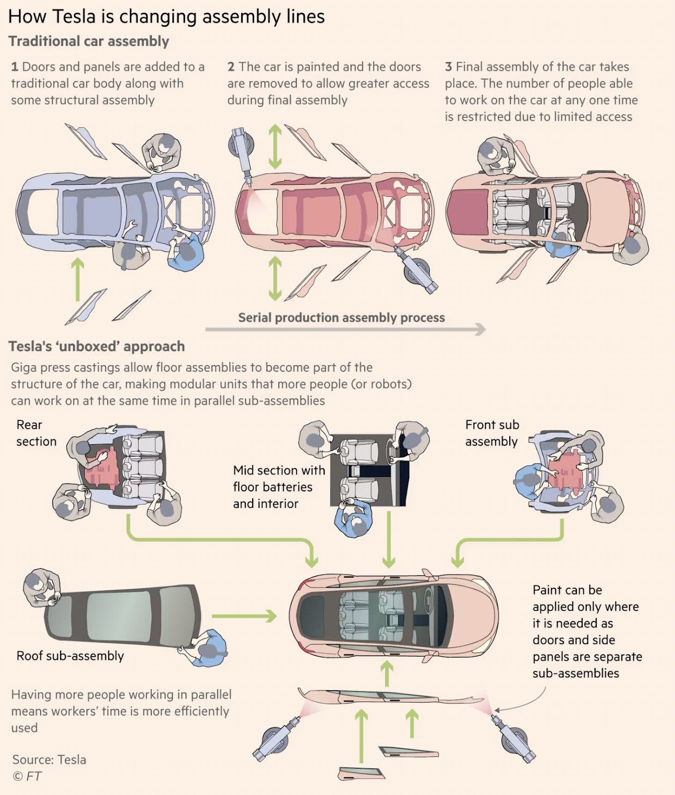
How Tesla is changing assembly lines
Tesla took apart the car assembly line like a marketer revamping a funnel. The traditional car build is a long...
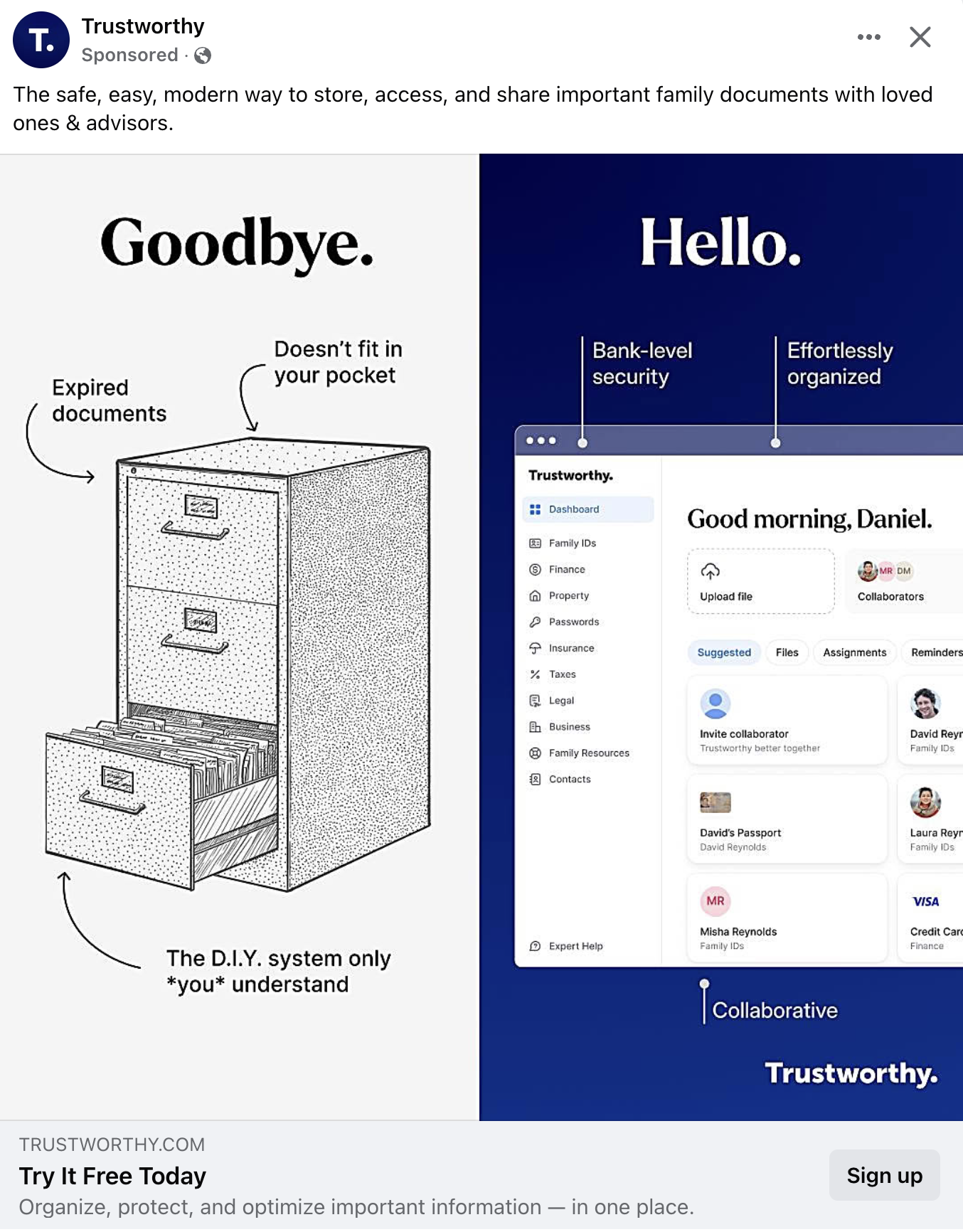
"Goodbye" to old file folders ad
This ad nails visual storytelling. Trustworthy uses a split image to show the pain of the old way (messy, outdated...
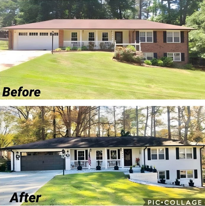
Before and After of a home transformation
This home makeover photo set is a masterclass in visual marketing. The “before” looks fine, but the “after” instantly commands...
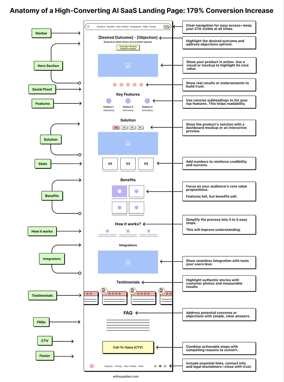
Anatomy of an AI SaaS Landing page
This landing page teardown maps every move that took a SaaS company from “okay” to “wow” — a 179% conversion...
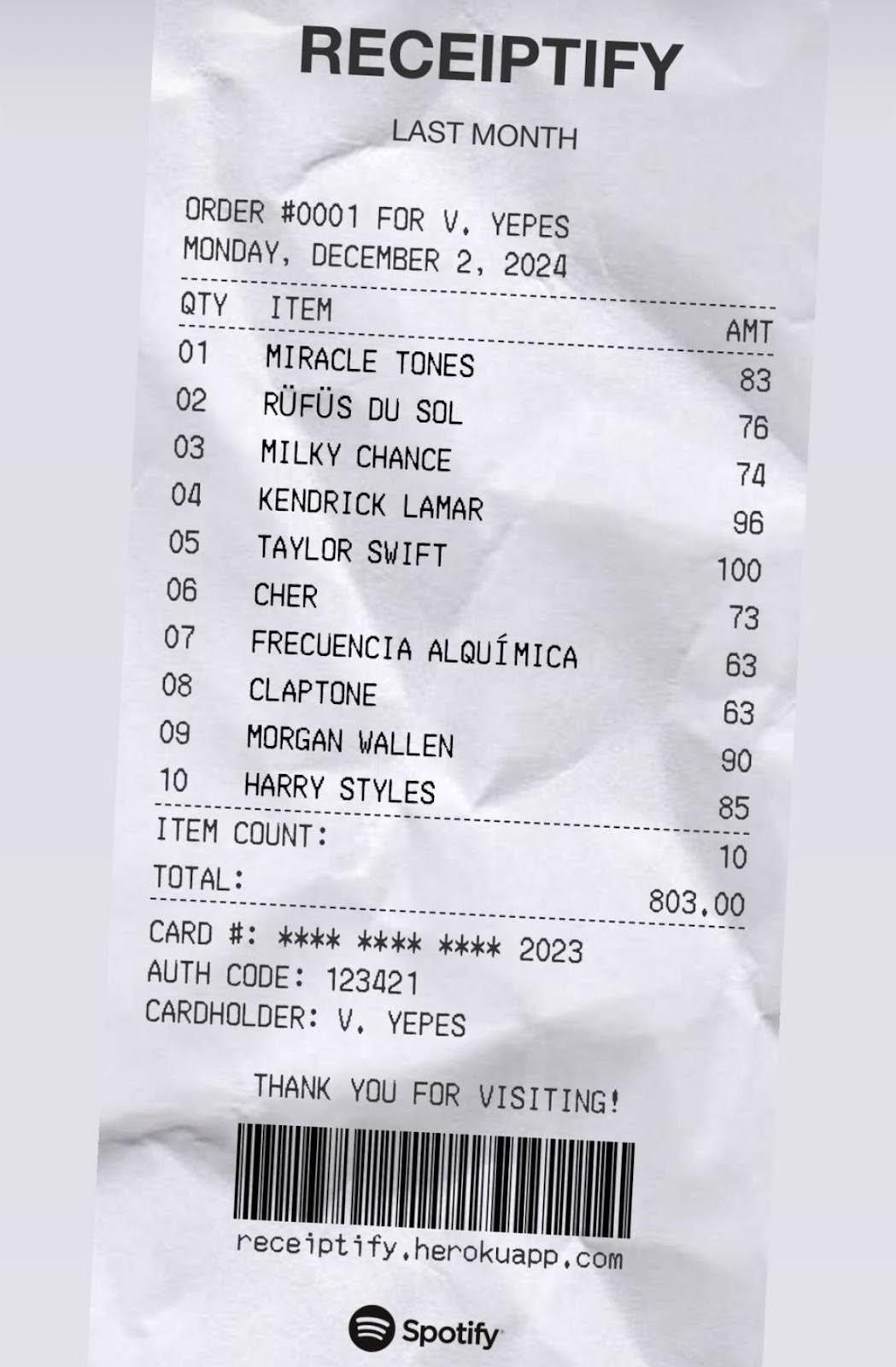
Funny Spotify Ad
Spotify nailed it with this “receipt” ad. It looks like a typical shopping bill listing all your favorite artists as...

The intersection of copywriting, design, and development
Great landing pages don’t just look good or sound clever — they work. And this diagram nails it: copywriting, design,...
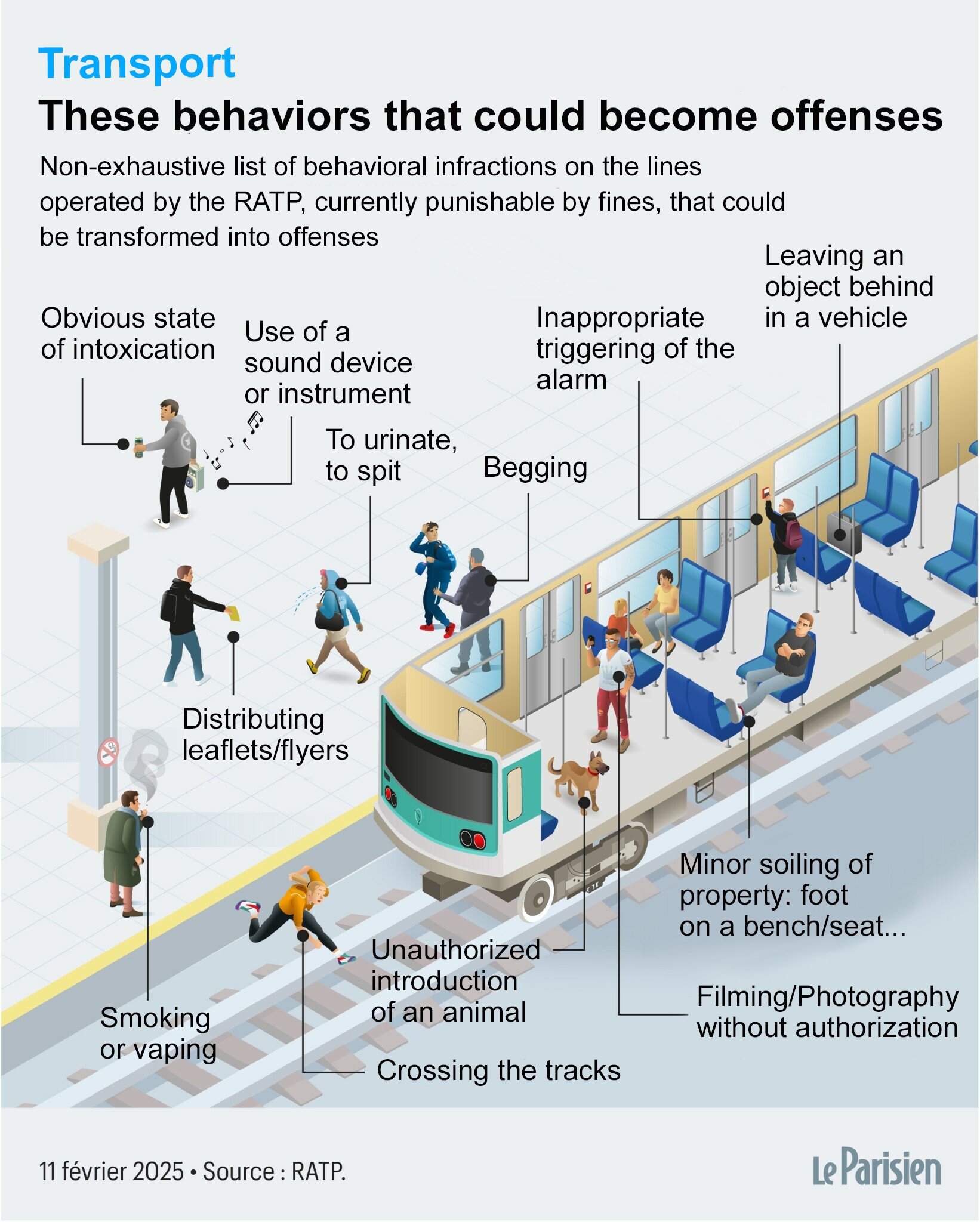
France considers banning public annoyances chart
France’s transit authority is cracking down on “habitual incivility.” Things like playing loud music, spitting, or leaving trash might soon...
What Tesla's train Full Self Driving (FSD) on
Tesla cars are like self-learning marketers. They record everything, feed it into a giant brain, and get smarter over time....
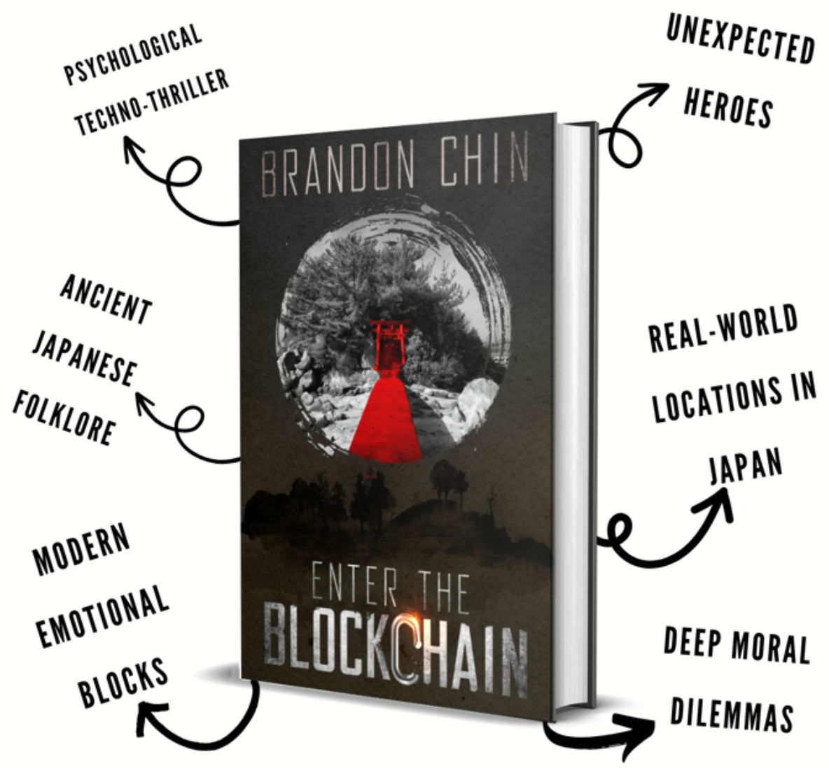
Book promotion with text mockup
It's hard to describe a book in one sentence. Author Brandon Chin nailed it with this visual from his Kickstarter...
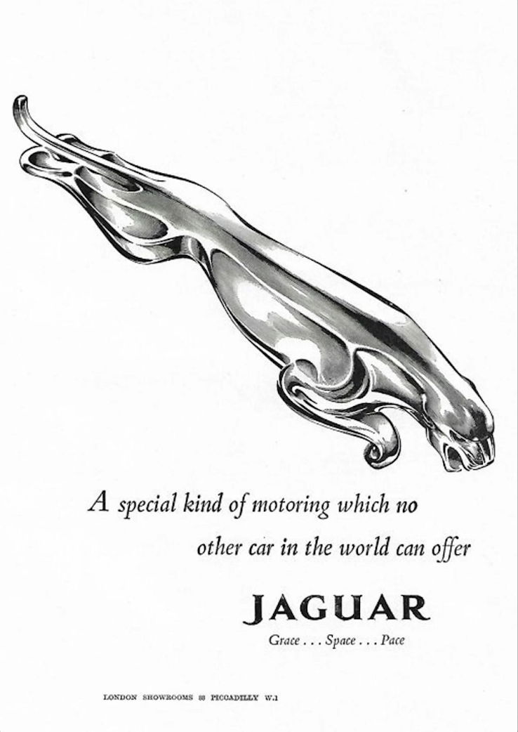
Jaguar social media ad
This old Jaguar ad nails luxury marketing with almost nothing on the page. Just a shiny chrome jaguar leaping across...
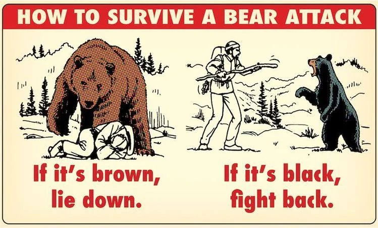
How to survive a bear attack jingle 🎶
This poster nails a core marketing lesson: rhyme + rhythm = recall. The bear attack instructions are memorable not because...
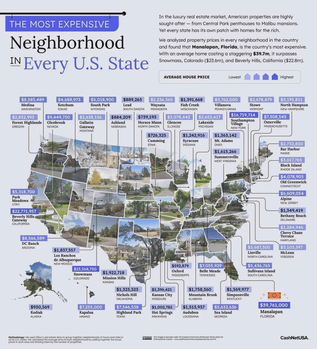
Most expensive neighborhood in each state
A plain spreadsheet of real estate prices is boring. But add photos, colors, and location labels, and suddenly you’ve got...
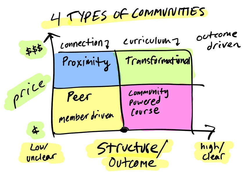
4 Types of Communities Chart
This chart by Jordan Godbey nails how community type drives price. Each quadrant shows how structure and connection change the...