1,913 Images and Illustration Examples That Teach Things
Drawings and illustrations and photography can transmit more information from human-to-human than text can. This board is perfect for designers and marketers seeking visual inspiration.

Visualization of Earth’s population
Ever read a stat that should blow your mind, but it just… doesn’t? That’s raw data without a visual story....

1958 “Features & Benefits” Adding Machine Ad
This Underwood Add-Mate ad is a masterclass in feature-benefit copywriting. It takes a boring product—a calculator—and makes it sound exciting,...

Product describes how it can dye your clothes a different color
This Rit ad from 1968 nails visual storytelling. One look at that bright yellow outfit and you instantly get the...
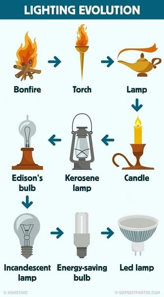
Fun “Lighting Evolution” Visual Chart
This chart shows how lighting evolved—from bonfires to LED bulbs. It’s a quick, visual lesson in innovation and how technology...

Velcro Ad Showing Results/Benefits of Product
This old-school Velcro ad nails one thing: simplicity. No jargon, no fluff—just a smiling woman showing how easy it is...

Shocking Visual Demonstration of Lethal Dose Drugs
These three vials show lethal doses of heroin, fentanyl, and carfentanil. No charts. No stats. Just a shocking visual that...

McDonalds promotion using the “Desire to Collect” trigger
In 1975, McDonald’s ran a masterclass in repeat sales. They launched “McDonaldland Glasses to Go” — six collectible glasses, released...

Visual demonstration of 400 calories of different foods
This image nails it. With just three stomachs, it shows how the same 400 calories can make you feel completely...
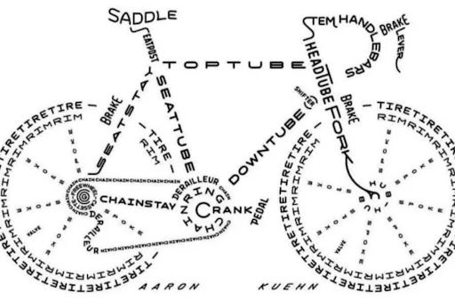
Awesome bicycle part labelling graphic
At first glance, this image looks like a slick line drawing of a bike. Look closer—every part of the bicycle...

Age Appropriate Chores List
This “Age-Appropriate Chores” chart is secretly a masterclass in marketing. It takes one universal job—teaching kids responsibility—and breaks it into...

Hilarious “Hot & Spicy” Pringles Ad
This Pringles Hot & Spicy ad doesn’t say a word—and it doesn’t need to. A guy literally heating a hot...
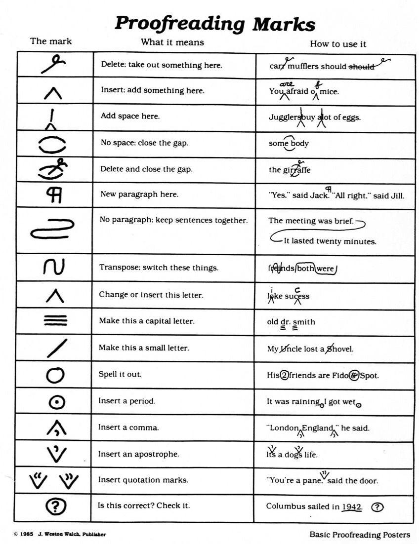
Physical writing proofreading markup symbols
Before Grammarly, editors had their own visual language for fixing text—proofreading marks. Each curl, caret, and circle told writers exactly...

How To Survive A Bear Attack Graphic
This bear survival graphic is a masterclass in message design. It’s visual, fast, and impossible to forget. In just two...

Nuclear Explosion Size Data
This chart comparing nuclear explosions doesn’t use boring bars or numbers. Instead, it shows mushroom clouds—each one bigger than the...
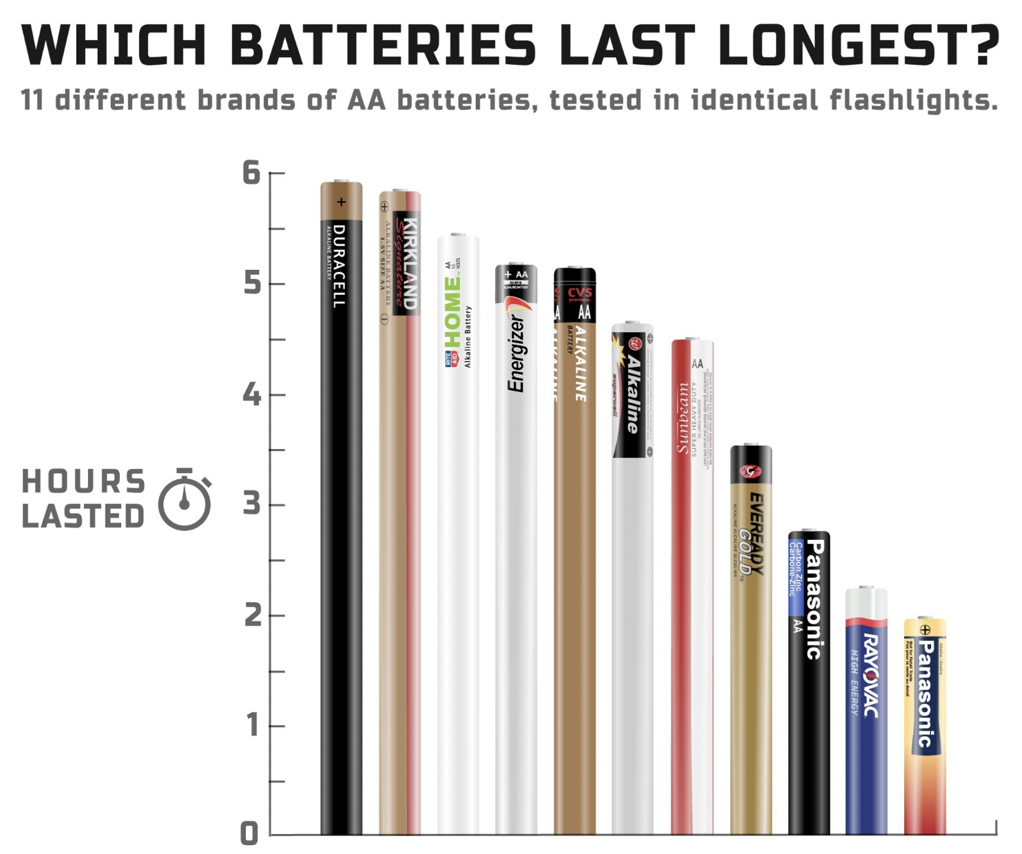
Clever “Battery Bar Chart”
This “Battery Bar Chart” turns a dull stat graphic into something you instantly get. Instead of colored bars, it uses...
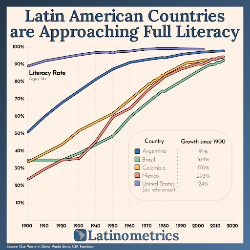
Great “zoomed out” view of literacy rates data
This chart from Latinometrics shows literacy rates in Latin America shooting past 90%. Day-to-day, the numbers don’t look explosive—but zoom...

Showing off the “call in” feature on a VCR
In 1989, Panasonic marketed something wild — a VCR you could call to record your shows. Forget your timer? No...

Cool Felix The Cat ad from 1959
This vintage Felix the Cat ad nails attention-getting design. One huge smiling cartoon, one short pun headline, and everyone instantly...

They're not buying a product, they're buying the transformation
This image nails it. You’re not selling a product. You’re selling transformation. Your customer is Mario, your product is the...

Email Marketing "Iceberg"
Ever hear someone say “email marketing is easy”? Show them this graphic. Most people see the tiny tip — writing...

History of the Telephone Ad
This 1964 Western Electric ad doesn’t just sell phones—it sells progress. It walks you through almost 90 years of innovation...
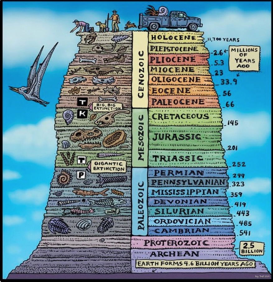
Geological Time Scale Chart
This chart by Rob Troll crams 4.6 billion years of Earth history into one colorful, scroll-stopping graphic. It’s not just...
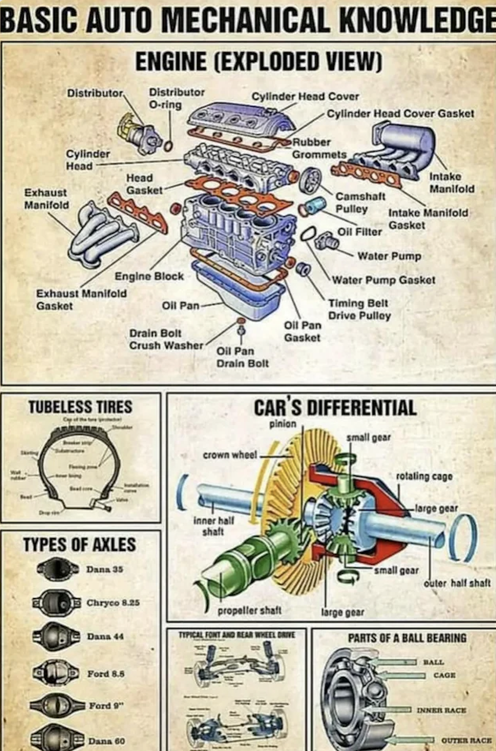
Basic Auto Mechanical Knowledge Drawing
Before CAD tools, engineers built entire airplanes and engines using just pen and paper. This diagram of a car’s mechanics...

The age you peak at everything
This chart showing when humans “peak” at different skills is a fun reminder that not everything grows linearly—some things rise...