2,048 Images and Illustration Examples That Teach Things
Drawings and illustrations and photography can transmit more information from human-to-human than text can. This board is perfect for designers and marketers seeking visual inspiration.

Sometimes the best marketing isn’t a fancy campaign. It’s a single, clear visual that nails the product’s main benefit—like this...

Miro’s Twitter ad doesn’t explain what their tool does. It shows it. A 14-second clip of a team collaborating in...

Rip Curl isn’t just great at surfing—they’re pros at marketing too. Their Campaign Monitor page shows how they use gorgeous...

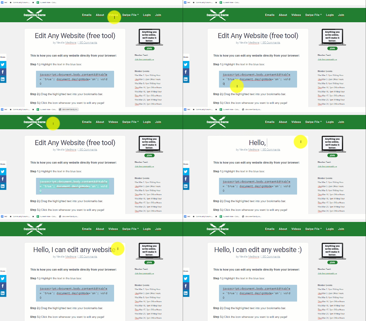
Ever wanted to test new headlines right on your own homepage before pushing them live? This little JavaScript trick lets...

Summari nails the “show, don’t tell” rule by using looping GIF demos instead of long feature lists. Each GIF shows...

Designjoy nails the perfect mix of showing skill and stacking proof. Their homepage design isn’t just pretty—it’s persuasive. What’s Happening...

Range Rover dropped a clever ad comparing its new air suspension system to the cushioning in running shoes. One photo...

This Revere Ware ad makes cookware look collectible. Instead of pushing one pan, it sells the entire kitchen lineup in...
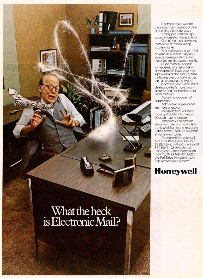
This 1977 Honeywell ad tried to explain a wild new idea: “Electronic Mail.” The dramatic photo says it all—a terrified...
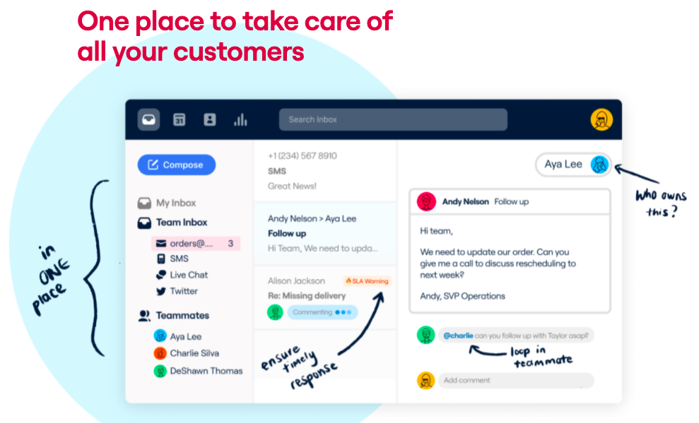
This image nails how to sell software without a wordy pitch. Instead of listing features, it shows them right where...

This SaaS homepage screams clarity. Right away, you know it’s a tool for Reddit marketing. The moving Reddit mascots instantly...

The first image on this Amazon listing does all the heavy lifting. Before a single feature is mentioned, Sony shows...

Designjoy’s “Membership Benefits” page is a masterclass in selling by showing. The layout, icons, and cheeky copy all prove they...


Guinness nails this ad by showing a stack of phones that looks just like a pint of their famous stout....

A woman stands in cozy socks and an oversized robe, blankly staring ahead while holding a vacuum. Next to her:...
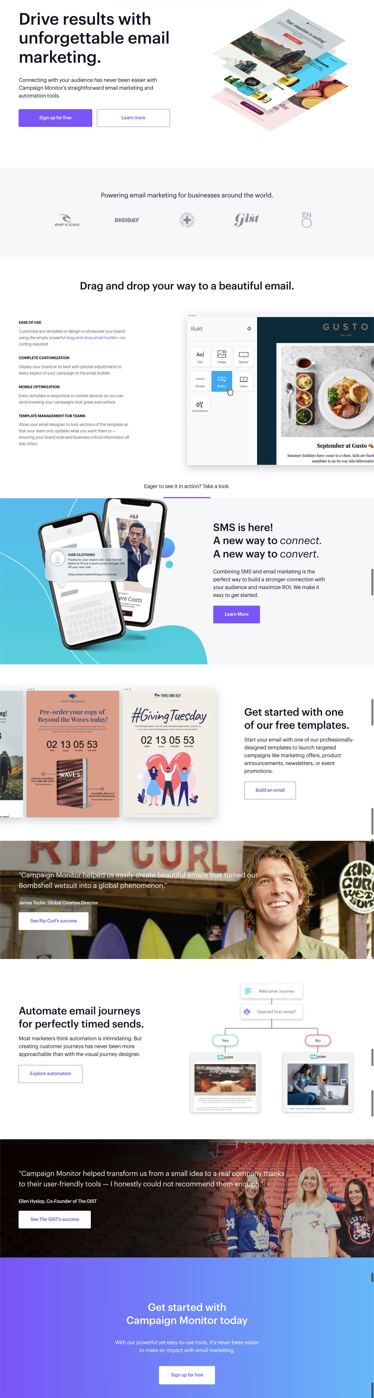
Campaign Monitor nails what most SaaS homepages struggle with: showing, not just telling. Their homepage instantly explains what the product...
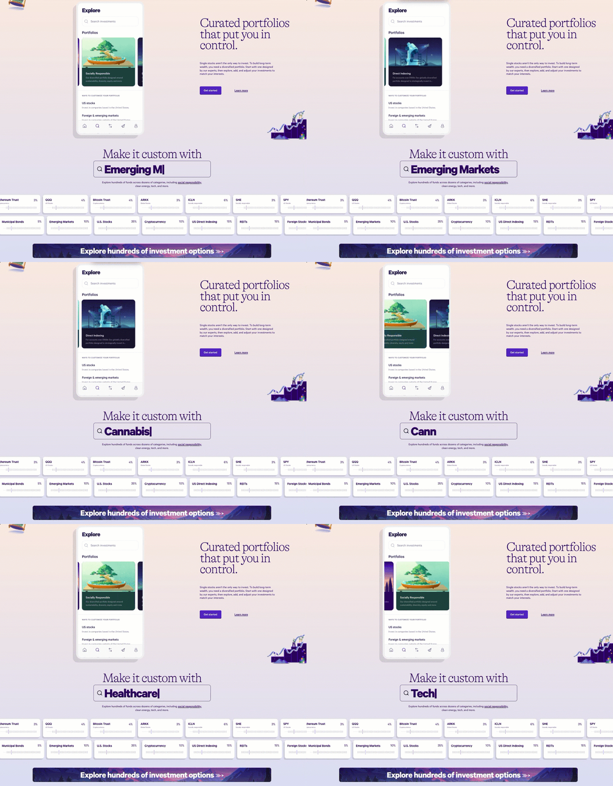
Wealthfront nails the first impression. Their homepage animation isn’t just pretty—it shows exactly how customizable investing can be, without needing...
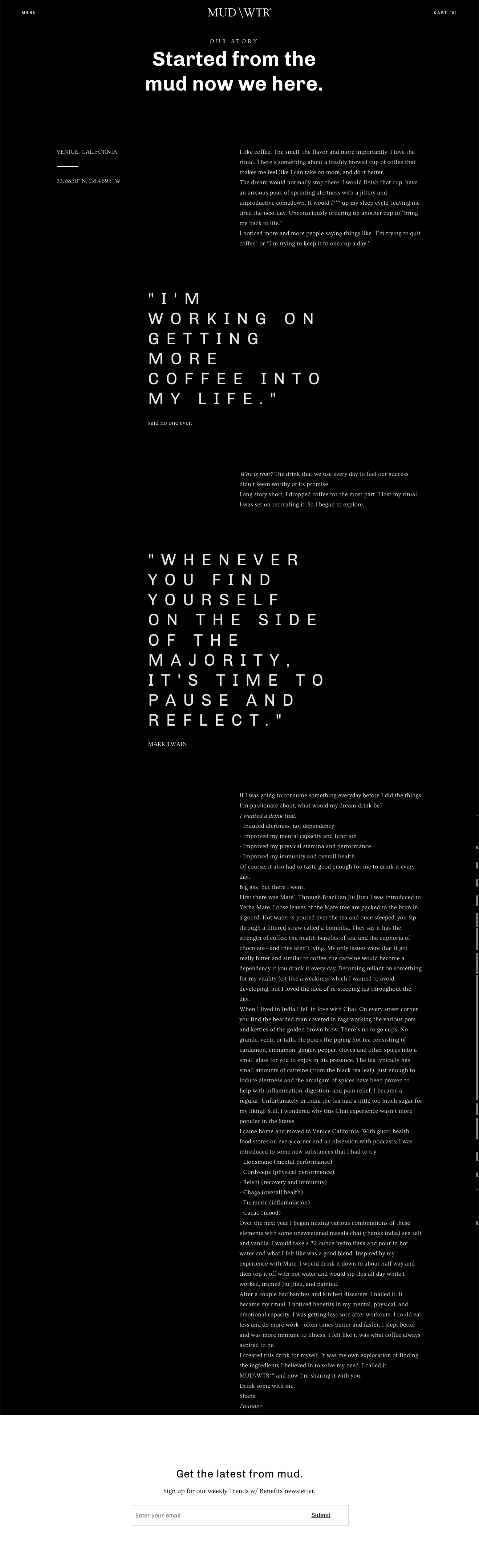
Most brands blame poor conversion on weak copy. But sometimes, it’s not the words—it’s how they’re shown. MUD/WTR’s “Our Story”...


