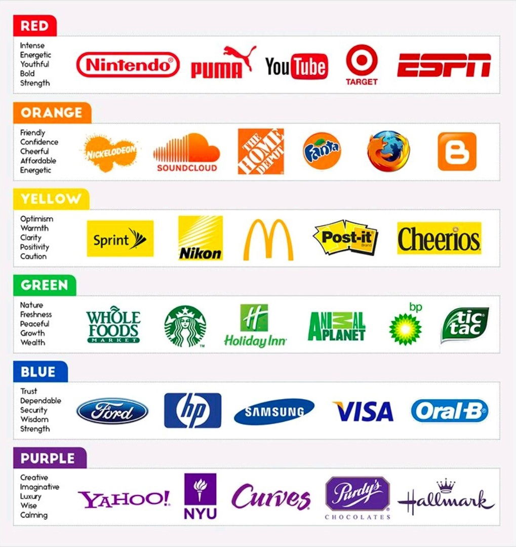
Before you obsess over fonts, funnels, or fancy logos, look at this color chart. Each row shows how monster brands quietly program your emotions with nothing but hue. Match your primary brand color to the feeling you want people to have in the first three seconds, and your copy, offers, and design suddenly start pulling in the same direction.
How To Pick Your Brand Color On Purpose
Start with the emotion, not the palette. Do you want customers pumped up to click fast (red or orange), calmly confident entering a credit card (blue), or feeling cared for and refreshed (green)? Study the chart, circle the row that matches your desired gut reaction, then build your logo, buttons, and key visuals around one dominant color and one supporting accent. Consistent use of that emotional color trains people to feel the right thing every time they see you.
What Each Color Is Really Selling
- Red brands (Nintendo, YouTube, Target, ESPN) crank up intensity: energy, boldness, urgency, action.
- Orange brands (Nickelodeon, SoundCloud, Fanta, Firefox) push friendliness: fun, confidence, affordability.
- Yellow brands (Sprint, Nikon, McDonald’s, Post-it, Cheerios) broadcast optimism: warmth, clarity, cheer.
- Green brands (Whole Foods, Starbucks, Holiday Inn, BP, Tic Tac) signal nature and growth: freshness, health, renewal.
- Blue brands (Ford, HP, Samsung, Visa, Oral-B) sell trust: security, dependability, calm control.
- Purple brands (Yahoo, NYU, Curves, Purdy’s, Hallmark) lean into imagination and luxury: creativity, wisdom, special-occasion vibes.
Creative Variations
Analyzed by Swipebot
Loading analysis...