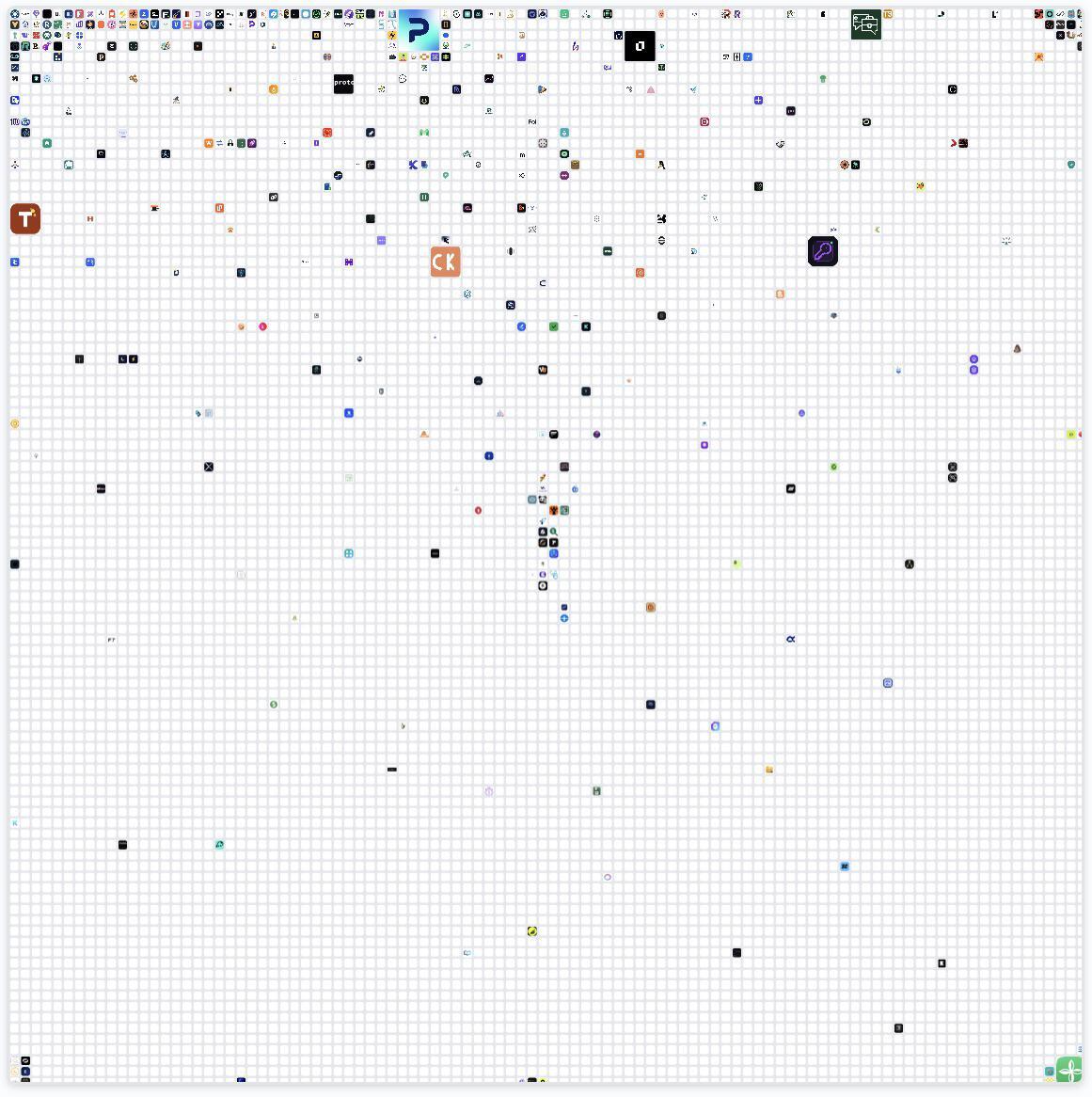
Zoom in on that grid and your brain instantly cheats: it jumps to the biggest, boldest, weirdest tiles. Everything else is wallpaper. On any app screen, Chrome tab bar, or SaaS dashboard, your icon is fighting this same battle. The job isn’t to be pretty, it’s to be findable. Let’s steal a few tricks from the stand-out tiles on this monster grid so your icon gets tapped, not ignored.
Turn Your App Icon Into a Searchlight
Design your icon like it will live on this zoomed‑out grid, not a Dribbble shot. Start with one bold shape or letter, jam it on a high‑contrast background, then strip detail until it still reads at thumbnail size. Test it by shrinking it to favicon size in a screenshot of a crowded home screen. If you can’t instantly spot it in one second, neither will your users.
Why Some Tiles Instantly Grab Your Eye
- Size breaks the pattern: the oversized tiles on the left jump out because everything else is tiny and polite.
- Solid color blocks win: the brown and purple squares beat the fussy multi-color icons around them.
- One strong letter > tiny logo: the tiles with a huge single letter are legible even zoomed way out.
- Contrast is king: dark shapes on light backgrounds (or vice versa) survive when the grid shrinks.
- Whitespace is a border: icons that don’t fill every pixel create a mini spotlight around themselves.
Real-World Icons That Punch Through Clutter
Spotify uses a flat, neon green circle with three simple black arcs, which stays unmistakable even when smashed into a tiny grid of tabs.
Slack leans on a chunky, colorful hash mark over white space, so the shape is recognizable long before you can read the logo.
YouTube relies on a solid red pill with a white play triangle, which pops instantly against almost any background of apps or bookmarks.
Creative Variations
Analyzed by Swipebot
Loading analysis...