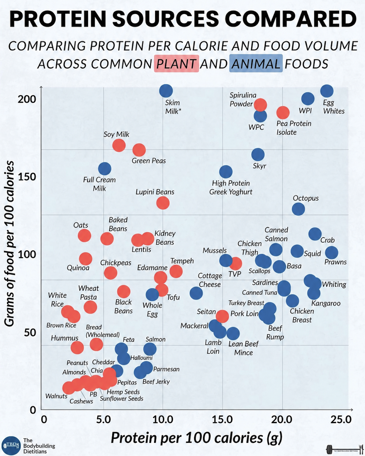
This chart is a protein treasure map. Every dot is a food, and its position tells you how much protein you get for every 100 calories, plus how much actual food volume hits your plate. Red dots are plants, blue dots are animal foods. Use it like a cheat sheet: slide right for more protein per calorie, slide up for meals that physically fill your stomach.
Plant vs animal: who wins?
Both teams have stars. Animal foods dominate the extreme right side with egg whites, seafood and lean meats. Plants punch back with powders (pea protein, spirulina), soy foods and beans sitting in the same neighborhood as many meats. The real win is stacking them: mix a mid-range plant protein like lentils or tofu with an ultra-lean animal pick or a plant isolate, and you’ve basically hacked the chart.
Fast takeaways from the chart
- Egg whites, whey protein isolate, prawns and crab are the absolute protein-per-calorie monsters on the animal side.
- Pea protein isolate, spirulina powder and TVP are the plant heavy-hitters for pure protein density.
- Skim milk, soy milk and green peas give a lot of physical food volume per 100 calories while still packing respectable protein.
- Nuts, seeds and nut butters sit bottom-left: calorie dense, low protein per calorie, so treat them as fats, not protein sources.
- Tofu, tempeh, edamame, lentils and chickpeas live in the middle zone: great for balanced, higher-volume plant-based meals.
How to use this cheat sheet in real life
The Bodybuilding Dietitians graphic shows that pairing a right-side protein like chicken breast or pea protein isolate with a high-volume option like skim milk or green peas lets you build huge, high-protein meals that stay lean.
Creative Variations
Analyzed by Swipebot
Loading analysis...