10 Simple Visuals That Fix Investor Mistakes
Published on



1/11
7.0K
18
investorsgivingadvice Save this post for later! 🙌 Share it with your friends to teach them valuable investing lessons....
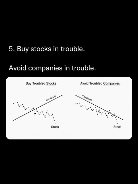
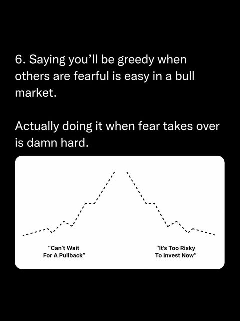
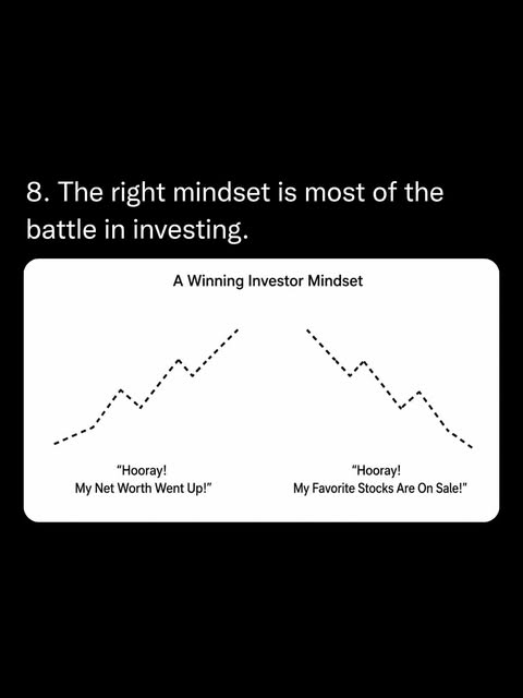
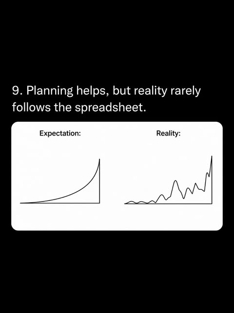
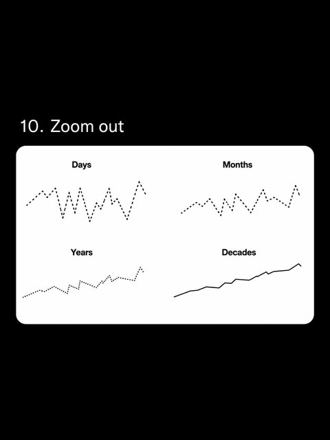
Most investors don’t need more data, they need better pictures in their heads. This Instagram carousel from @investorsgivingadvice turns PhD-level investing lessons into napkin doodles your brain actually remembers. Use these visuals as mental flashcards so you stop guessing, stop panicking, and start behaving like the calm, boring investor who quietly ends up rich.
How to actually use these visuals
Print or screenshot the slides and treat them like a cockpit checklist. Before buying or selling, ask: Am I following the DCA path? Am I judging risk over months or decades? Am I reacting to the chart or my mood? The more you rehearse with these pictures, the less room you leave for FOMO, doomscrolling, and hot-stock tips to hijack your account.
Why these visuals instantly fix bad investor behavior
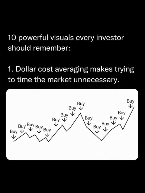
- The first chart shows dollar-cost averaging through every squiggle, training you to buy on schedule instead of chasing tops and bottoms.
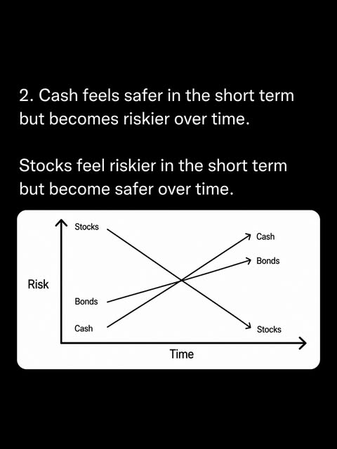
- The second graph flips the usual “cash is safe” myth by showing how risk shifts from stocks to cash as time stretches out.
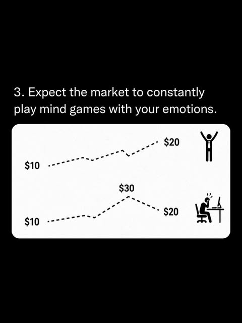
- The third panel exposes how identical price moves feel opposite emotionally, reminding you that feelings are lagging indicators, not signals.
Who’s already teaching with simple visuals

Investors Giving Advice uses minimalist black‑and‑white diagrams to explain dollar‑cost averaging, shifting risk over time, and emotional market swings in one swipeable post.
Creative Variations
Analyzed by Swipebot
Loading analysis...