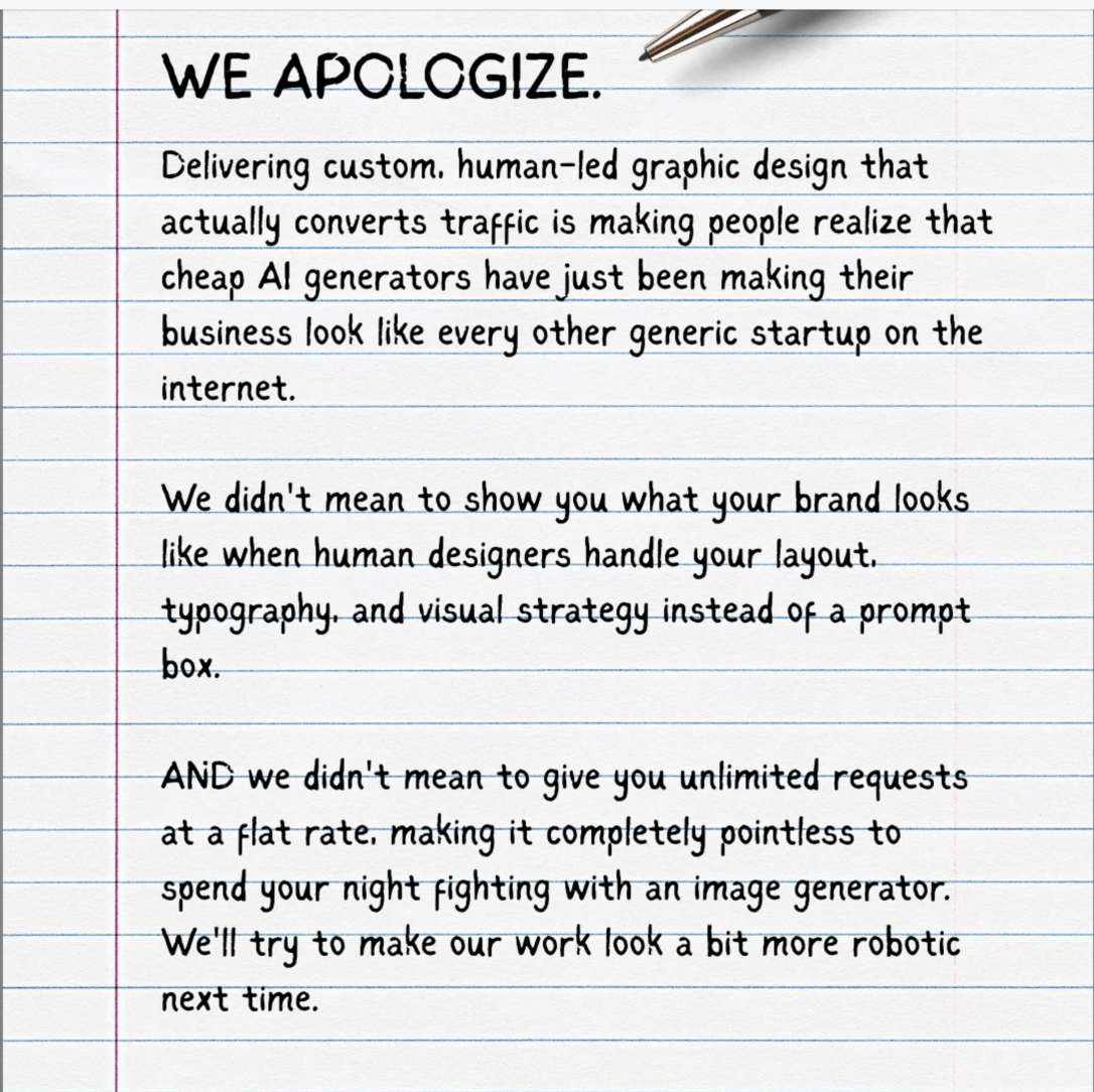
The image looks like a handwritten apology note on notebook paper, but it’s really a smackdown of lazy AI design. Instead of glossy mockups, it feels like something your favorite snarky designer slid across the table. The headline screams “WE APOLOGIZE.”, then roasts AI templates for making every brand look like a generic startup. This is how you visually prove that human-led design beats auto-generated sameness.
The Concept: A Fake Apology Letter
The “apology” format is brilliant because it flips the script: the designer pretends to apologize for doing their job too well. Lined paper, casual handwriting, and a pen in the corner all signal realness and imperfection. That contrast quietly says, “A human made this” long before you read a word. It’s not about hating AI, it’s about exposing the hidden cost of relying on it for everything: zero personality.
How To Steal This For Your Brand
Turn your biggest advantage over AI into a tongue-in-cheek apology. If you’re a writer, apologize for making copy that doesn’t sound like a robot. If you’re a marketer, apologize for campaigns that actually move the needle. Use a raw, human-feeling visual (handwriting, scribbles, marginal notes) to underline the point: real people, not prompts, are what actually convert.
Why This Anti-Template Visual Converts
- It calls out a real pain: AI templates make your brand look like everyone else.
- It reframes human design as a competitive advantage, not a luxury.
- It sells specifics: custom layout, typography, and visual strategy instead of a prompt box.
- It adds an offer: unlimited requests at a flat rate, so AI isn’t even the cheaper-feeling option.
Creative Variations
Analyzed by Swipebot
Loading analysis...