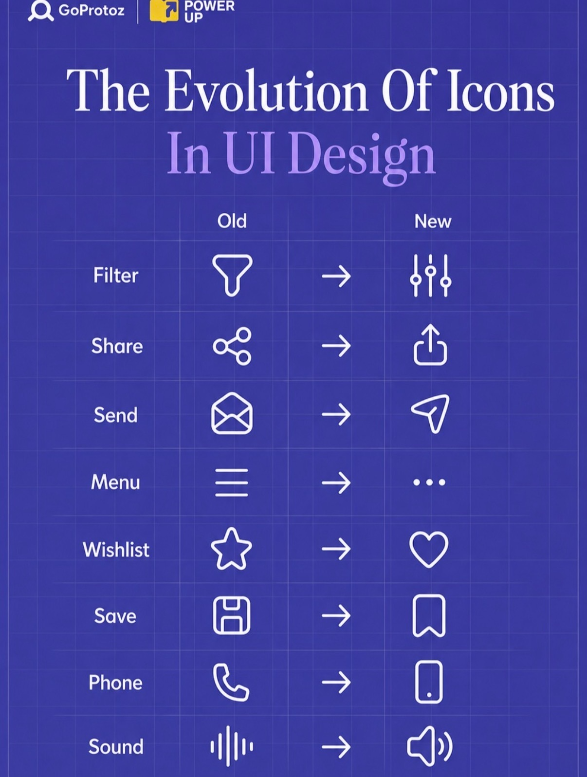
Old icons are like inside jokes from 2010: your team loves them, your users don’t get them. This visual from GoProtoz shows how tiny symbol tweaks can make your UI feel modern and instantly understandable. Let’s steal the best ideas from this evolution chart and clean up your own interface.
How To Run Your Own Icon Evolution
Pull up your product and screenshot every icon. Next to each one, write what you *want* the user to think in one word: share, save, edit, send, more, settings. If the symbol doesn’t shout that word in under a second, steal a clearer pattern from modern systems (iOS, Android, popular SaaS tools). Update a small batch first, test for confusion, then roll the new set across your app.
What This Icon Makeover Teaches You
- Filter: swap the chemistry funnel for mixer sliders so users think “adjust settings” instead of “lab experiment.”
- Share: move from the abstract node icon to the upload-style arrow that screams “send this out.”
- Send: ditch the envelope (email-era) for the paper plane that matches chat, DMs, and quick messaging.
- Menu: trade the heavy hamburger for three subtle dots that say “more options, not a full drawer.”
- Wishlist: evolve the generic star into a heart so it clearly reads as “things I love or want.”
- Save: retire the floppy disk fossil and use a bookmark shape that actually exists in users’ lives.
- Phone: replace the handset with a simple smartphone outline to match what’s really in their pocket.
- Sound: go from abstract waves to a classic speaker icon that’s unmistakable at a glance.
Real-World Icon Upgrades In The Wild

Instagram moved from a skeuomorphic camera to a flat, glowing glyph that signals modern, social-first photography instead of old hardware.
Google swapped many of its product icons to a consistent, minimal style so Gmail, Drive, and Docs all feel like one unified system.
Creative Variations
Analyzed by Swipebot
Loading analysis...