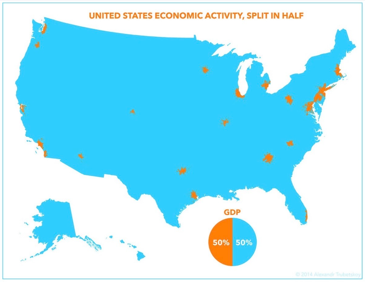
That bright blue US map with tiny orange splats looks harmless…until you realize those specks are where half of America’s GDP comes from. A handful of metro blobs crank out as much economic output as the entire rest of the country. If you sell anything, hire anyone, or plan events, this visual should change how you think about where money and attention actually live.
What the Map Really Shows
The image splits US economic activity into two colors: orange and blue. The orange patches are a few dense metro zones—think coastal hubs and a couple of inland hotspots. Everything else, including huge swaths of land, is calm blue. Yet the pie chart under the map shows a perfect 50/50 GDP split. Visually, it’s screaming: land area and economic power are not the same thing.
How to Use This in Your Business
- Aim ads, sales trips, and partnerships at the orange clusters where money and decision‑makers pile up.
- Test offers in one or two “orange-blob” metros before rolling them out to the quieter blue regions.
- Design messaging that speaks to dense, busy city life first—then adapt it for everyone else.
Real-World Targeting Based on Tiny Spots
Uber concentrated early expansion on a short list of orange-blob metros where riders, drivers, and nightlife density made the service spread fast.
Warby Parker opened showrooms first in a few high-GDP city neighborhoods to validate demand before going wider.
Creative Variations
Analyzed by Swipebot
Loading analysis...
.png?width=3840&quality=80)