The Hardest Years of Parenting Chart
Published on
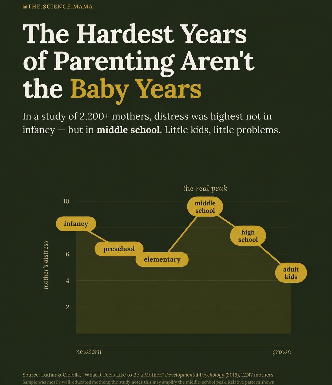
Everyone warns you about sleepless baby nights, but this chart flips the script: the real parental breakdown happens years later. According to data on 2,200+ mothers, stress quietly climbs and then spikes in middle school. That’s the headline for your post: it’s not the diapers, it’s the drama. Use the visual curve from calm elementary years to the middle school “mountain” as your storytelling backbone.
The psychology behind the middle school peak
Use the visual spike to explain why this season is brutal: kids are more independent but still emotionally volatile, problems move from naps to identity and peer drama, and parents lose the control they had in the early years. The graph gives you permission to say, “If this feels harder than newborn life, you’re not broken, you’re normal.” The post should turn that chart into validation, not a horror story.
Key story beats pulled straight from the graphic
- Hook readers with the bold claim from the image: the hardest years of parenting aren’t the baby years.
- Walk through the graph stages (infancy → preschool → elementary) and point out how distress stays relatively flat.
- Shift into the big reveal: distress shoots up in middle school and becomes “the real peak.”
- Contrast the middle school spike with the gradual drop in high school and adult kids to reassure readers it won’t last forever.
- Close by reframing “little kids, little problems” as a comforting mantra for parents currently stuck on that middle school peak.
Ways to reference the chart in your post

Your blog can open with a full-width screenshot of the chart and a caption that spells out, “In this study of 2,247 mothers, the highest distress point is smack in the middle school years.”

Your newsletter can crop the middle school “real peak” bubble and use it as the hero image for an issue about surviving tween mood swings.
Creative Variations
Analyzed by Swipebot
Loading analysis...