Search for a command to run...
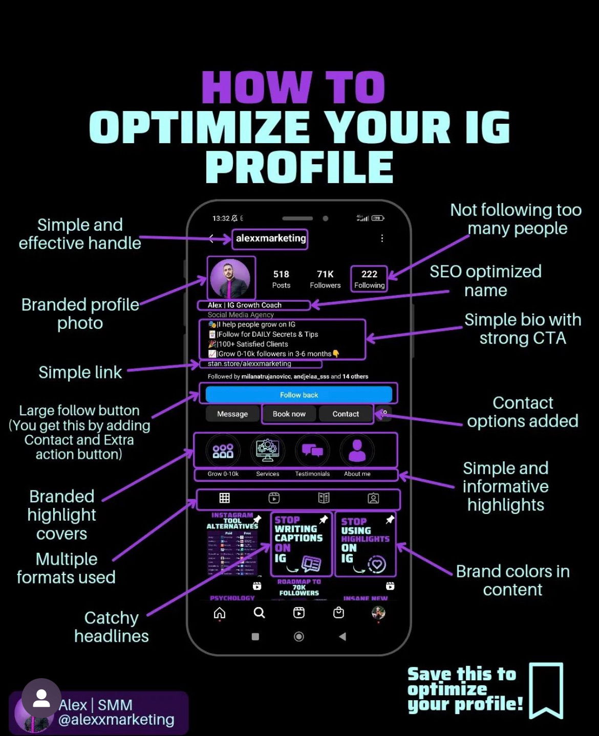
Most people overthink their Instagram bios. But this one image breaks it down beautifully — every piece of the profile...
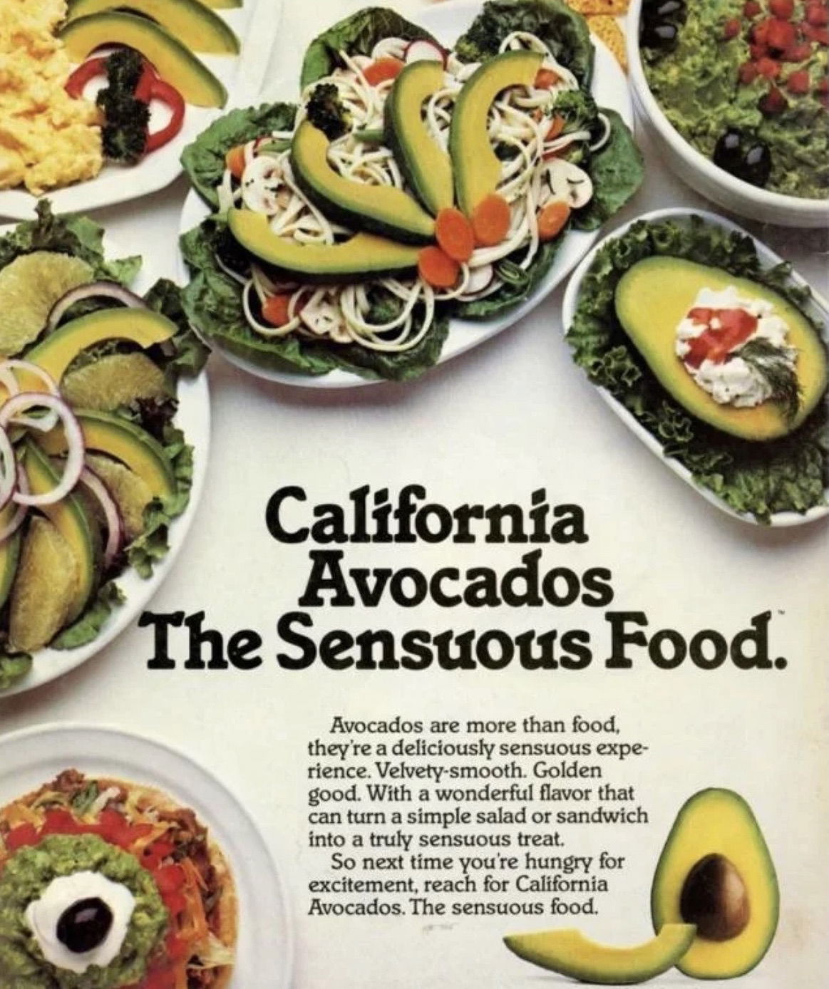
This vintage ad makes avocados sound downright seductive. Instead of talking about health or freshness, it leans into the feeling...
This visual is genius. It takes one of the most complex systems on Earth — the human body — and...
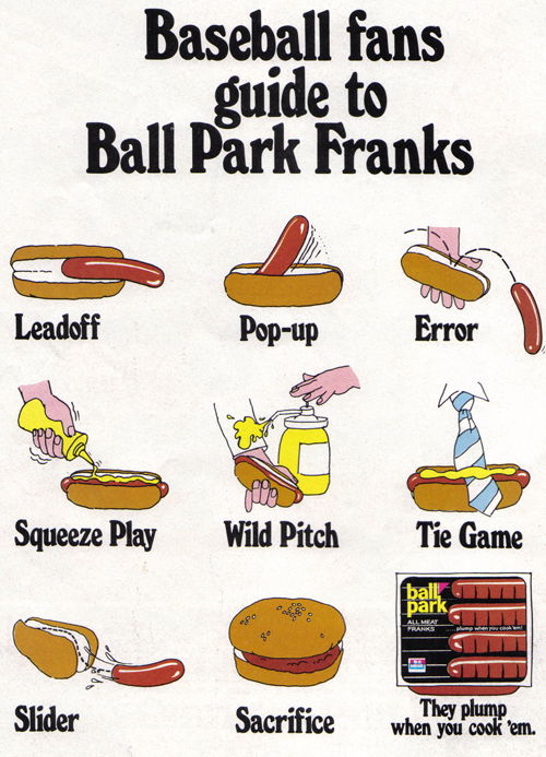
This ad nails the “speak your audience’s language” rule. Ball Park Franks turned baseball jargon into a visual joke book,...
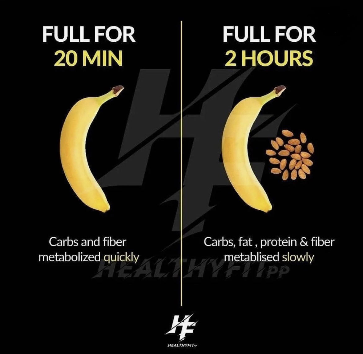
This image nails what great marketing does: tells a complex story in seconds. One banana, two timelines, and boom—you instantly...
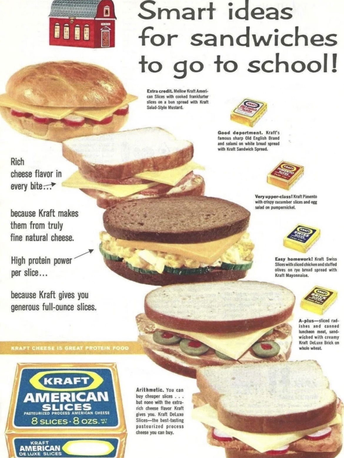
This 1962 Kraft ad didn’t just push cheese—it gave parents sandwich ideas for their kids’ lunches. That’s clever marketing: teaching...
Maurice Richard wasn’t just a hockey legend—he had “winning” hair, too. Vitalis used his fame in this vintage ad to...
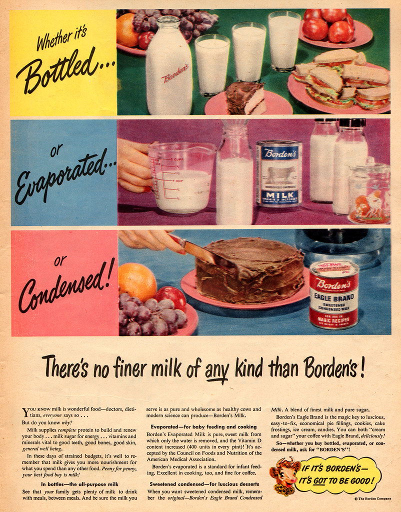
This vintage Borden’s ad is a masterclass in product synergy. It shows three types of milk—bottled, evaporated, and condensed—all under...
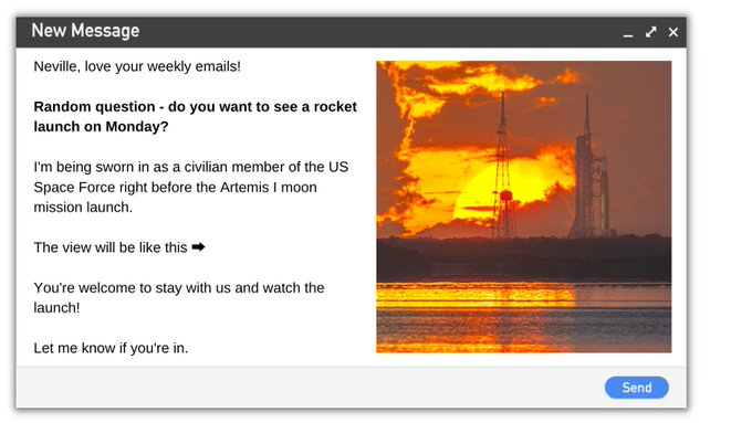
This cold email doesn’t push a pitch—it launches a connection. Literally. The sender invites someone to watch a rocket take...
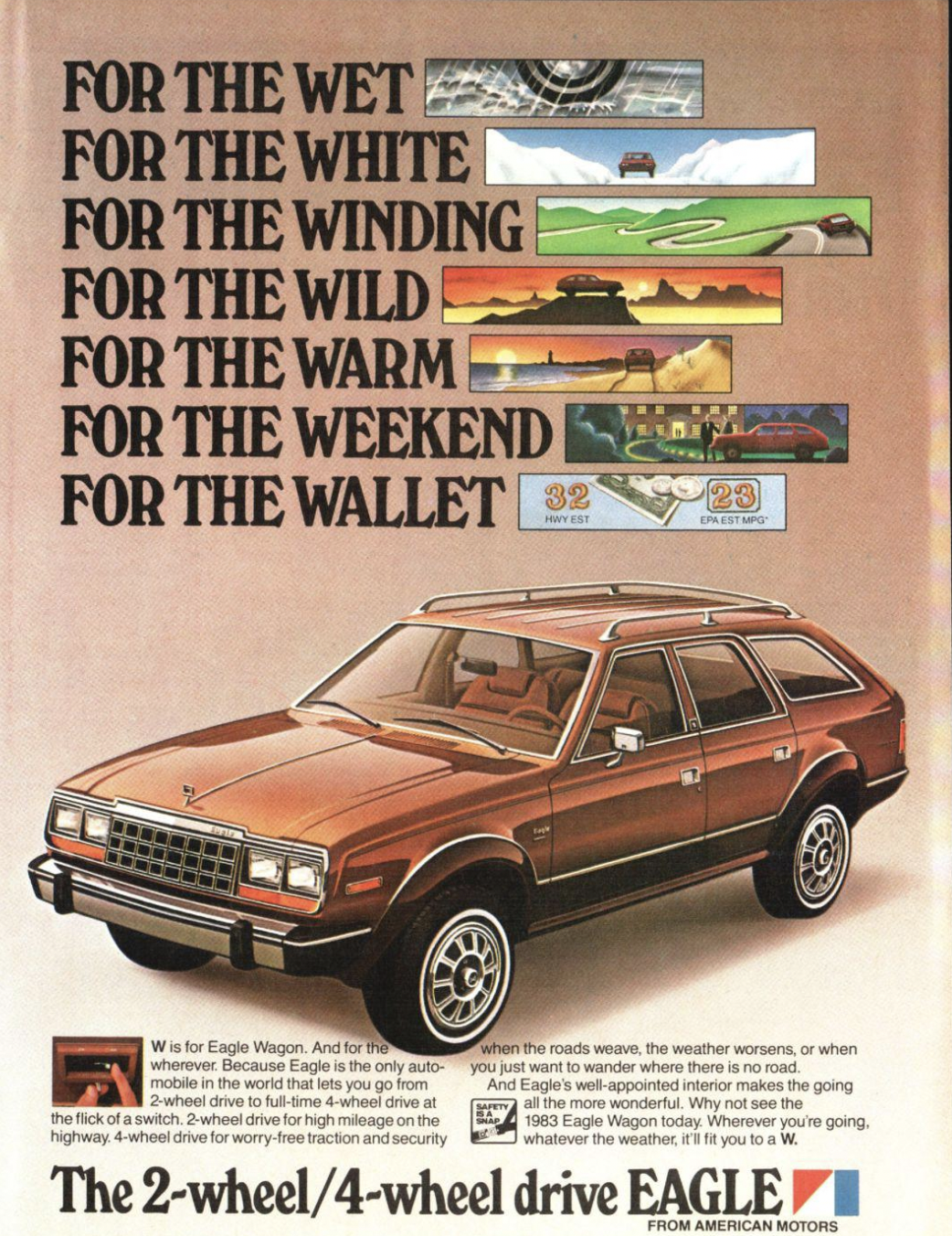
This 1983 Eagle Wagon ad packs a ton of info into just a few lines — and it works. Each...
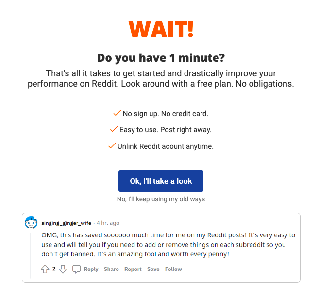
You know that moment when you’re about to leave a site…and then a well-timed popup grabs your attention? This one...
Klaviyo nails it here. Instead of dumping text about "automation" or "personalization", they show exactly how the magic happens. A...
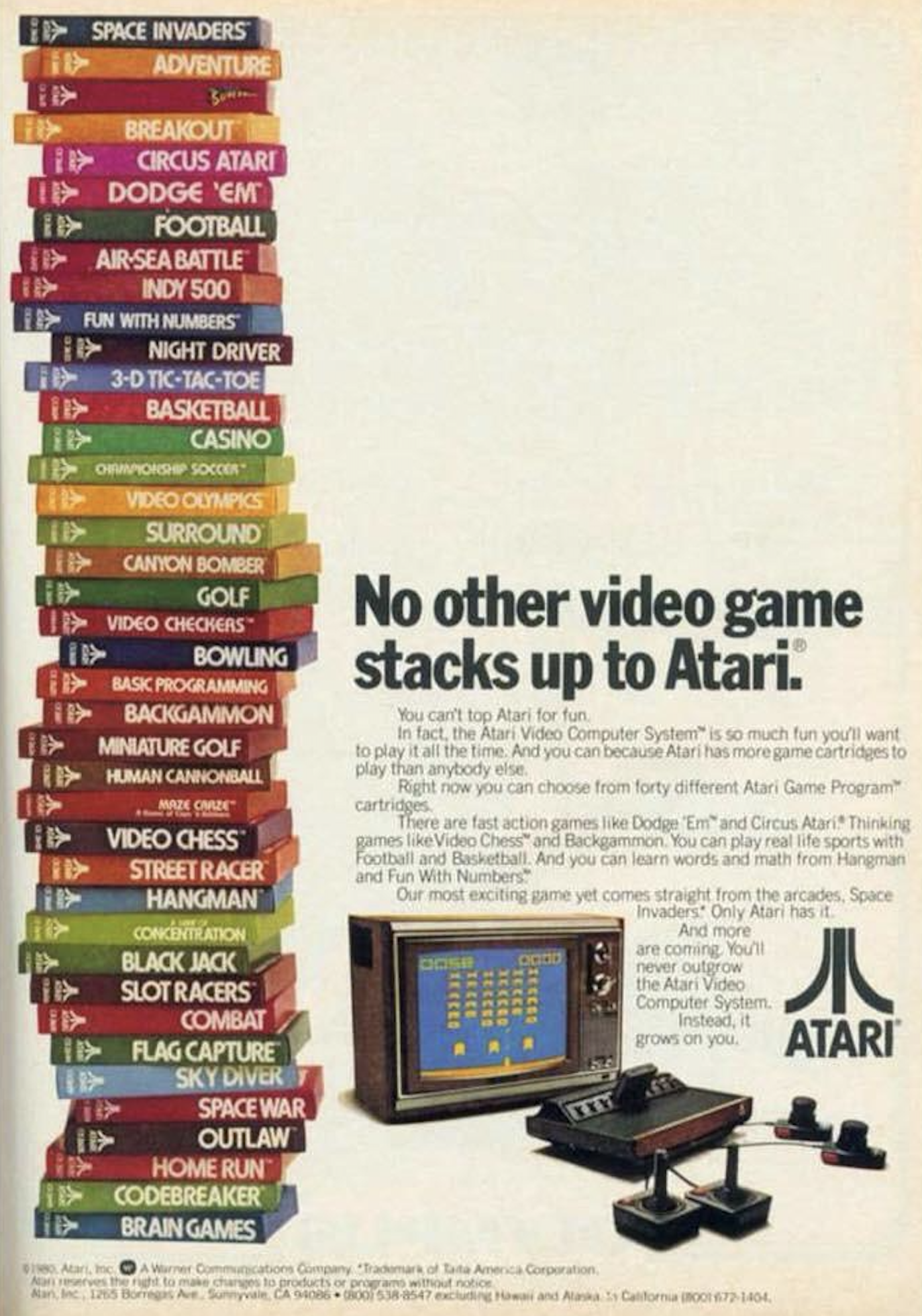
This 1980 Atari ad doesn’t just tell you they have more games—it shows you. A tall, colorful stack of game...
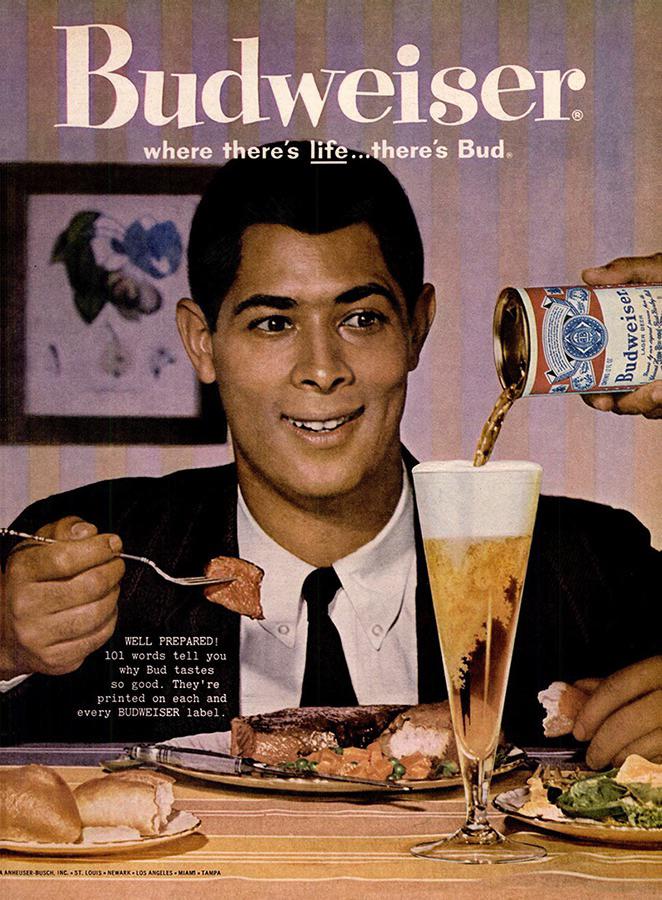
There’s something magnetic about this old Budweiser ad. A smiling guy mid-bite, beer mid-pour — it’s weirdly captivating. Let’s unpack...
This pricing page does something sneaky-smart. It warns visitors that prices are about to go up and gives them one...
Ghost nails social proof on their homepage. Instead of a boring wall of logos, they show off actual creators using...
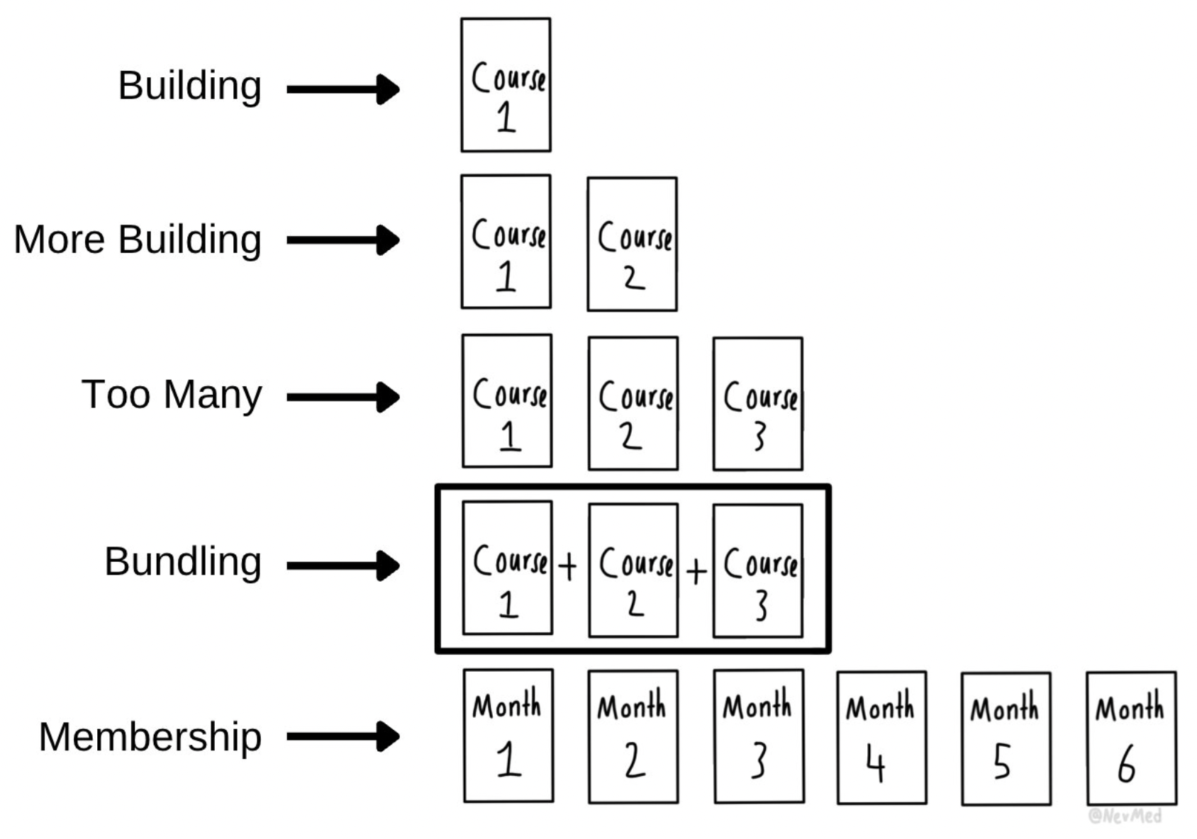
Ever notice how course creators all seem to follow the same growth path? It starts with one course and ends...
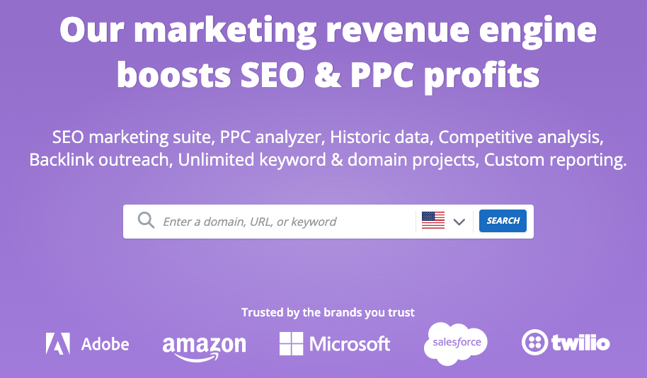
This page nails the classic SaaS formula: promise, proof, and participation. The visitor knows in five seconds what SpyFu does,...
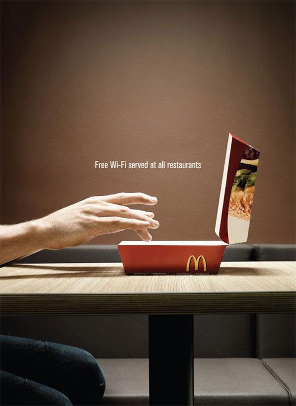
McDonald’s nailed visual storytelling with this ad. They took something as ordinary as a burger box and made it look...
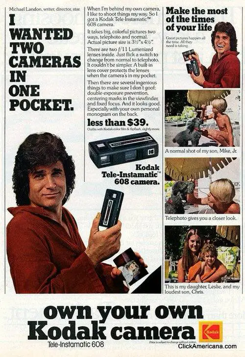
At first glance, this Kodak ad makes no sense. “Two cameras in one pocket”? Huh? But that confusion is exactly...
Look at that image: a glossy roulette table, stacks of chips, a laptop glowing in the background. That’s not just...
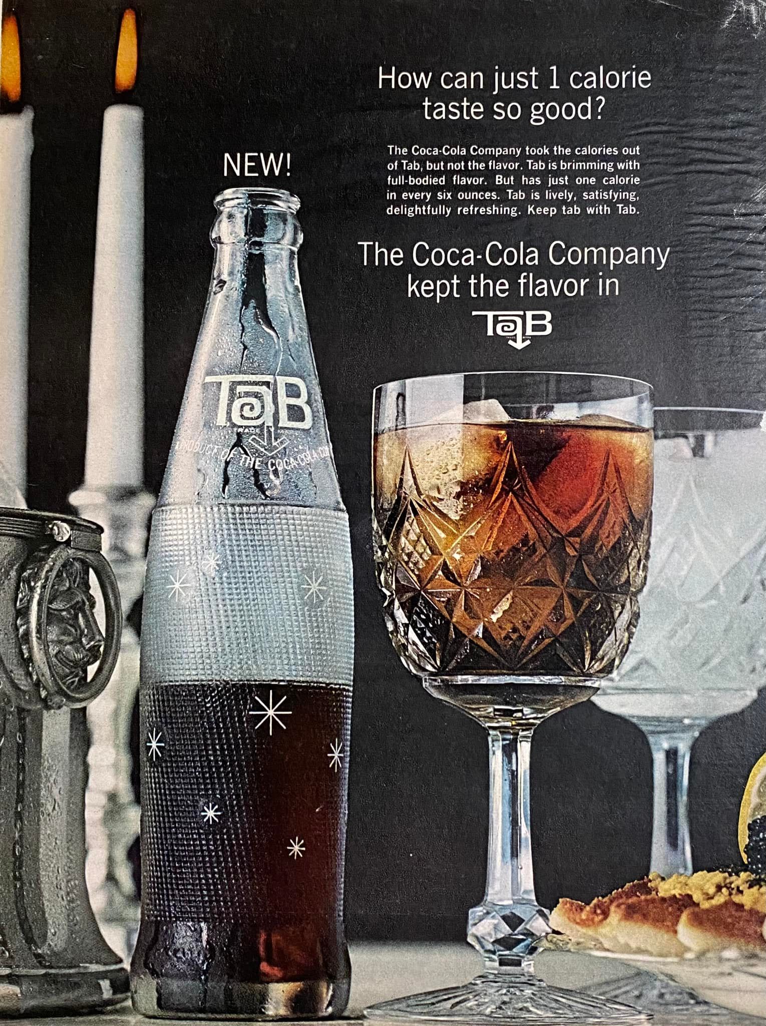
This 1964 Tab ad nailed what most modern brands still miss — it made “diet” feel indulgent. Instead of selling...
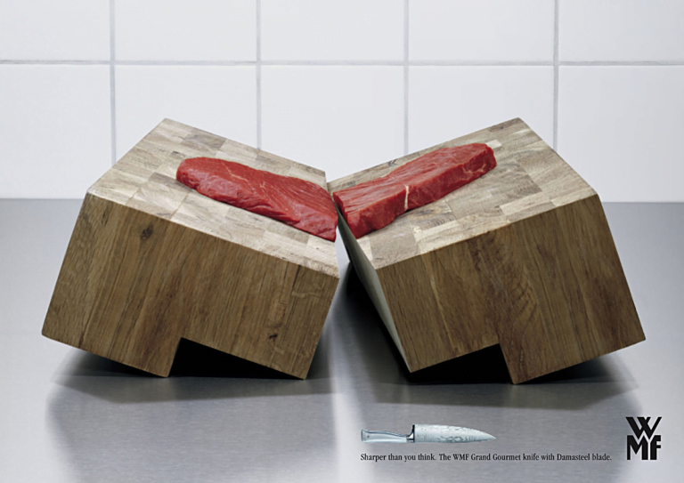
Talk about visual exaggeration done right. WMF’s knife ad doesn’t show slicing veggies—it shows the knife cutting through the whole...
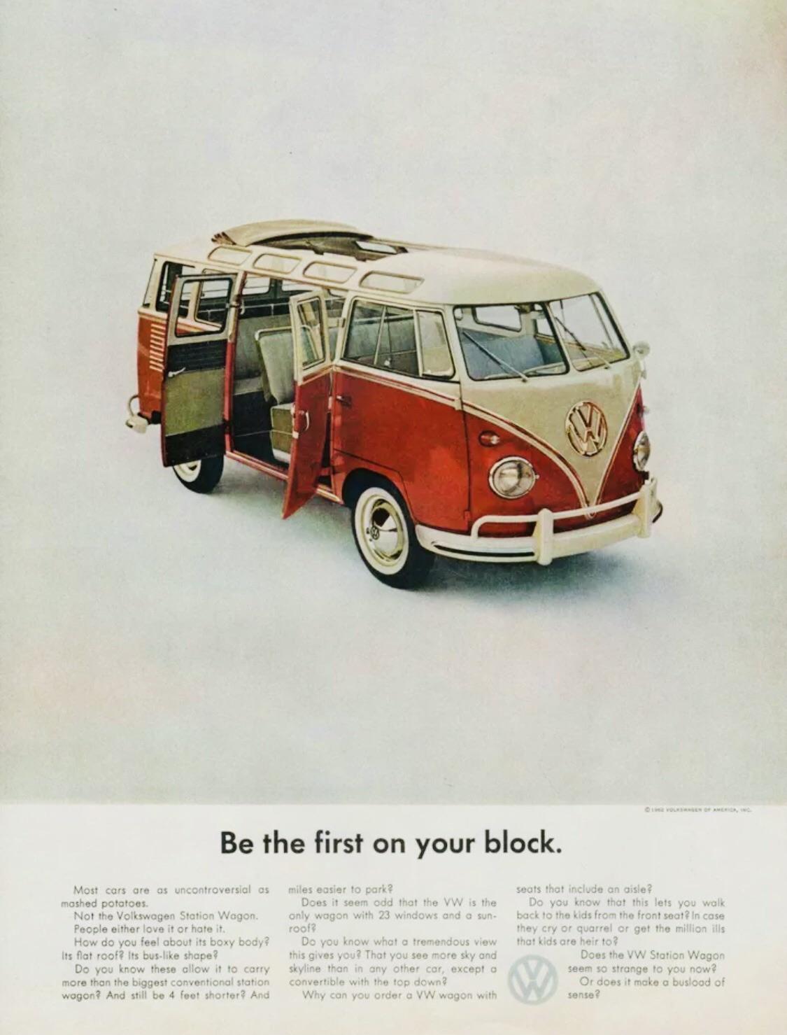
Volkswagen ads were masters of flipping the script. Just look at this one. A van with every door and window...