9 pieces of advice (things I'm glad I did when I was younger)
Most people want a “hack.” But real progress comes from stacking small but powerful habits. This list from Copywriting Course...
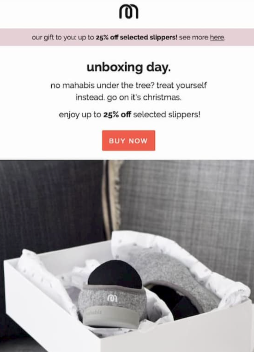
Mahabis After Christmas Sale
Everyone’s shopped for others all December, so Mahabis slips in with a smart twist: buy something for yourself. Their “unboxing...
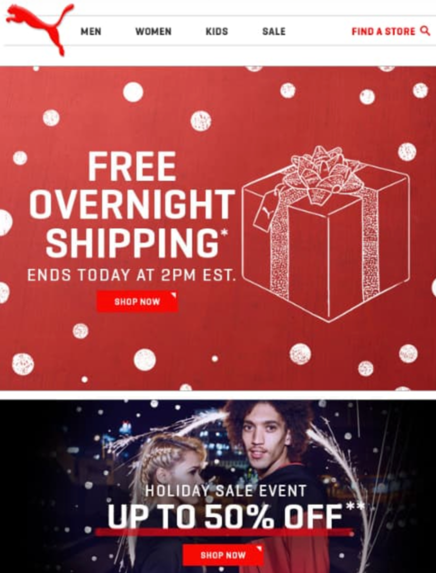
Puma Christmas Overnight Shipping Email
Most shoppers procrastinate. Puma knows it. So they sent this email reminding people they could still grab gifts in time...
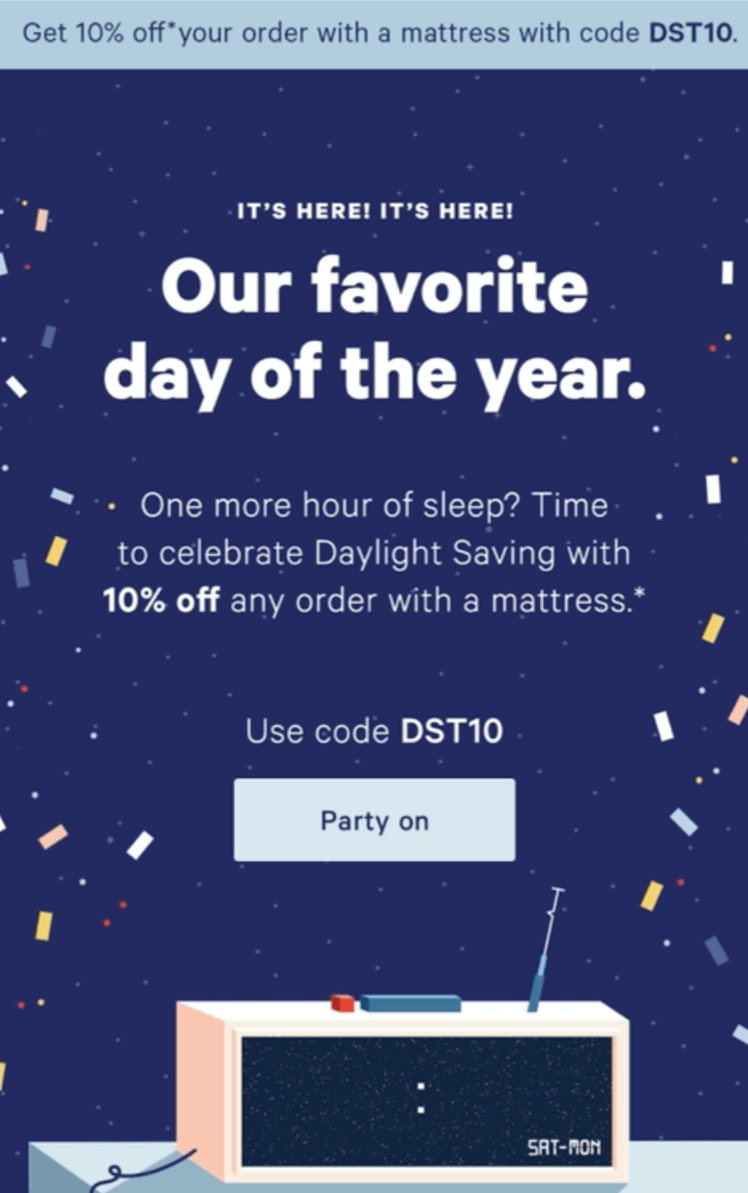
Casper Daylight Savings Email
Casper nailed it with this email. They took a tiny, random event (Daylight Saving Time) and spun it into a...
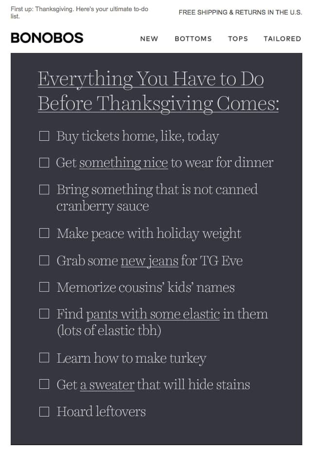
Bonobos Thanksgiving Checklist Email
Bonobos nailed the art of the non-pushy holiday email. Instead of blasting discounts like everyone else, they sent a funny...

Vezina Work From Home Outdoor Ad
This ad nails the post-pandemic vibe: a businessman in a suit jacket, tie… and underwear. It’s funny, relevant, and instantly...
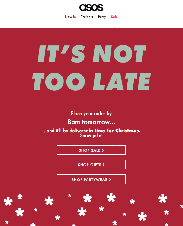
Asos Last Minute Christmas Sale Email
Every year, a flood of shoppers wait until the very last moment to grab Christmas gifts. ASOS nails this with...
YouTube Marketing, best marketing channels, and life planning with Noah Kagan of OkDork and AppSumo
Noah Kagan’s AppSumo does something simple but brilliant: it takes the “deal” format and turns it into a movement for...

1-800-Contacts Warm Email Reminder
This email from 1-800 Contacts nails the customer reminder. It’s short, helpful, and keeps their brand top of mind without...
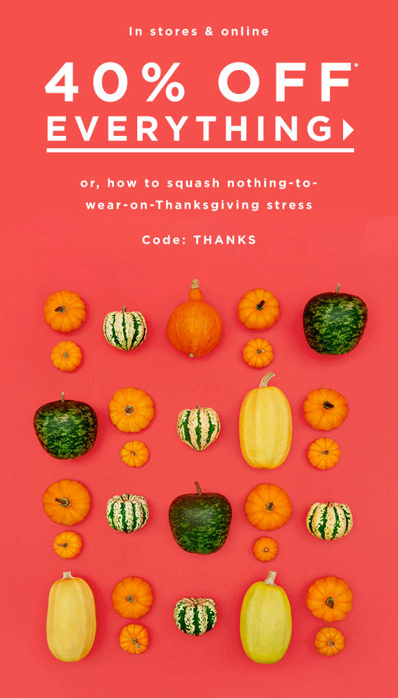
Loft Thanksgiving Email
This Thanksgiving sale nails the balance between cute and clear. It’s bright, bold, and instantly tells you what you’re getting....
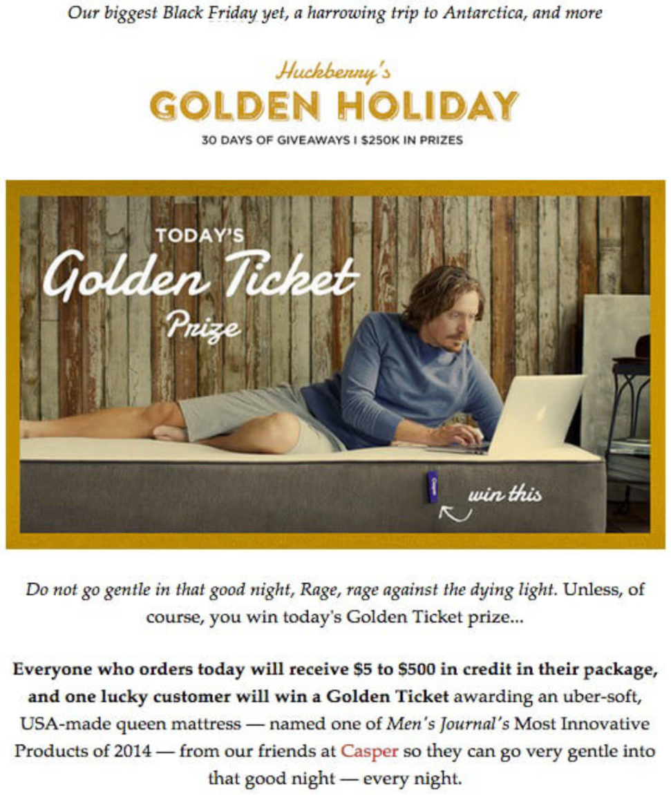
Huckberry Black Friday Sweepstakes
Most brands blast you with the same “20% off” deal. Huckberry flips that script with a surprise reward system. Every...

San Fransisco 49ers Black Friday Email
This 49ers Team Store email nails engagement with a simple gimmick: a digital scratch-off for a mystery Black Friday discount....
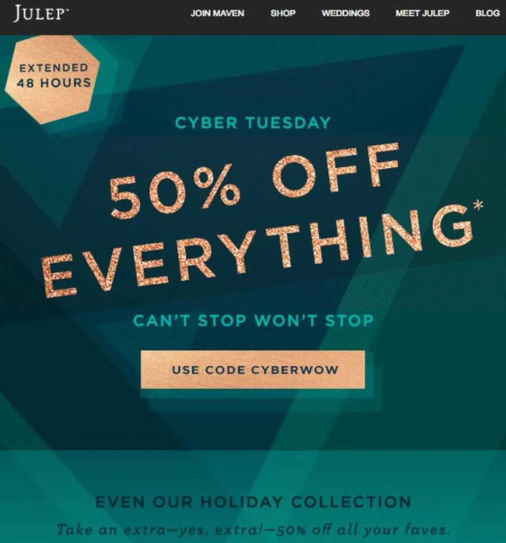
Julep Cyber Tuesday Sale
Julep didn’t stop at Cyber Monday. They rolled into Cyber Tuesday with a bold “50% OFF EVERYTHING” banner, extending their...
Cathryn Lavery of BestSelfCo Interview About eCommerce, Shopify & Amazon, and Crowd Funding Products
Cathryn Lavery started as an architect before turning a simple notebook idea into a multi-million dollar business. Her Best Self...
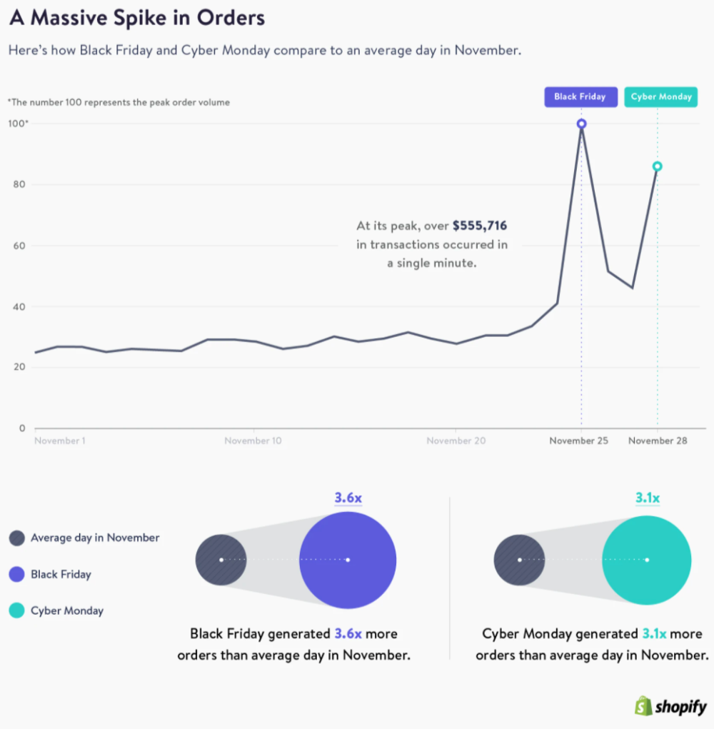
Black Friday + Cyber Monday Sales Graph
This Shopify chart tells a wild story. On regular November days, sales are steady… then Black Friday hits and order...

Poppin Cyber Monday Email GIF
Sometimes, less is more. This Cyber Monday email keeps it clean: one clear offer, one eye-catching GIF, and zero fluff....
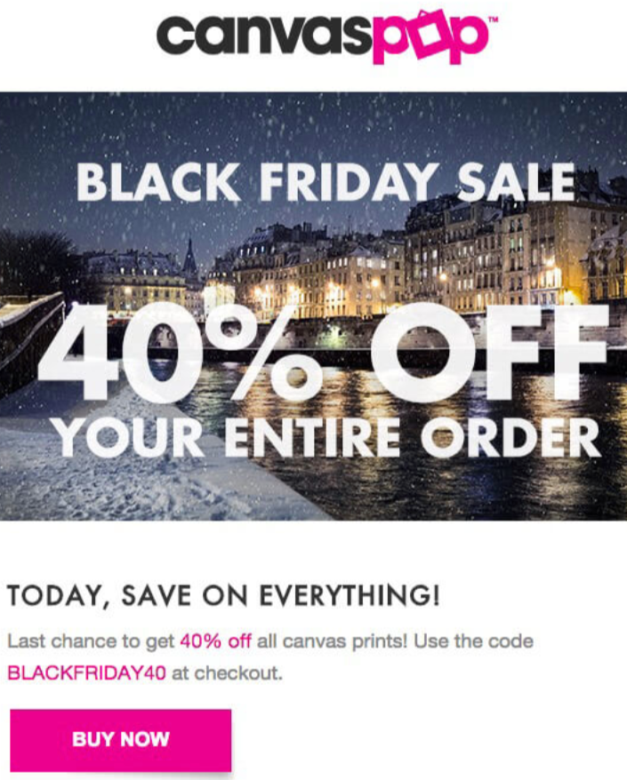
Canvas Pop Black Friday Email
Black Friday gets messy with confusing deals. CanvasPop cuts through that chaos like a hot knife through butter with one...

Brooks Brothers Cyber Monday Email
This Brooks Brothers email nails the art of keeping it simple. No fluff, no gimmicks—just clear info that shoppers actually...

American Eagle Black Friday Email
This email nails the trifecta of great seasonal offers: clarity, urgency, and irresistible value. The big “40% OFF + FREE...
Ranking blog content in the SEO results with Ross Hudgens of Siege Media and Neville Medhora
Ross Hudgens runs Siege Media — an SEO agency that’s ranked on the INC 5000 list four years straight. His...

Amazon Black Friday Facebook Ad
Amazon’s “free cat bed” post is genius. No big promo banner. No screaming discount. Just a fluffy cat in an...

MOO Black Friday Early Bird Sale
Instead of fighting in the Black Friday inbox war, MOO zigged where others zag. They launched their Cyber Sale four...

JetBlue Thanksgiving Email
JetBlue’s Thanksgiving email isn’t selling—it's entertaining. Instead of a hard pitch, they drop ten travel tips loaded with food puns...

Michael J Fox Giving Tuesday Twitter Campaign
Most brands chase sales on Black Friday. But the Michael J. Fox Foundation flipped the script on Giving Tuesday with...