

1/2
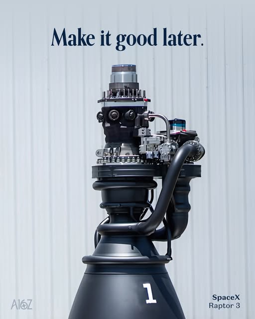
The two photos tell the whole story. Raptor 1 looks like a metal meatball of pipes and sensors. Raptor 3 looks like an iPhone in rocket form. That’s the game: ship the ugly, over-instrumented version first, then ruthlessly delete everything you can, and only add back what reality demands.
From Metal Hairball To Minimal Machine
Raptor 1 is a flying lab: hoses, bolts, flanges, extra plumbing everywhere. It’s not meant to be pretty; it’s meant to tell the truth about how the engine behaves. Raptor 3 is that truth, carved into metal. No external heat shield, fewer exposed lines, more welded, integrated parts. Same idea for your product: version one is allowed to be noisy and overbuilt as long as it teaches you what to remove.
The Ship–Delete–Add-Back Playbook
- Ship a “Raptor 1” version fast: lots of logging, knobs, and manual steps so you can actually see what’s happening.
- Delete 90% of features, options, and steps that customers don’t touch or don’t pay for.
- Add 10% back only when real users or hard data prove something is mission-critical.
- Design the next version so the essentials are baked in, not bolted on, just like Raptor 3’s integrated cooling circuits.
Who Uses This Rule In The Wild?
SpaceX started with a sensor-covered Raptor 1 and iterated down to the cleaner, simpler Raptor 3 by deleting unnecessary parts and folding crucial systems into the core design.
Slack launched as a scrappy internal tool with tons of rough edges, then continuously stripped away unused features while polishing the core messaging experience.
Creative Variations
Analyzed by Swipebot
Loading analysis...
.png?width=3840&quality=80)