X this page is down landing page
Published on
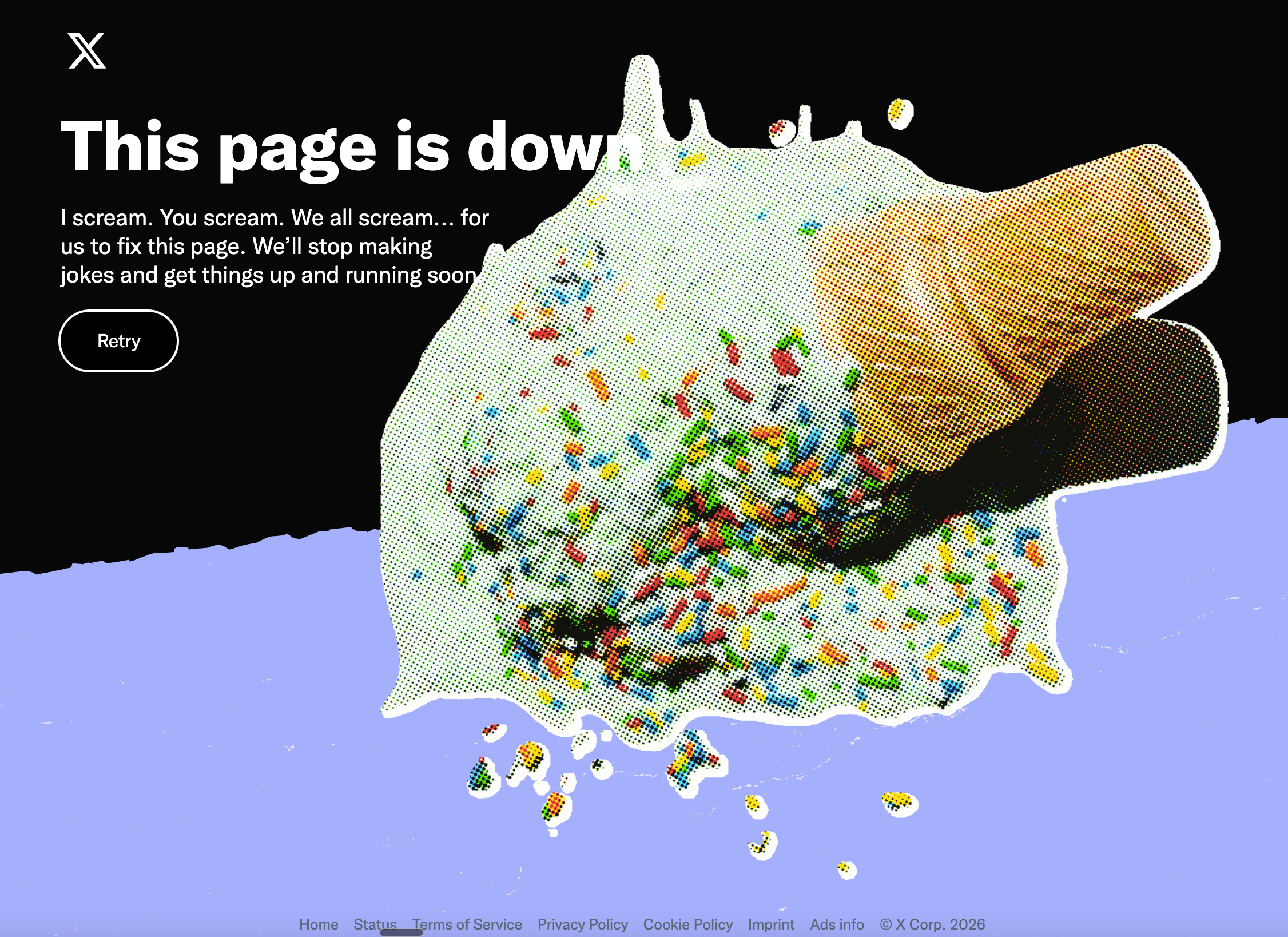
Most error pages feel like a brick wall: cold, silent, and annoying. This ice-cream-splat page flips that. Instead of hiding the mistake, it turns a broken link into a tiny brand moment that’s funny, visual, and memorable. Your visitors are already frustrated—this is how you disarm them and keep them liking you while things are broken.
What’s happening on this page
The headline bluntly says, “This page is down,” but the vibe is anything but bland. A giant, comic-style image of a dropped ice cream cone explodes across the screen, sprinkles flying. The copy leans into the metaphor with the classic “I scream, you scream…” line, then promises to stop joking and fix the page soon. A single, clear “Retry” button gives the user exactly one easy choice.
Why this error page actually helps the brand
- Owns the mistake with a big, bold headline instead of hiding behind jargon
- Uses a playful visual (spilled ice cream) to match the emotional moment of “well, that sucks”
- Cracks a short, on-brand joke to release tension instead of adding tech blame
- Keeps the action dead simple with one primary button: Retry
- Turns dead traffic into a branded experience people might even screenshot and share
Ideas you can steal for your own error pages

An ecommerce brand could show a toppled shopping cart and say the page wiped out, then offer a big button back to bestsellers.

A productivity app could show a crossed-out to-do list with a line that the page didn’t make the cut, then link back to the main dashboard.
Creative Variations
Analyzed by Swipebot
Loading analysis...
.png?width=3840&quality=80)