Viral Coffee, Toast & Steak Preference Chart
Published on
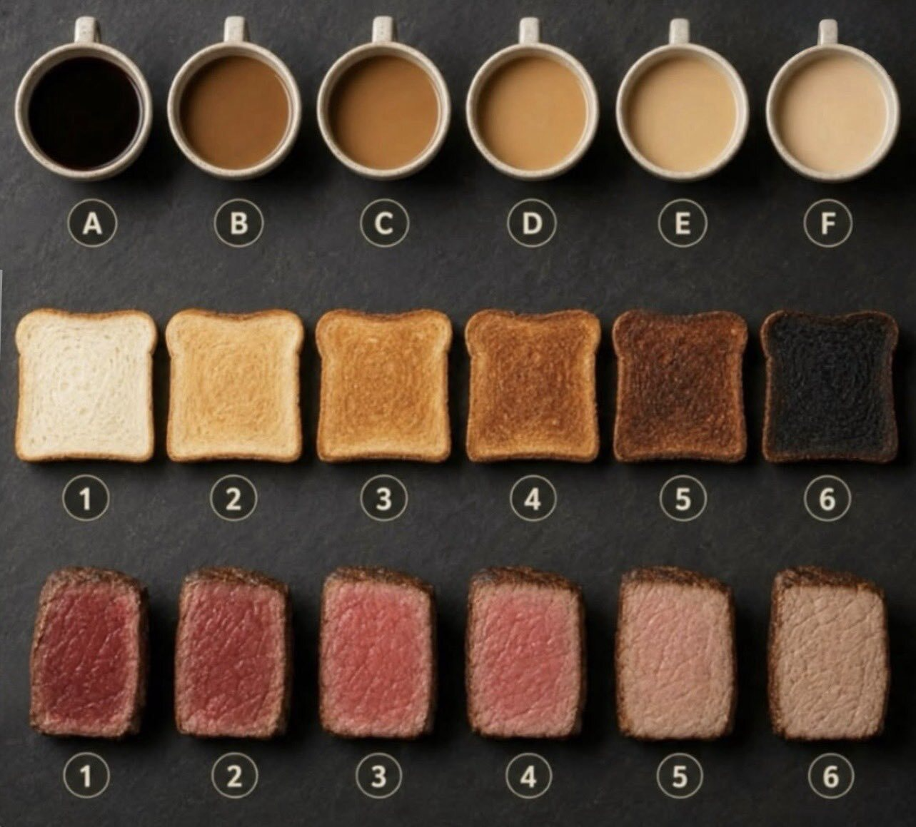
Levels confuse people. Food doesn’t. This visual takes something abstract like “how dark?” or “how cooked?” and turns it into coffee, toast, and steak that anyone can understand at a glance. Use this same trick to explain your own scales so your audience instantly “gets it” without reading a paragraph of instructions.
What’s Happening In This Image
The graphic uses three everyday food scales: coffee from black to milky (A–F), toast from white to burnt (1–6), and steak from rare to well-done (1–6). Each row shows a smooth, visual progression. No words like “medium-dark” or “light-medium-plus” needed. You just point to the square (or cup) that matches your preference and you’re done.
How To Steal This For Your Product
Take the spectrum your customers struggle with—plan sizes, urgency, difficulty, risk—and match each step to a familiar food or drink state. For example, a support queue could be “espresso fast” to “slow stew.” A pricing page could show scoops of ice cream from one to six. Anchor your levels in something people already buy, cook, or drink and they won’t need a legend.
Why Food Scales Work So Well
- Instant recognition: Everyone already knows what rare steak or burnt toast looks like.
- Built-in emotion: People feel their preference, they don’t have to calculate it.
- Fewer questions: Clear visuals kill back-and-forth like “Is ‘3’ more like medium or medium-well?”
- Easy to reuse: The same six-step template can map to heat, price tiers, risk levels, or package sizes.
Real-World Style Uses
Starbucks uses a simple Short–Tall–Grande–Venti cup lineup so customers understand drink sizes without reading ounces.
Blue Bottle Coffee shows roast levels as a gradient of bean colors so shoppers instantly grasp light vs dark without coffee jargon.
Creative Variations
Analyzed by Swipebot
Loading analysis...